Unlock a world of possibilities! Login now and discover the exclusive benefits awaiting you.
- Qlik Community
- :
- All Forums
- :
- QlikView App Dev
- :
- Re: How to differentiate accumulation by subject n...
- Subscribe to RSS Feed
- Mark Topic as New
- Mark Topic as Read
- Float this Topic for Current User
- Bookmark
- Subscribe
- Mute
- Printer Friendly Page
- Mark as New
- Bookmark
- Subscribe
- Mute
- Subscribe to RSS Feed
- Permalink
- Report Inappropriate Content
How to differentiate accumulation by subject name by year ?
Hi,
Below is the chart that I have:
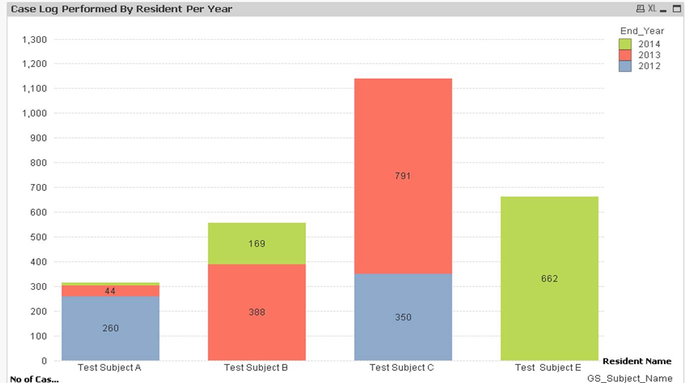
I have 2 dimensions for this "Full Accumulation" Graph; namely "Test Subject" & "Year".
However, they are adding on the number regardless of "Test Subject".
E.g
Test Subject A has 44 Cases for 2013. For Test Subject B, it will add Test Subject A 44 cases to its own test case.
What I want to show is that for test subject B, it should only show 344 cases, not accumulation of both test subject.
Any one has a solution to this ? I tried drill through too but cant get the right combination.
Thks in advance!
Accepted Solutions
- Mark as New
- Bookmark
- Subscribe
- Mute
- Subscribe to RSS Feed
- Permalink
- Report Inappropriate Content
That's what a stacked chart should do, it should accumulate across the 2nd dimension, in this case years. Don't need to accumulate the expression itself.
- Mark as New
- Bookmark
- Subscribe
- Mute
- Subscribe to RSS Feed
- Permalink
- Report Inappropriate Content
What you've described making B have 44 + 344 sounds exactly like what I'd expect with Full Accumulation. Why do you have that turned on if don't want to accumulate.
- Mark as New
- Bookmark
- Subscribe
- Mute
- Subscribe to RSS Feed
- Permalink
- Report Inappropriate Content
Hi,
I need accumulation on the cases but it should be categorize by Subject Name and year and not lump all the cases together regardless of subject name.
What I want to see is that for each subject name, the case should be accumulated in term of years for that subject name only.
Hope this helps to clarify.
- Mark as New
- Bookmark
- Subscribe
- Mute
- Subscribe to RSS Feed
- Permalink
- Report Inappropriate Content
That's what a stacked chart should do, it should accumulate across the 2nd dimension, in this case years. Don't need to accumulate the expression itself.
- Mark as New
- Bookmark
- Subscribe
- Mute
- Subscribe to RSS Feed
- Permalink
- Report Inappropriate Content
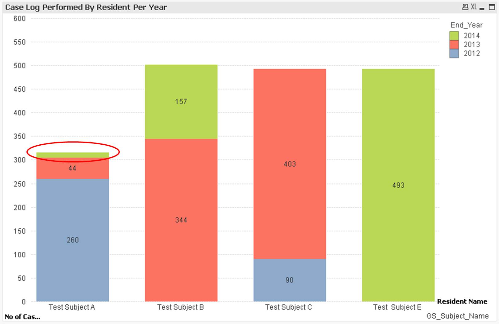
Dear Michael,
Thanks for your guidance. Able to get the result with no accumulation. Below is the answer.
Just one last question, the graph cannot display the figure for test subject A on year 2014. The reason is that the graph thickness is too thin, any way to show the figure out ???
Thanks!
- Mark as New
- Bookmark
- Subscribe
- Mute
- Subscribe to RSS Feed
- Permalink
- Report Inappropriate Content
Only thing I can think of is to make sure your axis font is as small as can be as that determines how much can be fit.
The size of the graph also influences.
There is a setting in the Presentation tab called "Plot Values Inside Segments" which you've selected. If turn off, it will show value above the column which means not restricted by size. But it will only show the total over the years which doesn't work for you
Think this is just a limitation in Qlikview. There could be other tricks like making a combo chart with two expressions, one being the bar (without value showing) and a second being a symbol with value showing (but hide the symbol). This might do it - but I had a quick go and couldn't get it to work.
- Mark as New
- Bookmark
- Subscribe
- Mute
- Subscribe to RSS Feed
- Permalink
- Report Inappropriate Content
Hi Anthony,
appreciate on your end to give this a try. The size of the graph is quite big actually.
Guess this is the limitation in Qlikview unless some people has a workaround for this.
I will have to see if the management accept this a not since this is technically infeasible.
Therefore, I will close this thread as answered.
Appreciate your help along the way in resolving this.