Unlock a world of possibilities! Login now and discover the exclusive benefits awaiting you.
Announcements
Live today at 11 AM ET. Get your questions about Qlik Connect answered, or just listen in.
SIGN UP NOW
- Qlik Community
- :
- All Forums
- :
- QlikView App Dev
- :
- Re: How to present long raw of data in a chart?
Options
- Subscribe to RSS Feed
- Mark Topic as New
- Mark Topic as Read
- Float this Topic for Current User
- Bookmark
- Subscribe
- Mute
- Printer Friendly Page
Turn on suggestions
Auto-suggest helps you quickly narrow down your search results by suggesting possible matches as you type.
Showing results for
Not applicable
2013-03-15
09:56 AM
- Mark as New
- Bookmark
- Subscribe
- Mute
- Subscribe to RSS Feed
- Permalink
- Report Inappropriate Content
How to present long raw of data in a chart?
Hello,
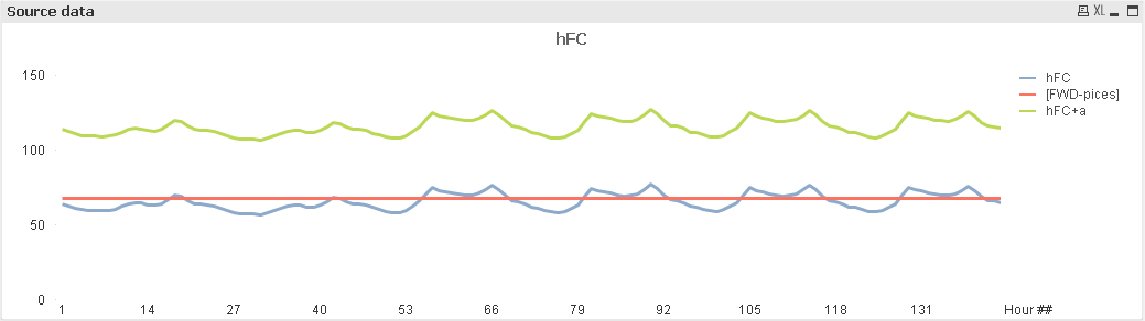
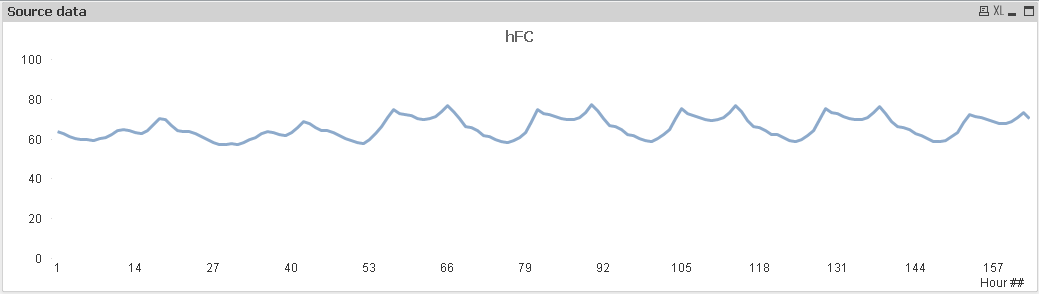
I have about 8.000 values which are to be shown on chart. But the chart shows only the first hundred and something number (screenshot attached). How to display them all? There must be some settings to change, but I didn't manage to figure out which ones...
Should there be other good ways of presenting long data, I'd appreciate the hint a lot.
Thanks in advance!
/Stanislav
443 Views
1 Solution
Accepted Solutions
Not applicable
2013-03-15
10:23 AM
Author
- Mark as New
- Bookmark
- Subscribe
- Mute
- Subscribe to RSS Feed
- Permalink
- Report Inappropriate Content
Solved! Needed to check Continious for dimension axis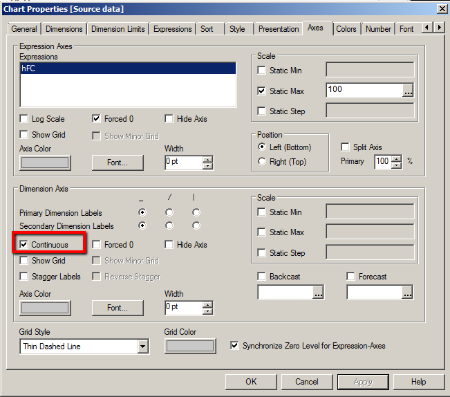 .
.
219 Views
3 Replies
Not applicable
2013-03-15
10:02 AM
Author
- Mark as New
- Bookmark
- Subscribe
- Mute
- Subscribe to RSS Feed
- Permalink
- Report Inappropriate Content
Hi,
Have a look on the image.
219 Views
Not applicable
2013-03-15
10:15 AM
Author
- Mark as New
- Bookmark
- Subscribe
- Mute
- Subscribe to RSS Feed
- Permalink
- Report Inappropriate Content
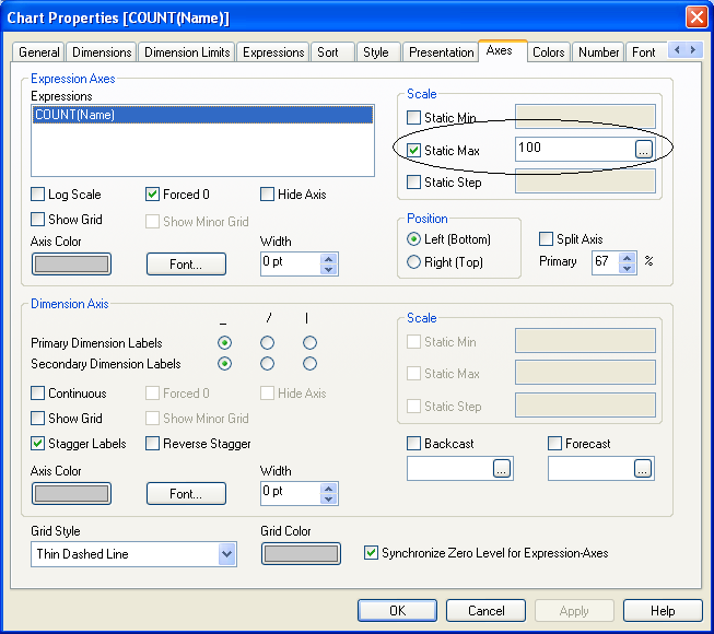
Thanks a lot, but doesn't seem to help entirely - please refer screenshots (I left only one dimension). 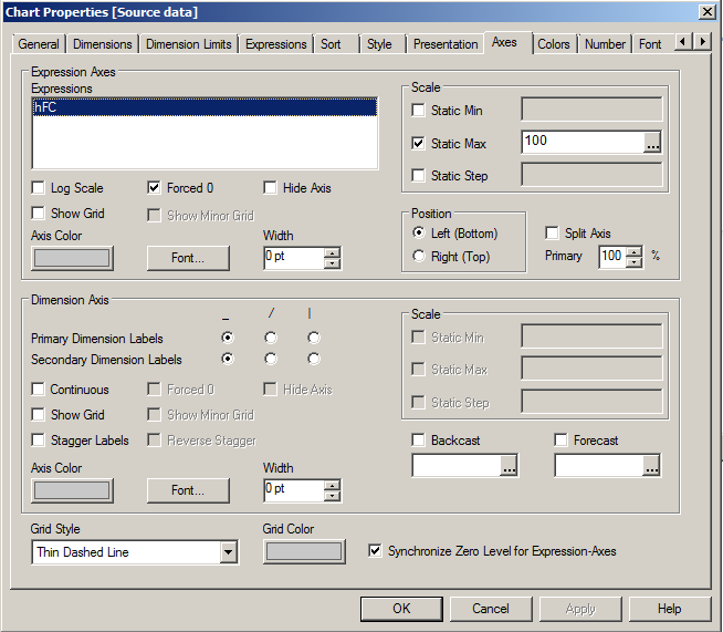
219 Views
Not applicable
2013-03-15
10:23 AM
Author
- Mark as New
- Bookmark
- Subscribe
- Mute
- Subscribe to RSS Feed
- Permalink
- Report Inappropriate Content
Solved! Needed to check Continious for dimension axis.
220 Views