Unlock a world of possibilities! Login now and discover the exclusive benefits awaiting you.
- Qlik Community
- :
- All Forums
- :
- QlikView App Dev
- :
- How to remove the first bar or datapoint in a bar ...
- Subscribe to RSS Feed
- Mark Topic as New
- Mark Topic as Read
- Float this Topic for Current User
- Bookmark
- Subscribe
- Mute
- Printer Friendly Page
- Mark as New
- Bookmark
- Subscribe
- Mute
- Subscribe to RSS Feed
- Permalink
- Report Inappropriate Content
How to remove the first bar or datapoint in a bar chart?
Heyy
I created a few bar charts using complex expressions and something weird happens:
First I made an evolution bar chart, this means that I calculate the increase/decrease with respect to the previous month.
So when I select let's say the last 5 months, it should give me 4 bars, the first month selected is used for the calculations.
Here is the expression:
if(rangesum(Above(count(customerid),1,1))=0 or count(customerid)-rangesum(Above(count(customerid),1,1))=0,
dual(round(100*(count(customerid)-rangesum(above(count(customerid),1,1)))/rangesum(above(count(customerid),1,1)),0.01)&'% ▬',(count(customerid)-rangesum(above(count(customerid),1,1)))/rangesum(above(count(customerid),1,1))),
if(count(customerid)-rangesum(Above(count(customerid),1,1))<0,
dual(round(100*(count(customerid)-rangesum(above(count(customerid),1,1)))/rangesum(above(count(customerid),1,1)),0.01)&'% ▼',(count(customerid)-rangesum(above(count(customerid),1,1)))/rangesum(above(count(customerid),1,1))),
dual(round(100*(count(customerid)-rangesum(above(count(customerid),1,1)))/rangesum(above(count(customerid),1,1)),0.01)&'% ▲',(count(customerid)-rangesum(above(count(customerid),1,1)))/rangesum(above(count(customerid),1,1)))))
simple: it calculates how much customers there are more or less in the next month, compared to the month before. Using this gives me what I want: only ... bars (Starting from April 2016 though I selected data from March 2016). Color formatting is done with the following expression:
if(((count(customerid)-rangesum(above(count(customerid),1,1)))
/rangesum(above(count(customerid),1,1)))>=Klantstijginggroen,RGB(114,231,122),
if(((count(customerid)-rangesum(above(count(customerid),1,1)))
/rangesum(above(count(customerid),1,1)))>=Klantstijginggeel,RGB(236,231,50),RGB(248,100,63)))
It just says that if the increase in customers is greater than a variable that can be filled in (the variable Klantstijginggroen means that this number represents a great increase and therefor will be green, the Klantstijginggeel is a variable that represents a moderate increase, therefor yellow. If there is a decrease, the color will be red.
Again no problems.
BUT, if I try to add the real increase or decrease in absolute values below, it shows me the first month that I selected too below, so March 2016, it does not show me a bar chart. See attachment: Example1.png
For another bar chart, where I don't put the exact numbers below, I get what I want: Example2.png
The expressions and formatting are quite similar though I use sum instead of count there and other variables and colors.
Note: I guess it has to do with color formatting. With other graphs that have 3 colors, I have the problem in all of them.
However, the problem does not occur when I remove the bottom numbers (they are a separate expression). Meaning that the color formatting in 3 colors for Example 1.png itself, does not give any problems.
Note: I mentionned 5 months on top, the printscreens are made with more months: from March 2016 until March 2017 (so until 31 March 2017)
This is probably very confusing but I can't give a lot more information so I hope that it is clear and that someone can help me with my problem.
Thanks in advance
Accepted Solutions
- Mark as New
- Bookmark
- Subscribe
- Mute
- Subscribe to RSS Feed
- Permalink
- Report Inappropriate Content
So, here is what I can tell you....
1) I don't know your expressions well enough to suggest any major changes.... may be this is possible without brute force, but since I can't really recommend a change there... I can give you two options
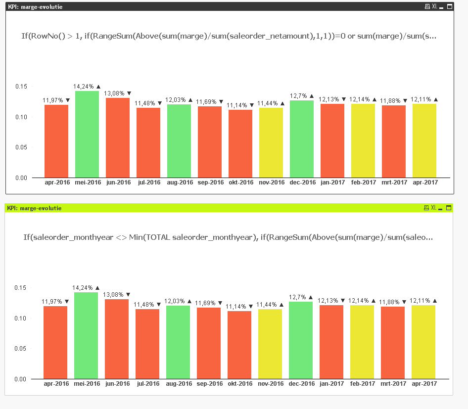
a) Use RowNo() function in the if statement
If(RowNo() > 1, YourExpression)
Basically this forces the first bar to be 0 with or without selections
b) Make use of saleorder_monthyear field
If(saleorder_monthyear <> Min(TOTAL saleorder_monthyear), YourExpression)
This is more logical, but will most of the time do the same thing as option a (unless you have set analysis requirement). The one is checking that if monthyear is not equal to the lowest monthyear, then display your expression, otherwise force it to be null.
- Mark as New
- Bookmark
- Subscribe
- Mute
- Subscribe to RSS Feed
- Permalink
- Report Inappropriate Content
Would it be possible for you to share your qvw file to see the issue
- Mark as New
- Bookmark
- Subscribe
- Mute
- Subscribe to RSS Feed
- Permalink
- Report Inappropriate Content
Can you try to remove Text on axis for Example 1 then see how March data looks like?
- Mark as New
- Bookmark
- Subscribe
- Mute
- Subscribe to RSS Feed
- Permalink
- Report Inappropriate Content
I tried this. The only thing that changed is that the numbers on the axis disappear (kinda obvious) but it still shows me an empty bar for March. Only disabling the expression for the numbers on the axis, gives me the wanted result, but then I lose the absolute values, which I need to be displayed.
- Mark as New
- Bookmark
- Subscribe
- Mute
- Subscribe to RSS Feed
- Permalink
- Report Inappropriate Content
So, here is what I can tell you....
1) I don't know your expressions well enough to suggest any major changes.... may be this is possible without brute force, but since I can't really recommend a change there... I can give you two options
a) Use RowNo() function in the if statement
If(RowNo() > 1, YourExpression)
Basically this forces the first bar to be 0 with or without selections
b) Make use of saleorder_monthyear field
If(saleorder_monthyear <> Min(TOTAL saleorder_monthyear), YourExpression)
This is more logical, but will most of the time do the same thing as option a (unless you have set analysis requirement). The one is checking that if monthyear is not equal to the lowest monthyear, then display your expression, otherwise force it to be null.