Unlock a world of possibilities! Login now and discover the exclusive benefits awaiting you.
- Qlik Community
- :
- All Forums
- :
- QlikView App Dev
- :
- Re: How to transform a stacked chart into a groupe...
- Subscribe to RSS Feed
- Mark Topic as New
- Mark Topic as Read
- Float this Topic for Current User
- Bookmark
- Subscribe
- Mute
- Printer Friendly Page
- Mark as New
- Bookmark
- Subscribe
- Mute
- Subscribe to RSS Feed
- Permalink
- Report Inappropriate Content
How to transform a stacked chart into a grouped bar chart
Hi guys! How do I transform a stacked chart into a grouped chart even if it has 2 dimensions. I only have 1 expression and I tried to do by simply changing the style at the properties tab however it didn't display the chart I wanted.
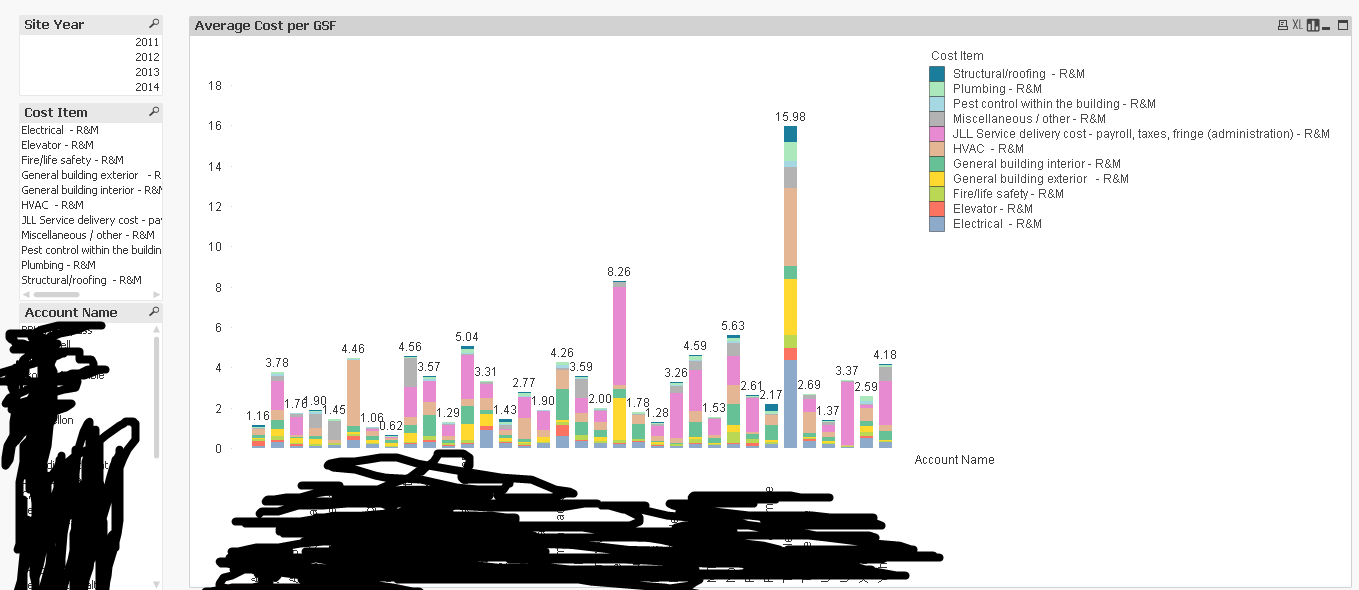
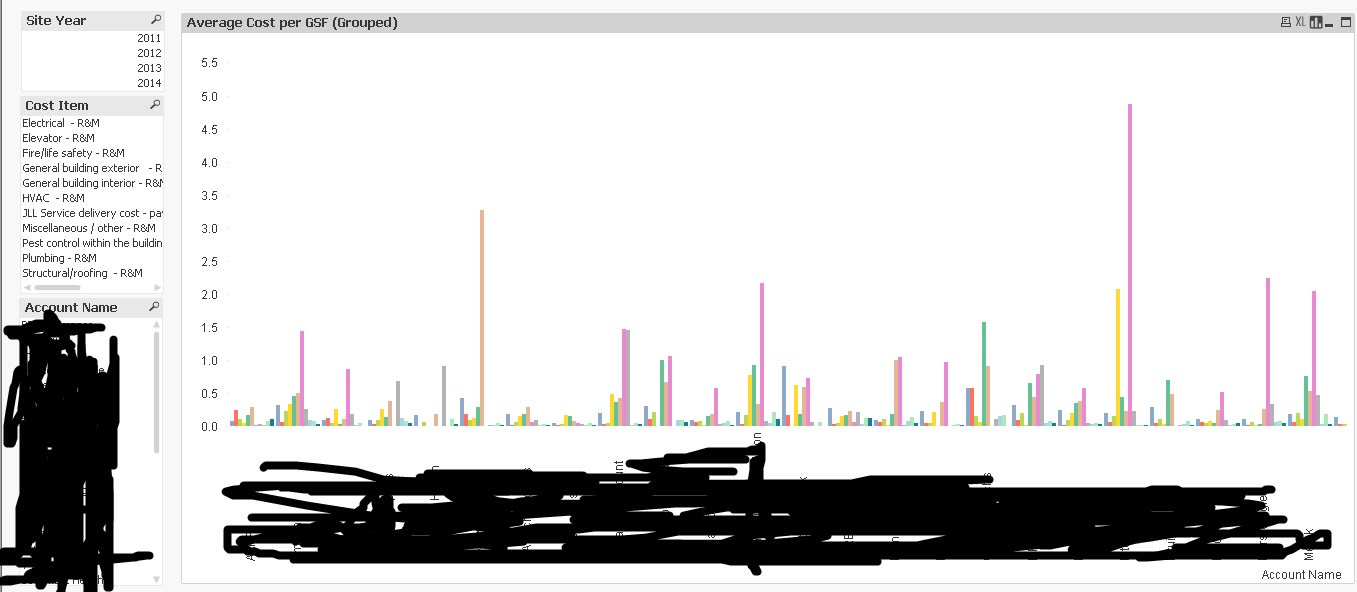
This the result I wanted to:
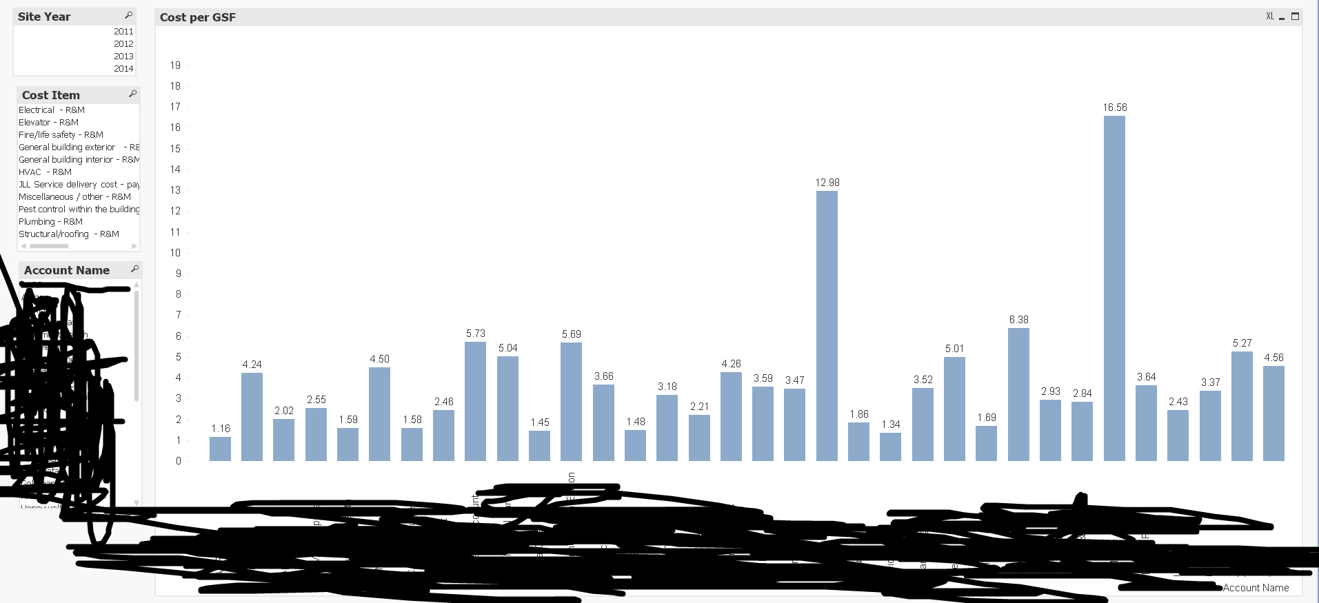
But instead I'm getting this:
Help me on this please. Thanks in advance!
- « Previous Replies
-
- 1
- 2
- Next Replies »
- Mark as New
- Bookmark
- Subscribe
- Mute
- Subscribe to RSS Feed
- Permalink
- Report Inappropriate Content
OK, so Kaushik's solution is correct as far as the colours are concerned but you see different result in the values at the top of the bar. That's a problem with the expression you have used.
You probably need and Sum(Aggr()..) type expression but if you want specific help, then I suggest that you supply the complete expression, (and define any variables in the expression) and the chart dimensions.
- Mark as New
- Bookmark
- Subscribe
- Mute
- Subscribe to RSS Feed
- Permalink
- Report Inappropriate Content
Here is my load script sir.
T1:
CrossTable([Cost Item], Data, 6)
LOAD [Account Code],
[Account Name],
[Site Code],
[Site Name],
[Site Year],
[Gross square feet (GSF)],
[JLL Service delivery cost - payroll, taxes, fringe (administration) - R&M],
[Electrical - R&M],
[Elevator - R&M],
[Fire/life safety - R&M],
[General building exterior - R&M],
[General building interior - R&M],
[HVAC - R&M],
[Structural/roofing - R&M],
[Plumbing - R&M],
[Pest control within the building - R&M],
[Miscellaneous / other - R&M]
FROM
(ooxml, embedded labels, table is Data)
Where [Gross square feet (GSF)] > 0 and Len(Trim([Gross square feet (GSF)])) > 0;
T2:
Load
[Account Code],
[Account Name],
[Site Code],
[Site Name],
[Site Year],
[Gross square feet (GSF)],
[Site Name]&[Site Year] as key
Resident T1;
T3:
Load
[Cost Item],
Data/[Gross square feet (GSF)] as "Cost/GSF",
[Site Name]&[Site Year] as key
Resident T1;
Drop Table T1;
Cost Item is the assigned dimension. Those cost items include:
JLL Service delivery cost - payroll, taxes, fringe (administration) - R&M],
[Electrical - R&M],
[Elevator - R&M],
[Fire/life safety - R&M],
[General building exterior - R&M],
[General building interior - R&M],
[HVAC - R&M],
[Structural/roofing - R&M],
[Plumbing - R&M],
[Pest control within the building - R&M],
[Miscellaneous / other - R&M]
The main task is to compute for the Total Average Cost/GSF and Average Cost/GSF (grouped and stacked). Cost are the values of the Cost Items, while GSF is the [Gross square feet (GSF)].
In the Expression tab, the expression I used for the Total Average Cost/GSF is:
Sum(Aggr(Avg([Cost/GSF]),[Account Name],[Site Name],[Site Year]))
while the expression I used for the Average Cost is:
Aggr(Avg([Cost/GSF]),[Account Name],[Cost Item])
Where could I have possibly gone wrong? Although I was able to get the expected output of chart for the Total Average Cost/GSF, the values on the chart were not the same as the expected output as well. As for the Average Cost/GSF Stacked and Grouped, I couldn't get the expected output of both the chart and the values.
- Mark as New
- Bookmark
- Subscribe
- Mute
- Subscribe to RSS Feed
- Permalink
- Report Inappropriate Content
Sir, I'm running a personal edition so do you mind typing down the script in your reply? Thank you.
- Mark as New
- Bookmark
- Subscribe
- Mute
- Subscribe to RSS Feed
- Permalink
- Report Inappropriate Content
The Aggr() expressions must include the chart dimensions and the Average cost expression needs some aggregation function like Sum() or Avg().
Beyond that its hard to day without a small sample qvw that illustrates the problem.
- Mark as New
- Bookmark
- Subscribe
- Mute
- Subscribe to RSS Feed
- Permalink
- Report Inappropriate Content
Dear Kat,
As Mr. jontydkpi said, It would be great if you can share some sample data which shows the problem you are facing, without which its difficult to help.
Regards,
Kaushik Solanki
- Mark as New
- Bookmark
- Subscribe
- Mute
- Subscribe to RSS Feed
- Permalink
- Report Inappropriate Content
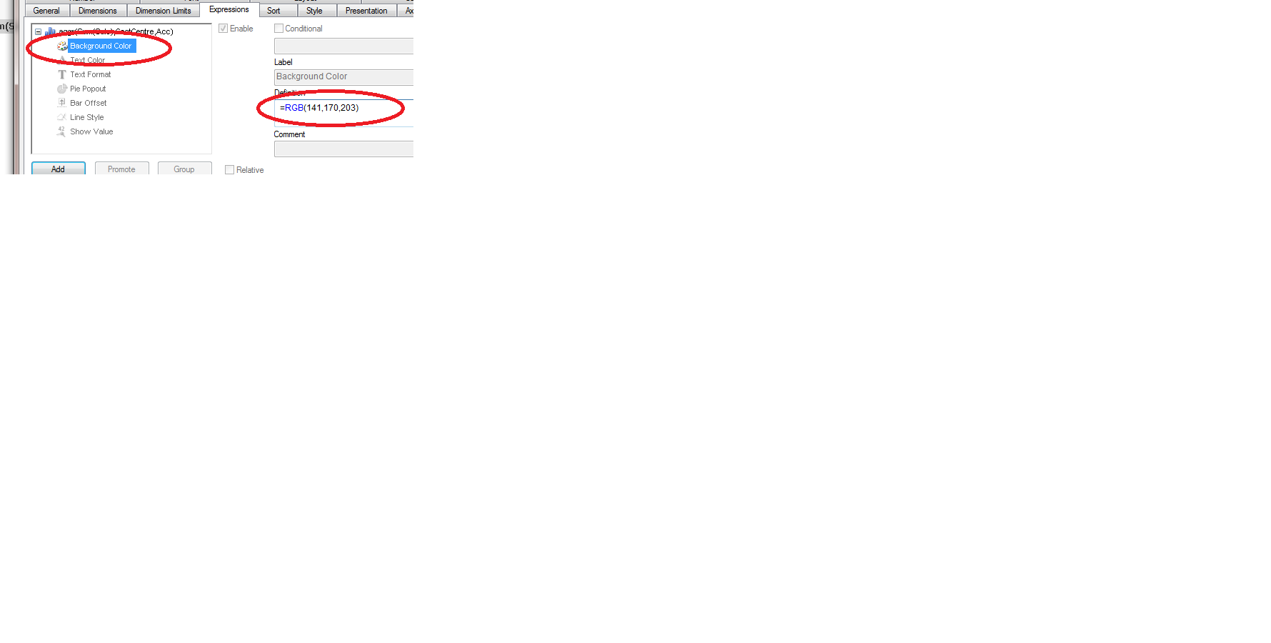
Dear Kat,
You have to change the background color under Expression. Please Refer the below image.
- Mark as New
- Bookmark
- Subscribe
- Mute
- Subscribe to RSS Feed
- Permalink
- Report Inappropriate Content
Hi everyone, what I wanted to achieve is this kind of grouped chart:

Instead, I'm getting this chart:
- « Previous Replies
-
- 1
- 2
- Next Replies »