Unlock a world of possibilities! Login now and discover the exclusive benefits awaiting you.
- Qlik Community
- :
- All Forums
- :
- QlikView App Dev
- :
- In QS how to show two different calculations (seen...
- Subscribe to RSS Feed
- Mark Topic as New
- Mark Topic as Read
- Float this Topic for Current User
- Bookmark
- Subscribe
- Mute
- Printer Friendly Page
- Mark as New
- Bookmark
- Subscribe
- Mute
- Subscribe to RSS Feed
- Permalink
- Report Inappropriate Content
In QS how to show two different calculations (seen as per Tableau chart) without using an extension
I'm working on a QS PoC that replicates Tableau dashboard chart.
The tableau dashboard chart can be seen in the screen shot below
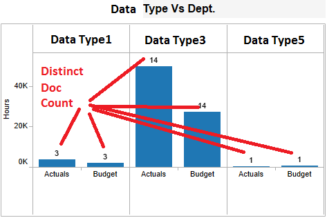
Y AXIS calculation for two bars in a group are as follows
Actuals
Sum({<[AS]={"AS1"}, [Data Type]={"Data Type2", "Data Type5", "Data Type8"}>}[Actual])
Budget
Sum({<[AS]={"AS1"}, [Data Type]={"Data Type2", "Data Type5", "Data Type8"}>}[Budget])
On Bar the count should be
Count(distinct DocID)
Is there anyway to show count seen on bars? Any advise would be helpful.
Please find sample file attached. please note that data value may not match with screen shot but the idea is to get hours Y axis, and count on bar
Thanks
- Mark as New
- Bookmark
- Subscribe
- Mute
- Subscribe to RSS Feed
- Permalink
- Report Inappropriate Content
Hi,
I have attached a possible solution of your requirement.
Thanks,
- Mark as New
- Bookmark
- Subscribe
- Mute
- Subscribe to RSS Feed
- Permalink
- Report Inappropriate Content
Maybe something like the below
Enable the trellis chart
Dim1 : Category
Dim2 : Valuelist ('Actual' , 'Budget' )
Exp1 : if( ValueList('Actual','Budget') ='Actual' , sum(amount) , sum(budget) )
Exp2 : count(ordered) -
Uncheck the Bar and check the value on data points in this Exp2
Check the Bar and Uncheck the value on data points in this Exp1
- Mark as New
- Bookmark
- Subscribe
- Mute
- Subscribe to RSS Feed
- Permalink
- Report Inappropriate Content
Hi,
Thanks for the response. I want count value to be seen on bar. Also I want it to work in QlikSense.
BR,
Vijay
- Mark as New
- Bookmark
- Subscribe
- Mute
- Subscribe to RSS Feed
- Permalink
- Report Inappropriate Content
Hi Susant,
Is it in QlikView or QlikSense? I've to do it in QS. Thanks for taking time to provide a response.
BR,
Vijay
- Mark as New
- Bookmark
- Subscribe
- Mute
- Subscribe to RSS Feed
- Permalink
- Report Inappropriate Content
Its in Qlikview but the logic should remain the same
- Mark as New
- Bookmark
- Subscribe
- Mute
- Subscribe to RSS Feed
- Permalink
- Report Inappropriate Content
Not all of the features available in various charts within Qlikview are available in Qlik Sense