Unlock a world of possibilities! Login now and discover the exclusive benefits awaiting you.
- Qlik Community
- :
- All Forums
- :
- QlikView App Dev
- :
- Re: Please, urgent help needed , How to manage mul...
- Subscribe to RSS Feed
- Mark Topic as New
- Mark Topic as Read
- Float this Topic for Current User
- Bookmark
- Subscribe
- Mute
- Printer Friendly Page
- Mark as New
- Bookmark
- Subscribe
- Mute
- Subscribe to RSS Feed
- Permalink
- Report Inappropriate Content
Please, urgent help needed , How to manage multiple header rows of excel in QlikView ?
As i am new to Qlikview, Please help me to resolve the below question asap.
Excel file is as given below.
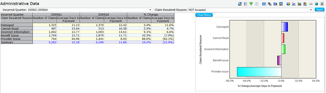
| Incurred Quarter | 2009Q1 | 2009Q4 | % Change | |||
| Claim Resubmit Reason | Number of Claims | Average Days to Payment | Number of Claims | Average Days to Payment | Number of Claims | Average Days to Payment |
| Damaged | 1325 | 11.13 | 1370 | 12.42 | 3.4% | 11.6% |
| Cannot Read | 487 | 15.64 | 513 | 16.38 | 5.3% | 4.7% |
| Incorrect Information | 1002 | 12.77 | 1093 | 13.61 | 9.1% | 6.6% |
| Benefit Issue | 1704 | 12.71 | 1879 | 11.71 | 10.3% | -7.9% |
| Provider Issue | 764 | 44.96 | 1441 | 8.05 | 88.6% | -82.1% |
| Summary | 5282 | 15.18 | 6296 | 11.86 | 19.2% | -21.9% |
And the dashboard should be as given below in Qlikview. I should get both graph and table data in a single qlikview sheet. Please find the attached files.
Thanks in advance. Appreciate your response.
- « Previous Replies
-
- 1
- 2
- Next Replies »
- Mark as New
- Bookmark
- Subscribe
- Mute
- Subscribe to RSS Feed
- Permalink
- Report Inappropriate Content
you can insert a new coulumn and use it as a field .
- Mark as New
- Bookmark
- Subscribe
- Mute
- Subscribe to RSS Feed
- Permalink
- Report Inappropriate Content
Thanks for your reply. If you don't mind, can you provide me the steps ?. thanks
- Mark as New
- Bookmark
- Subscribe
- Mute
- Subscribe to RSS Feed
- Permalink
- Report Inappropriate Content
Post a sample i am not sure but yes i can try to implement it.
- Mark as New
- Bookmark
- Subscribe
- Mute
- Subscribe to RSS Feed
- Permalink
- Report Inappropriate Content
Hi,
You can use below format to load the data and you can get the desired result in pivot table in QlikView
| Period | Claim Resumbit Reason | Number of Claims | Average Days to Payment |
| 2009Q1 | Damaged | ||
| 2009Q1 | Cannot Read | ||
| 2009Q1 | Incorrect Information | ||
| 2009Q1 | Benefit Issue | ||
| 2009Q1 | Provider Issue | ||
| 2009Q4 | Damaged | ||
| 2009Q1 | Cannot Read | ||
| 2009Q1 | Incorrect Information | ||
| 2009Q1 | Benefit Issue | ||
| 2009Q1 | Provider Issue |
Regards,
Raghav
- Mark as New
- Bookmark
- Subscribe
- Mute
- Subscribe to RSS Feed
- Permalink
- Report Inappropriate Content
Seems like this..
- Mark as New
- Bookmark
- Subscribe
- Mute
- Subscribe to RSS Feed
- Permalink
- Report Inappropriate Content
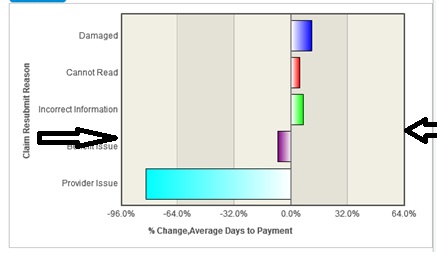
Thanks. Here i need to avoid summary ( ')' symbol in excel sheet) displayed on the y axis of my bar chart. How can i avoid a particluar word disaplying on Y axis. Also Claim Resubmit Reason label should be displayed as given on the Y axis. I am not able to do all these.
- Mark as New
- Bookmark
- Subscribe
- Mute
- Subscribe to RSS Feed
- Permalink
- Report Inappropriate Content
Hi,
You can add one more column with the description what you want in bar graph and use the same column as dimension in the bar graph.
Regards,
Raghav
- Mark as New
- Bookmark
- Subscribe
- Mute
- Subscribe to RSS Feed
- Permalink
- Report Inappropriate Content
Hi,
You can add one more column with the description what you want in bar graph and use the same column as dimension in the bar graph.
Regards,
Raghav
- Mark as New
- Bookmark
- Subscribe
- Mute
- Subscribe to RSS Feed
- Permalink
- Report Inappropriate Content
Also i need a black wrapping line around the graph as i marked in the given image. How can i do it? I can able to do it on X & Y axis but not on opposte sides.
- « Previous Replies
-
- 1
- 2
- Next Replies »