Unlock a world of possibilities! Login now and discover the exclusive benefits awaiting you.
- Qlik Community
- :
- All Forums
- :
- QlikView App Dev
- :
- Qlikview Pivot Chart with new dimension and expres...
- Subscribe to RSS Feed
- Mark Topic as New
- Mark Topic as Read
- Float this Topic for Current User
- Bookmark
- Subscribe
- Mute
- Printer Friendly Page
- Mark as New
- Bookmark
- Subscribe
- Mute
- Subscribe to RSS Feed
- Permalink
- Report Inappropriate Content
Qlikview Pivot Chart with new dimension and expression
Hi
I am trying to add a new row label to my existing pivot chart in Qlikview but I am not able to add any row label.
The expression for that row label is also a formula which I have attached in excel sheet.
Can you fix this .qvw table with Row label and formula as per the Sample excel sheet (Tab Name:Pivot)
Thanks
Hari Babu
Accepted Solutions
- Mark as New
- Bookmark
- Subscribe
- Mute
- Subscribe to RSS Feed
- Permalink
- Report Inappropriate Content
May be like attached
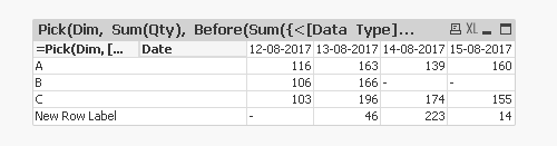
Dimension
=Pick(Dim, [Data Type], 'New Row Label')
Date
Expression
Pick(Dim, Sum(Qty), Before(Sum({<[Data Type] = {'B', 'C'}>}Qty)) - Sum({<[Data Type] = {'A'}>}Qty))
- Mark as New
- Bookmark
- Subscribe
- Mute
- Subscribe to RSS Feed
- Permalink
- Report Inappropriate Content
May be like attached
Dimension
=Pick(Dim, [Data Type], 'New Row Label')
Date
Expression
Pick(Dim, Sum(Qty), Before(Sum({<[Data Type] = {'B', 'C'}>}Qty)) - Sum({<[Data Type] = {'A'}>}Qty))
- Mark as New
- Bookmark
- Subscribe
- Mute
- Subscribe to RSS Feed
- Permalink
- Report Inappropriate Content
Hello Sunny,
Based on your solution, i was trying to build a package around Pick function. I am facing problem when I am trying to pull a chart with pick dimensions.
so can you please check the sample excel sheet and qlikview file and let me know the right way to approach the graph built in excel sheet ?
- Mark as New
- Bookmark
- Subscribe
- Mute
- Subscribe to RSS Feed
- Permalink
- Report Inappropriate Content
Try attached
- Mark as New
- Bookmark
- Subscribe
- Mute
- Subscribe to RSS Feed
- Permalink
- Report Inappropriate Content
Your calculations are out of the box...
Thanks a lot
- Mark as New
- Bookmark
- Subscribe
- Mute
- Subscribe to RSS Feed
- Permalink
- Report Inappropriate Content
Hello Sunny,
I have built a straight table based on the logic you provided above.
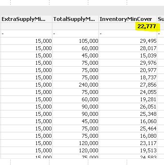
This Column Inventory Min Cover is a calculated expression in the straight table.
Can you help me out if I can refer this highlighted yellow cell in text box?
I wanted to show this value (eg:22777) average of that column in a text box
- Mark as New
- Bookmark
- Subscribe
- Mute
- Subscribe to RSS Feed
- Permalink
- Report Inappropriate Content
Would you be able to share the file where you have this straight table?
- Mark as New
- Bookmark
- Subscribe
- Mute
- Subscribe to RSS Feed
- Permalink
- Report Inappropriate Content
Hi,
Please find the attached sample file where there are two charts , one with complete table and the other chart only with average value of one single column.
Is there any other way to show the second chart (preferably in Text box etc) where i am having single cell (average value of particular column)?
- Mark as New
- Bookmark
- Subscribe
- Mute
- Subscribe to RSS Feed
- Permalink
- Report Inappropriate Content
I don't think I have a way to resolve this unless you are willing to do this in the script... But the problem with script will be that it will be a static value which won't change based on selections. I know kush141087 worked on a similar issue, may be he can share his expertise 
- Mark as New
- Bookmark
- Subscribe
- Mute
- Subscribe to RSS Feed
- Permalink
- Report Inappropriate Content