Unlock a world of possibilities! Login now and discover the exclusive benefits awaiting you.
- Qlik Community
- :
- All Forums
- :
- QlikView App Dev
- :
- Re: Rename Class and Specify Buckets
- Subscribe to RSS Feed
- Mark Topic as New
- Mark Topic as Read
- Float this Topic for Current User
- Bookmark
- Subscribe
- Mute
- Printer Friendly Page
- Mark as New
- Bookmark
- Subscribe
- Mute
- Subscribe to RSS Feed
- Permalink
- Report Inappropriate Content
Rename Class and Specify Buckets
Right now I am using the following Dimension for my interval buckets:
=replace(aggr(Class(count(GOV_DECISION_BODY_SUB),2), DEFECT_ID), '<= x <','-')
What I am trying to accomplish is 3 things:
- Hardcode the PROCESS_STEP selections so the user does not need to select them from the list box. I will have several versions of this graph with different selections to be used in an Nprinting export.
- I would think 0-1, 2-3, 4-5, 6 or more or whatever a frequency distribution suggests. Or, maybe 0, and 1 should be broken out separately. . . . and then the other categories.
- If possible, rename the 0-1 bucket to Low Complexity, rename 2-3 to Medium etc
Any suggestions?
Thanks in advance!
- « Previous Replies
- Next Replies »
- Mark as New
- Bookmark
- Subscribe
- Mute
- Subscribe to RSS Feed
- Permalink
- Report Inappropriate Content
Other graph? Not sure why other graph you are referring to 
- Mark as New
- Bookmark
- Subscribe
- Mute
- Subscribe to RSS Feed
- Permalink
- Report Inappropriate Content
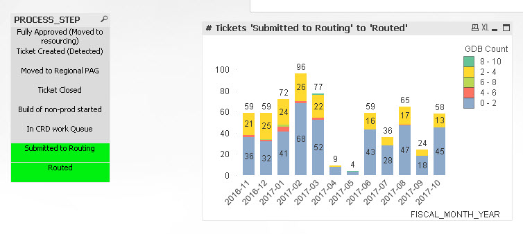
My original post had 2 charts - one for # tickets and one for Avg # days.
See attached.
- Mark as New
- Bookmark
- Subscribe
- Mute
- Subscribe to RSS Feed
- Permalink
- Report Inappropriate Content
Are they not working? I mean they don't change based on selection in PROCESS_STEP.... so I might think they work... unless you know that they are not
- Mark as New
- Bookmark
- Subscribe
- Mute
- Subscribe to RSS Feed
- Permalink
- Report Inappropriate Content
If you look at class_rename_3.qvw, no, the # Avg Days chart is not working. selecting Process Steps changes the data. If nothing is selected, you see 4 months of numbers. Selecting any process steps shows the right data but I'm not sure why I would have to select anything - like the # tickets graph.
- Mark as New
- Bookmark
- Subscribe
- Mute
- Subscribe to RSS Feed
- Permalink
- Report Inappropriate Content
So it should work like the # tickets but if no selections are made, it has different numbers than if PROCESS_STEPs are selected.
- Mark as New
- Bookmark
- Subscribe
- Mute
- Subscribe to RSS Feed
- Permalink
- Report Inappropriate Content
oops I had that sheet restricted! reattaching
- « Previous Replies
- Next Replies »