Unlock a world of possibilities! Login now and discover the exclusive benefits awaiting you.
- Qlik Community
- :
- All Forums
- :
- QlikView App Dev
- :
- Re: SCOM Dashboard on QlikVeiw
- Subscribe to RSS Feed
- Mark Topic as New
- Mark Topic as Read
- Float this Topic for Current User
- Bookmark
- Subscribe
- Mute
- Printer Friendly Page
- Mark as New
- Bookmark
- Subscribe
- Mute
- Subscribe to RSS Feed
- Permalink
- Report Inappropriate Content
SCOM Dashboard on QlikVeiw
Please, help with visualization of these systems. The standard set of objects I could find something suitable.
Objective: To get from SCOM state systems in the format Name System; state of the system (0-not monitored; 1 healthy 2-something with an agent; 3 is not healthy). The QlikView add a "display name" and a picture of the system.
I want to display the system only with the state №2 (color yellow) or state №3 (color red). At the same table not mean (I do not like to scroll system). This should be an object with automatic scaling of content as Block Char or Mekko, where to place as one and ten or more systems.
Or an option to the table, but divided into columns (for example in a row of each column should be no more than 6 lines), that is, the column №1 displays the first 6 systems, column №2 displays the system from 7 to 12, column №3 with 13 to 18.
Thank you in advance.
Accepted Solutions
- Mark as New
- Bookmark
- Subscribe
- Mute
- Subscribe to RSS Feed
- Permalink
- Report Inappropriate Content
1) You should group your objects based on business interest for example you have 10 objects, five objects showing Disk space analysis and other five showing the server analysis. you can make them conditional hide and show.
so that you can toggle between Disk space analysis and server analysis, only 5 objects will be there on screen.
2)Try to use gauge chart instead of that indicator.
3)Try to use other chart with the expression that can show only the data for the system that are not properly working.
4)try to split your dashboard in to 2 Parts Part 1 will show the analysis of normal system.and part 2 will be your red zone.
Regards,
Sandip Satbhai
- Mark as New
- Bookmark
- Subscribe
- Mute
- Subscribe to RSS Feed
- Permalink
- Report Inappropriate Content
could you please share the sample data and screen shot of your requirement?
- Mark as New
- Bookmark
- Subscribe
- Mute
- Subscribe to RSS Feed
- Permalink
- Report Inappropriate Content
Thanks for the help.
Clarify: SCOM - MS System Center Operations managery
And my only question on data visualization, and not as their load of SQL, and so on. I can not visualize the problem exactly (otherwise I would have already done).
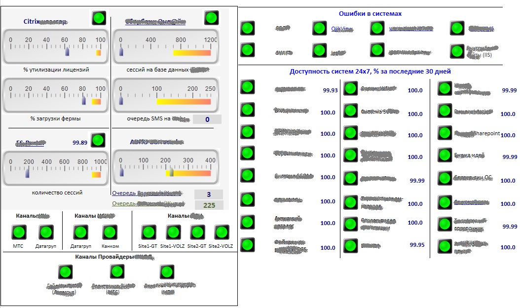
Now I have the Image-1 and I do not like it, because the:
1. It takes a lot of space;
2. Do not informative;
3. It is not nice;
4. Systems lot, everything is green and you can skip the red.
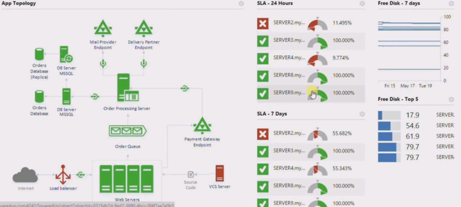
I want to not only display the normal state (yellow or red), this will reduce the size of the panel and will allow me to display more information about the failure of the system. Something like that shown in Image-2 only systems in the green state superfluous.
- Mark as New
- Bookmark
- Subscribe
- Mute
- Subscribe to RSS Feed
- Permalink
- Report Inappropriate Content
1) You should group your objects based on business interest for example you have 10 objects, five objects showing Disk space analysis and other five showing the server analysis. you can make them conditional hide and show.
so that you can toggle between Disk space analysis and server analysis, only 5 objects will be there on screen.
2)Try to use gauge chart instead of that indicator.
3)Try to use other chart with the expression that can show only the data for the system that are not properly working.
4)try to split your dashboard in to 2 Parts Part 1 will show the analysis of normal system.and part 2 will be your red zone.
Regards,
Sandip Satbhai
- Mark as New
- Bookmark
- Subscribe
- Mute
- Subscribe to RSS Feed
- Permalink
- Report Inappropriate Content
Hi Mihail,
Did you get this set up yet?
J.