Unlock a world of possibilities! Login now and discover the exclusive benefits awaiting you.
- Qlik Community
- :
- All Forums
- :
- QlikView App Dev
- :
- Show secondary axe in line chart
- Subscribe to RSS Feed
- Mark Topic as New
- Mark Topic as Read
- Float this Topic for Current User
- Bookmark
- Subscribe
- Mute
- Printer Friendly Page
- Mark as New
- Bookmark
- Subscribe
- Mute
- Subscribe to RSS Feed
- Permalink
- Report Inappropriate Content
Show secondary axe in line chart
Hi,
I made a chart with two y Axes 'cause I have two different range of values in Expressions, but I'm not able to show the secondary axe in the chart: the primary il visible on the right of the chart, but the secondary doesn't appear.
Can anyone teach me where is the option to set it?
I attach ex example to clearify what I'd like to raise.
Thank you.
N.
Accepted Solutions
- Mark as New
- Bookmark
- Subscribe
- Mute
- Subscribe to RSS Feed
- Permalink
- Report Inappropriate Content
use this inline table in the script
CostType:
Load * inline [
_Cost Type, _Cost Type Flag
Energy, 1
Employee, 2
Shipping, 3
];
Create a variable
vCostType= pick([_Cost Type Flag], 'Energy','Employee', Shipping')
use this expression with in ur first expression of the chart and delete the other two
Sum({<CostType={=$(=$(vCostType))}>},Value)
Make a list box for the column :
[_Cost Type]
Make any selection in this box to see changes in your chart and enable 'Always one selected value' .
- Mark as New
- Bookmark
- Subscribe
- Mute
- Subscribe to RSS Feed
- Permalink
- Report Inappropriate Content
Nick,
1. To show the secondary axes, in chart properties> axes with in expressions sections select your second expressions and uncheck 'Hide Axes'.
2. It is not a good practice to show both the axes if the Unit of Measure is same.
3. In the attachment example I observed two dimensions, are you talking about two dimesnions?? I dont understand what your chart says.
However, to view the secondary axes, follow step 1.
hope this helps...
- Mark as New
- Bookmark
- Subscribe
- Mute
- Subscribe to RSS Feed
- Permalink
- Report Inappropriate Content
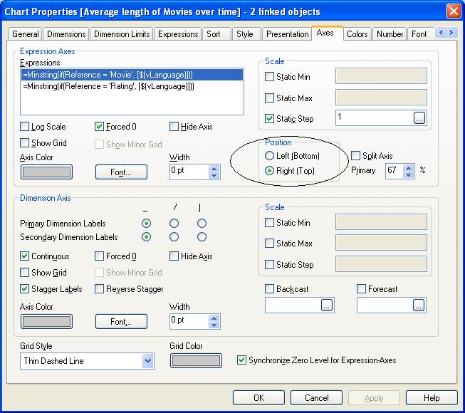
hi,
Goto Axes tab and there click on your expression and set the position of values using Position either left or right.
see screen shot below:
- Mark as New
- Bookmark
- Subscribe
- Mute
- Subscribe to RSS Feed
- Permalink
- Report Inappropriate Content
Please check the Axes Tab
See what is the possition value for both expressions.
One should be right and the other left.
- Mark as New
- Bookmark
- Subscribe
- Mute
- Subscribe to RSS Feed
- Permalink
- Report Inappropriate Content
Well, I did what you suggested jet, but it doesn't work, so I post the qw file in attach.
Sincerly, I don't like my solution so much, because I had to share the expression with and IF condition to set the values in different axes (and it isn't a good solution if the values of the expressions are not fixed).
Plus of this, It doesn't work well with the secondary axe  .
.
If one of you can suggest a solution to set the Y values in different axes dynamically (not based on fixed values of the dimension) it will be appreciate.
Shrikant, you wrote that it's not a good practise to show both the axes if the Unit of Measure is same; I agree with you that is not very immediate to understand which line of the garph is associate to the first axe and to the second one: do you suggestion to make two chart about the same argument (yearly costs) or what else?
Thank you.
N.
- Mark as New
- Bookmark
- Subscribe
- Mute
- Subscribe to RSS Feed
- Permalink
- Report Inappropriate Content
use this inline table in the script
CostType:
Load * inline [
_Cost Type, _Cost Type Flag
Energy, 1
Employee, 2
Shipping, 3
];
Create a variable
vCostType= pick([_Cost Type Flag], 'Energy','Employee', Shipping')
use this expression with in ur first expression of the chart and delete the other two
Sum({<CostType={=$(=$(vCostType))}>},Value)
Make a list box for the column :
[_Cost Type]
Make any selection in this box to see changes in your chart and enable 'Always one selected value' .
- Mark as New
- Bookmark
- Subscribe
- Mute
- Subscribe to RSS Feed
- Permalink
- Report Inappropriate Content
Very good. 
Thank you very much.
N.