Unlock a world of possibilities! Login now and discover the exclusive benefits awaiting you.
- Qlik Community
- :
- All Forums
- :
- QlikView App Dev
- :
- Urgent - creating simple bar chart
- Subscribe to RSS Feed
- Mark Topic as New
- Mark Topic as Read
- Float this Topic for Current User
- Bookmark
- Subscribe
- Mute
- Printer Friendly Page
- Mark as New
- Bookmark
- Subscribe
- Mute
- Subscribe to RSS Feed
- Permalink
- Report Inappropriate Content
Urgent - creating simple bar chart
Hi All,
I am new to Qlikview.
I am trying to create a very simple bar chart.
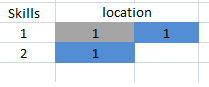
I am loading below data from an excel.
Name Skills Location
A 1 xx
B 2 yy
C 1 yy
Now my bar chart should show like below:
Can you please help me how to do this. I have successfully loaded the data from excel into qlikview.
Thanks
- Tags:
- bar
- new_to_qlikview
Accepted Solutions
- Mark as New
- Bookmark
- Subscribe
- Mute
- Subscribe to RSS Feed
- Permalink
- Report Inappropriate Content
Hi,
You need to use two dimension, first is skill and then Name
Write your expression and use style as stacked.
- Mark as New
- Bookmark
- Subscribe
- Mute
- Subscribe to RSS Feed
- Permalink
- Report Inappropriate Content
Hi,
You need to use two dimension, first is skill and then Name
Write your expression and use style as stacked.
- Mark as New
- Bookmark
- Subscribe
- Mute
- Subscribe to RSS Feed
- Permalink
- Report Inappropriate Content
Create Bar chart
1.Use Dimensions Skill and Name
2.Create Expression Count(Location)
3.Bar Chart Style : Orientation Landscape and Subtype : Stacked
- Mark as New
- Bookmark
- Subscribe
- Mute
- Subscribe to RSS Feed
- Permalink
- Report Inappropriate Content
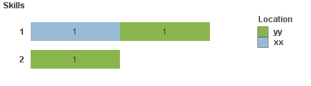
Hey Sayantan Dutta
I hope this solves your problem.
Here you can use Skills in the dimension and do 'count(Location)' in the expression of a bar chart.@Sayantan Dutta
PFA the example qvw as well.
Thanks
Ganesh
- Mark as New
- Bookmark
- Subscribe
- Mute
- Subscribe to RSS Feed
- Permalink
- Report Inappropriate Content
Hi,
try with this.
Regards.
- Mark as New
- Bookmark
- Subscribe
- Mute
- Subscribe to RSS Feed
- Permalink
- Report Inappropriate Content
Maybe like this
- Mark as New
- Bookmark
- Subscribe
- Mute
- Subscribe to RSS Feed
- Permalink
- Report Inappropriate Content
Hi Sayantan,
Simple example attached
HTH - Andy
- Mark as New
- Bookmark
- Subscribe
- Mute
- Subscribe to RSS Feed
- Permalink
- Report Inappropriate Content
Sorry, this.
Best regards.
- Mark as New
- Bookmark
- Subscribe
- Mute
- Subscribe to RSS Feed
- Permalink
- Report Inappropriate Content
Hi, Sayantan,
see the below picture:
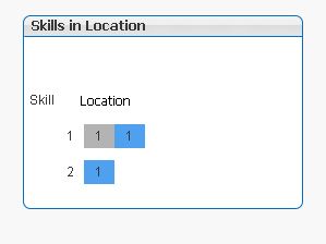
This is done with a stacked bar chart in QlikView.
In the dimension tab enter Skills and then Location as dimensions.
In the expression tab enter one expression: Count(Skills). Please mark the check box 'Values on Data Points' and enter
your expressen label. I used 'Skills in Location'.
In the style tab mark the horizontal bars and mark 'Stacked'.
In the presentation tab mark the check box 'Plot Values Inside Segments' and uncheck the 'Show Legend' check box.
Add a text in chart named 'Location'- you certainly have to arrange this text with ctrl+shift in the chart to get it aligned with the dimension label 'Skill', later.
At last go to the axis tab and mark the 'Hide Axis' check box.
That's all.
Happy qliking
Burkhard