Unlock a world of possibilities! Login now and discover the exclusive benefits awaiting you.
- Qlik Community
- :
- All Forums
- :
- QlikView App Dev
- :
- Re: What am I doing wrong here
- Subscribe to RSS Feed
- Mark Topic as New
- Mark Topic as Read
- Float this Topic for Current User
- Bookmark
- Subscribe
- Mute
- Printer Friendly Page
- Mark as New
- Bookmark
- Subscribe
- Mute
- Subscribe to RSS Feed
- Permalink
- Report Inappropriate Content
What am I doing wrong here
I have attached an app where I have tried to create a bubble chart similar to what hic has beautifully illustrated here Creating a Scatter Chart but I have failed so far.
below are the requirements
X-axis - Time (I have aggregated time stamps)
Y-axis - Count(TRANSACTION_DATE)
size of bubble - to be determined by sum(Revenue)
and I want to see all these by Regions.
Issue: I tried to put Count(TRANSACTION_DATE) in the Y axis, but just could not. Y axis is always taken by Region.
Count of Transaction_date is the frequency of transaction and I want to measure that in the Y axis. how to make that possible.
- Mark as New
- Bookmark
- Subscribe
- Mute
- Subscribe to RSS Feed
- Permalink
- Report Inappropriate Content
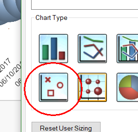
You have chosen "Grid chart" instead of Scatter chart.
HIC
- Mark as New
- Bookmark
- Subscribe
- Mute
- Subscribe to RSS Feed
- Permalink
- Report Inappropriate Content
Thank you Henric. I am making improvements.
After changing the chart type to grid chart, i checked advanced mode box and it allowed me to include 3 expressions:
1) this is my x axis where i want to see time (time stamp aggregated to day- level). but it is not understanding my expression (which is correct) that aggregates. its not letting simple transaction_date in the x-axis either. its counting transaction_date which is supposed to happen only in the 2nd expression
2) count(transaction_date): i intend to treat this expn. as Y-axis which is working well
3) sum(revenue): this is supposed to determine the bubble size, which is as expected.
one last issue: the bubbles are connected with a straight line as well. how to get rid of that.