Unlock a world of possibilities! Login now and discover the exclusive benefits awaiting you.
- Qlik Community
- :
- All Forums
- :
- QlikView App Dev
- :
- re: labels on the axis of a forecast?
- Subscribe to RSS Feed
- Mark Topic as New
- Mark Topic as Read
- Float this Topic for Current User
- Bookmark
- Subscribe
- Mute
- Printer Friendly Page
- Mark as New
- Bookmark
- Subscribe
- Mute
- Subscribe to RSS Feed
- Permalink
- Report Inappropriate Content
re: labels on the axis of a forecast?
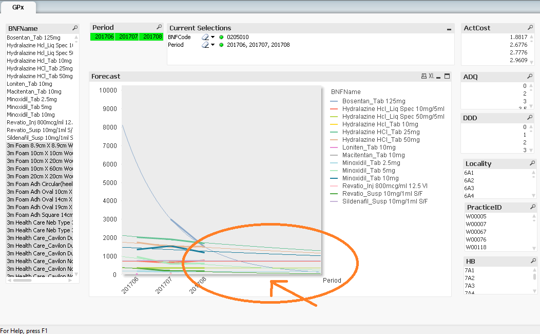
I've added a forecast value of three on the axis tab of chart properties:
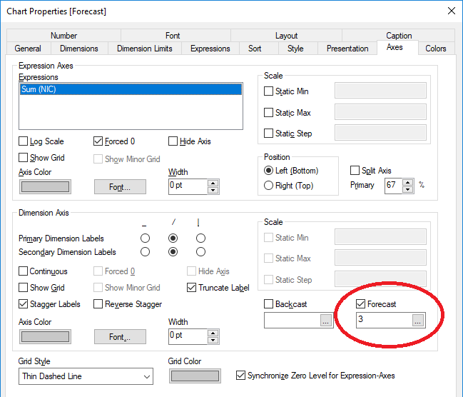
and was wondering if there is any way to get some labels on the x-axis after the dates eg: forecastdate1, forecastdate2 etc..
Accepted Solutions
- Mark as New
- Bookmark
- Subscribe
- Mute
- Subscribe to RSS Feed
- Permalink
- Report Inappropriate Content
There's no inherent way, but there's a workaround you can try and use.
Under "Presentation", add reference text. Enter a formula for the next period (in your case, it would probably be Max(Period)+100). Format it as desired. Using CTRL+SHIFT, drag it to the right side and place it where the label would normally go. Repeat the process for the number of forecast periods you plan to enable.
- Mark as New
- Bookmark
- Subscribe
- Mute
- Subscribe to RSS Feed
- Permalink
- Report Inappropriate Content
There is no way, But we can add using Island table that necessary to use from reference of island field and which occurs to forecast using Linest_M and Linest_B ..
- Mark as New
- Bookmark
- Subscribe
- Mute
- Subscribe to RSS Feed
- Permalink
- Report Inappropriate Content
Do you have an example?
- Mark as New
- Bookmark
- Subscribe
- Mute
- Subscribe to RSS Feed
- Permalink
- Report Inappropriate Content
There's no inherent way, but there's a workaround you can try and use.
Under "Presentation", add reference text. Enter a formula for the next period (in your case, it would probably be Max(Period)+100). Format it as desired. Using CTRL+SHIFT, drag it to the right side and place it where the label would normally go. Repeat the process for the number of forecast periods you plan to enable.
- Mark as New
- Bookmark
- Subscribe
- Mute
- Subscribe to RSS Feed
- Permalink
- Report Inappropriate Content
I see! Label dragging. Crude workaround. Thanks! 

- Mark as New
- Bookmark
- Subscribe
- Mute
- Subscribe to RSS Feed
- Permalink
- Report Inappropriate Content
Please attach you application to investigate. And make sure to add inline to reload an Island table.
And, As work around requested - Try to use "Text in Chart" option from presentation tab of each line if report got constant.
- Mark as New
- Bookmark
- Subscribe
- Mute
- Subscribe to RSS Feed
- Permalink
- Report Inappropriate Content
As per thread. Text in the chart works to my satisfaction. All done now. Thanks everyone! 
- Mark as New
- Bookmark
- Subscribe
- Mute
- Subscribe to RSS Feed
- Permalink
- Report Inappropriate Content
I even wonder, How Customer satisfy this review because It may change some where in filter and it compulsi to compute each. And here not sure how they know which is forecast and which is normal data set. Are you going to change any text color? If so, That could be make sense.
- Mark as New
- Bookmark
- Subscribe
- Mute
- Subscribe to RSS Feed
- Permalink
- Report Inappropriate Content
That is a good point about the line colour. They will know because the verbal commentary will state from which month the forecast begins... 