Unlock a world of possibilities! Login now and discover the exclusive benefits awaiting you.
- Qlik Community
- :
- All Forums
- :
- QlikView App Dev
- :
- Accumulation in chart beyond boundaries
- Subscribe to RSS Feed
- Mark Topic as New
- Mark Topic as Read
- Float this Topic for Current User
- Bookmark
- Subscribe
- Mute
- Printer Friendly Page
- Mark as New
- Bookmark
- Subscribe
- Mute
- Subscribe to RSS Feed
- Permalink
- Report Inappropriate Content
Accumulation in chart beyond boundaries
Hi!
I'm writting because I have a simple problem which couldn't solve yet.
I have the following table:

As you can see, the fields are year, month, day, date (which summarizes the former 3 fields in date format) and sales.
There is a row for each day from 1 june 2015 to 31 august 2015, and in each row the value of Sales field is 10.
Mi goal is to show a line chart where when filtering by year and month, the chart would show the days of that month in the X axis and for each date the sales of the last 60 days until that day in the Y axis (for example, in 20 august in X axis it should show 600 sales because 600 is the number of sales from 20 of june to 20 of august).
Because there are 10 sales each day, the chart should show an horizontal line with 600 as Y axis value, however, the result I get is quite different:
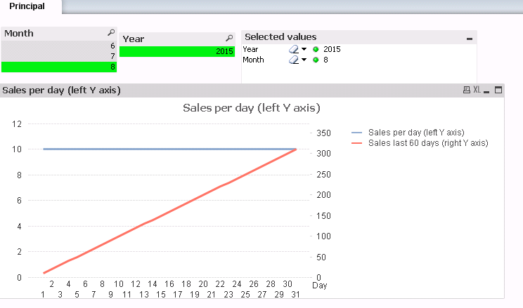
The expression I'm using to get the sales from last 60 days is the following (note that I'm using Sum(Sales) with 60 steps of accumulation):

Obviously, the result I get (a line from 0 to 300 sales) is not the expected result (an horizontal line fixed at 600 sales).
What I need is a solution, no matter if using SET ANALYSIS, ACCUMULATION or whatever in order to reach my goal.
If there is any doubt, please do not hessitate in asking for further information.
I've attached the files Sales.qvw and Sales.xlsx (both files should be in the same folder in order to load the data from the xlsx to the qvw).
Thanks in advance!
Matias