Unlock a world of possibilities! Login now and discover the exclusive benefits awaiting you.
- Qlik Community
- :
- All Forums
- :
- QlikView App Dev
- :
- Aggr Count distint
- Subscribe to RSS Feed
- Mark Topic as New
- Mark Topic as Read
- Float this Topic for Current User
- Bookmark
- Subscribe
- Mute
- Printer Friendly Page
- Mark as New
- Bookmark
- Subscribe
- Mute
- Subscribe to RSS Feed
- Permalink
- Report Inappropriate Content
Aggr Count distint
Hi guys,
I have to get an aggregate count distinct over time.
I wrote this expression:
rangesum(above(sum({<Month={'<=$(=max(Month))'}>}aggr(distinct count({<Month={'<=$(=max(Month))'}>} distinct [Goods Supplier]),[Goods Supplier])),0,RowNo()))
It works very well on my local pc (even with web view on), but it is totally messed up when published on the access point (see attached screen...this is not the shape I see on my pc).
This is a really mind blowing problem to me...I thought it was an object bug, but is seems not to be the case.
Any idea/suggestion on that?
Many thanks.
Matteo
- « Previous Replies
-
- 1
- 2
- Next Replies »
- Mark as New
- Bookmark
- Subscribe
- Mute
- Subscribe to RSS Feed
- Permalink
- Report Inappropriate Content
What is wrong in the image? Can you point out?
- Mark as New
- Bookmark
- Subscribe
- Mute
- Subscribe to RSS Feed
- Permalink
- Report Inappropriate Content
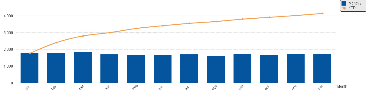
The problem is that this can't be right (see Jan, the aggr dist is the Orange line and it should equals to the monthly value).
- Mark as New
- Bookmark
- Subscribe
- Mute
- Subscribe to RSS Feed
- Permalink
- Report Inappropriate Content
I sort of understand what you mean, but not really sure what might be going on.... May be someone else might have a better idea
- Mark as New
- Bookmark
- Subscribe
- Mute
- Subscribe to RSS Feed
- Permalink
- Report Inappropriate Content
Hope so...the biggest problem is that the chart is fine on local, while it changes significantly when published. I am not able to figure out why this happens
- Mark as New
- Bookmark
- Subscribe
- Mute
- Subscribe to RSS Feed
- Permalink
- Report Inappropriate Content
How looks the expression for the bars and how looked it on your local machine?
- marcus
- Mark as New
- Bookmark
- Subscribe
- Mute
- Subscribe to RSS Feed
- Permalink
- Report Inappropriate Content
Hi Marcus,
please find attached a snapshot.
- Mark as New
- Bookmark
- Subscribe
- Mute
- Subscribe to RSS Feed
- Permalink
- Report Inappropriate Content
Does it change on the Accesspoint without reloading the data? If you reload, do you use the exact same data sources and environmental settings?
I assume your records that define relation between supplier and month come in differently (in different order) in both settings.
I would suggest that you use a different, more robuts approach for your distinct count, try an AsOf table approach:
- Mark as New
- Bookmark
- Subscribe
- Mute
- Subscribe to RSS Feed
- Permalink
- Report Inappropriate Content
Hi Stefan,
data sources are the same and,as far as I know , enviromental settings as well.
I actually noticed that also activating the web view the chart changes slightly shape.
- Mark as New
- Bookmark
- Subscribe
- Mute
- Subscribe to RSS Feed
- Permalink
- Report Inappropriate Content
If you create a straight table with same dimension and same expressions, do these values change when you do what you've done before?
- « Previous Replies
-
- 1
- 2
- Next Replies »