Unlock a world of possibilities! Login now and discover the exclusive benefits awaiting you.
- Qlik Community
- :
- All Forums
- :
- QlikView App Dev
- :
- Applying Appropriate Filters when Selecting in a C...
- Subscribe to RSS Feed
- Mark Topic as New
- Mark Topic as Read
- Float this Topic for Current User
- Bookmark
- Subscribe
- Mute
- Printer Friendly Page
- Mark as New
- Bookmark
- Subscribe
- Mute
- Subscribe to RSS Feed
- Permalink
- Report Inappropriate Content
Applying Appropriate Filters when Selecting in a Chart
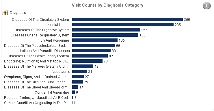
I have a horizontal bar chart in my application that counts visits by a diagnosis drill-down dimension. My application brings in 2 years of data, but my chart is using set analysis to limit the counts to a particular service type and the most recent year. sum({<Event_ServiceCat={5},Event_CurrentFlag={1}>} Event_Counter)
When a user highlights the top Diagnosis category the app is only applying the Diagnosis filter, but is ignoring the Event_ServiceCat and Event_CurrentFlag restrictions. So the data is showing more data than the users would expect. I tried adding Event_CurrentFlag and Event_ServiceCat as Dimensions, but that didn't seem to change anything when selecting the data.
Any help is greatly appreciated!
- Mark as New
- Bookmark
- Subscribe
- Mute
- Subscribe to RSS Feed
- Permalink
- Report Inappropriate Content
I'm afraid I don't understand what you mean. If the expression explicitly selects Even_ServiceCat and Even_CurrentFlag values like your expression then those will be applied regardless of what you do or don't select in Diagnosis. Can you explain in more detail what you are doing and what you expect? A small qlikview document that demonstrates the problem would help.
talk is cheap, supply exceeds demand
- Mark as New
- Bookmark
- Subscribe
- Mute
- Subscribe to RSS Feed
- Permalink
- Report Inappropriate Content
I assume you are referring to other charts / measures than the shown bar chart when you are saying 'So the data is showing more data than the users would expect.', right? So you want QV to apply the filters from the chart to the current selection state? But only when the user selects in that chart?
Is this what you are expecting?
- Mark as New
- Bookmark
- Subscribe
- Mute
- Subscribe to RSS Feed
- Permalink
- Report Inappropriate Content
When a user selects a bar in the graph associated, the data gets filtered to the Diagnosis data. The chart shows one type of service (Event_ServiceCat = 5) and current year (Event_CurrentFlag = 1) only. So when they filter, they get a drilldown into the 256 cases. However, our reports will show for example 1000 patients, because the filter is only selecting the Diagnosis. So they in other places they are seeing ALL services and the full 2 years of data.
What I want to code, is when they select on the graph that the selections become Diagnosis = 'Circulatory', Event_ServiceCat =5 and Event_CurrentFlag = 1. This will ensure that the list of patients will be <= the 256 visits that the user thinks they have selected.
- Mark as New
- Bookmark
- Subscribe
- Mute
- Subscribe to RSS Feed
- Permalink
- Report Inappropriate Content
Yes that is correct!
- Mark as New
- Bookmark
- Subscribe
- Mute
- Subscribe to RSS Feed
- Permalink
- Report Inappropriate Content
Well, the other charts have no knowledge of the filters you hard-code in your expressions. So you'll either have to hard-code them in the expressions in the other charts too or let users select them for all charts.
You could create expressions that check the number of selections in the Diagnosis field and then use either an expression with the hard-coded selections or the expression without.
It's probably easiest to copy the current chart expressions and change the copy to include the hard-coded selections. You can then enable then Conditional option for both expressions and use =If(GetSelectedCount(Diagnosis)=1,1,0) for one expression and =If(GetSelectedCount(Diagnosis)=1,0,1) for the other. That way only one of the two will be shown depending on the selection in the Diagnosis field.
talk is cheap, supply exceeds demand
- Mark as New
- Bookmark
- Subscribe
- Mute
- Subscribe to RSS Feed
- Permalink
- Report Inappropriate Content
As you probably know, a selection in a chart is actually selecting dimension values, not expression values, so you are not selecting the 245 visits and the related data, but only the single dimension value Diagnosis Category.
You could consider using an action triggered by your dimension selection to select in the two other fields.
This might get pretty messy when there are other possibilites (list boxes / charts) to make selections in Diagnosis.
[you could get around this using a field that is a copy of Diagnosis and only used in that chart].
But all this might confuse the user as well. Maybe it's just enough to make it clear what your chart actually is showing (like 'Current year Type 5 Visit Counts by Diagnosis Category').
- Mark as New
- Bookmark
- Subscribe
- Mute
- Subscribe to RSS Feed
- Permalink
- Report Inappropriate Content
Right, so I was trying to add the Event_ServiceCat and Event_CurrentFlag to the dimensions, thinking that would apply the selections. But leaving the restrictions in the set analysis seems to nullify the selection in those dimensions.
I was playing around with the triggers, but as you mentioned it would get very messy jumping to other reports with the Event_ServiceCat selection would actually not be correct.
- Mark as New
- Bookmark
- Subscribe
- Mute
- Subscribe to RSS Feed
- Permalink
- Report Inappropriate Content
Well, how have you tried to add these field to your dimensions in your bar chart?
- Mark as New
- Bookmark
- Subscribe
- Mute
- Subscribe to RSS Feed
- Permalink
- Report Inappropriate Content
Adding the following additional fields to my dimensions:
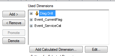
Selecting the first row in the chart, now applies the Diagnosis and ServiceCat filters, but does no include the CurrentFlag one. Not sure why that is the case.