Unlock a world of possibilities! Login now and discover the exclusive benefits awaiting you.
- Qlik Community
- :
- All Forums
- :
- QlikView App Dev
- :
- Bar Graph "stacked"
- Subscribe to RSS Feed
- Mark Topic as New
- Mark Topic as Read
- Float this Topic for Current User
- Bookmark
- Subscribe
- Mute
- Printer Friendly Page
- Mark as New
- Bookmark
- Subscribe
- Mute
- Subscribe to RSS Feed
- Permalink
- Report Inappropriate Content
Bar Graph "stacked"
Hi everybody!
Sorry for my bad english but i have one question, i hope i can describe it correctly! 😉
In our ERP System we have a Projektmanagement tool.
People can create different Performance Type (names) and later they can describe their performance in the erp System and the time for this performance.
For Example one Person works a mont 120 hours and has 5 different performance types this month
I want to create a stacked bar graph with the performance types the name in the database is "lme_art" there are all created performance types in this column.
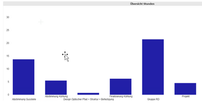
with the dimension "lme_art" and the formular "sum(lme(hours)" i can not create a bar graph with the different types
i got this:
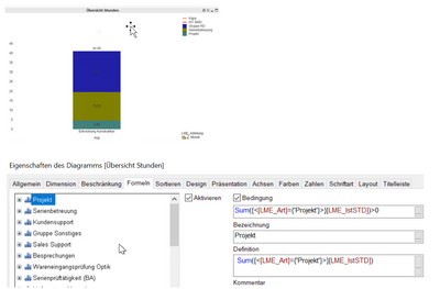
then i tryed the version below it Works BUT i have to write a formula for every performance type. If anybody makes a new one in the erp system and i forgot it in the formula, we can't see it in the report!
You can see in the first graph i have five types, in the second where i dont typte the formulas manually (i forgot it) are ony three!
Does anybody have an idea how i can solve this problem?
I have a stacked bar graph
Accepted Solutions
- Mark as New
- Bookmark
- Subscribe
- Mute
- Subscribe to RSS Feed
- Permalink
- Report Inappropriate Content
HI,
I guess what you have now is, only one dimension and multiple expressions and those are stacked together.
If this is true the, change it as below.
Have 2 dimension and only 1 measure and then have a stack bar chart.
This will save you when the type name changes, you wont need any change in chart. it will automatically take the changes.
- Mark as New
- Bookmark
- Subscribe
- Mute
- Subscribe to RSS Feed
- Permalink
- Report Inappropriate Content
if you want the bar stacked with a line, you need to move the 2nd dimension to the expressions. see the youtube vid how its done:
https://www.youtube.com/watch?v=5RHVcdw9oYA
- Mark as New
- Bookmark
- Subscribe
- Mute
- Subscribe to RSS Feed
- Permalink
- Report Inappropriate Content
HI,
I guess what you have now is, only one dimension and multiple expressions and those are stacked together.
If this is true the, change it as below.
Have 2 dimension and only 1 measure and then have a stack bar chart.
This will save you when the type name changes, you wont need any change in chart. it will automatically take the changes.
- Mark as New
- Bookmark
- Subscribe
- Mute
- Subscribe to RSS Feed
- Permalink
- Report Inappropriate Content
Thank you very much! This works!
Now i have a question again and i think thats a big problem! 😉
In this stacked bar graph i also want to have a line graph AND if i take two dimensions in the combined "stacked bar + line graph" i got a normal bar graph (not stacked) again thats the reason because i solved it like in picture two.
For explantation why i ned this combinded graph. in the stacked bar graph we can see the hours of projekt types for the employee. then whe have a second system in the company the time recording system. the employee beginns at 08:00 and ends his work at 14:00 so his recorded time is 6 hours in the time recording database. For example at this day he works 5 hours and 30 Minutes at 2 projekt types and he writes the time in the database. No we will see the difference between recording time and projekt work time.
I hope i explained it correctly! 😉
- Mark as New
- Bookmark
- Subscribe
- Mute
- Subscribe to RSS Feed
- Permalink
- Report Inappropriate Content
@kaushiknsolanki Any chance you can circle back on this one and have a look at the subsequent post, if you let me know after, I can circle back and mark your first post as the solution to close the thread, thanks in advance.
Regards,
Brett
I now work a compressed schedule, Tuesday, Wednesday and Thursday, so those will be the days I will reply to any follow-up posts.
- Mark as New
- Bookmark
- Subscribe
- Mute
- Subscribe to RSS Feed
- Permalink
- Report Inappropriate Content
if you want the bar stacked with a line, you need to move the 2nd dimension to the expressions. see the youtube vid how its done:
https://www.youtube.com/watch?v=5RHVcdw9oYA
- Mark as New
- Bookmark
- Subscribe
- Mute
- Subscribe to RSS Feed
- Permalink
- Report Inappropriate Content
Thanks @Brett_Bleess.
My view is, it is not possible to have the dynamic stack bar along with Line chart.
If you need stack bar then you need to hard code the values as shown in the video shared by @edwin
- Mark as New
- Bookmark
- Subscribe
- Mute
- Subscribe to RSS Feed
- Permalink
- Report Inappropriate Content
i would say use with caution and it may still be 100% dynamic given the right scenario - if the 2nd dimension is finite and defined - that is actually the condition for this chart anyways since you dont want to stack a hundred diff values...
you can then add an if statement in the expression to check if the value for that expression is a possible value. that will allow it to be a 100% dynamic chart. not elegant i admit but there are indeed cases where QV does have limitations and you have to stretch it a little to get what you need.
this i believe is the best solution short of creating an extension (which for this case is actually a simple extension)

