Unlock a world of possibilities! Login now and discover the exclusive benefits awaiting you.
- Qlik Community
- :
- All Forums
- :
- QlikView App Dev
- :
- Bar chart above and below zero values
- Subscribe to RSS Feed
- Mark Topic as New
- Mark Topic as Read
- Float this Topic for Current User
- Bookmark
- Subscribe
- Mute
- Printer Friendly Page
- Mark as New
- Bookmark
- Subscribe
- Mute
- Subscribe to RSS Feed
- Permalink
- Report Inappropriate Content
Bar chart above and below zero values
Can anyone help me to create a bar chart that would show positive and negative values for a category in one bar (or at least make it appear like one bar) above and below the 0 axis? I'm trying to show gains and losses by category.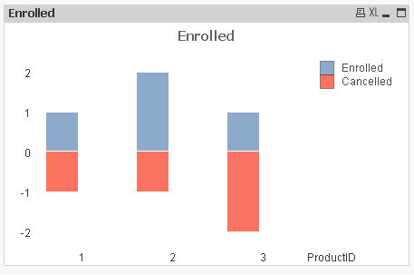
Above is a screen shot of what i want it to look like and I've attached a sample doc with data and the chart as close as i can get it.
Accepted Solutions
- Mark as New
- Bookmark
- Subscribe
- Mute
- Subscribe to RSS Feed
- Permalink
- Report Inappropriate Content
Hi,
Try like this
Dimension : ProductID
Expressions:
Enrolled : =Sum(Enrolled)
Cancelled: =Sum(Cancelled)*-1
Now Chart Properties-> Style-> Select subtype as Stacked
Hope this helps you.
Regards,
Jagan.
- Mark as New
- Bookmark
- Subscribe
- Mute
- Subscribe to RSS Feed
- Permalink
- Report Inappropriate Content
See attached,
is this what you are trying, your requirement wasn't much clear.
Cheers
- Mark as New
- Bookmark
- Subscribe
- Mute
- Subscribe to RSS Feed
- Permalink
- Report Inappropriate Content
Perfect! The 'stacked' property is what i was overlooking. Thanks!