Unlock a world of possibilities! Login now and discover the exclusive benefits awaiting you.
- Qlik Community
- :
- All Forums
- :
- QlikView App Dev
- :
- Barcode Width Control (Using an Expression)
- Subscribe to RSS Feed
- Mark Topic as New
- Mark Topic as Read
- Float this Topic for Current User
- Bookmark
- Subscribe
- Mute
- Printer Friendly Page
- Mark as New
- Bookmark
- Subscribe
- Mute
- Subscribe to RSS Feed
- Permalink
- Report Inappropriate Content
Barcode Width Control (Using an Expression)
Is it possible to control the width of the bars in a bar-chart using and expression (like with background color)?
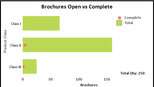
I have a stacked bar chart showing Completed vs Total. I'd like for the Completed bar to be more narrow than the Completed bar.
Haven't found anything that describes how yet.
Thanks
- Mark as New
- Bookmark
- Subscribe
- Mute
- Subscribe to RSS Feed
- Permalink
- Report Inappropriate Content
Hello Jeff,
As far as I know, you cannot dynamically change the width of bars in a bar chart.
If I'm understanding your issue though, you could try layering 2 bar charts on top of each other, with one chart, the top chart, showing Completed, and the bottom chart showing total. You could change the width of the Completed bars to be skinnier, and also make the chart transparent. This will give the end user the illusion that it is one chart, when in fact it is two.
- Mark as New
- Bookmark
- Subscribe
- Mute
- Subscribe to RSS Feed
- Permalink
- Report Inappropriate Content
I though of that. However my dimension (Class) has some lines of data where there is no data. See attached.
Until I have data for each class, the columns won't line up.
Can I create a placeholder to fill in the Class I dimension until data is there?
Thanks
- Mark as New
- Bookmark
- Subscribe
- Mute
- Subscribe to RSS Feed
- Permalink
- Report Inappropriate Content
You absolutely can. In your expression, or the script if you can, say if(isnull(sum([Brochures.RA Appprove Complete])),0,sum([Brochures.RA Appprove Complete])). This will put a 0 wherever there are no values.
Make sure you just uncheck "Supress Zero-Values" under the presentation tab.
EDIT: You'll also have to edit the Static Max in the top chart so that the numbers will line up. You can use =max(aggr(sum([Brochures.Total Qty Required]),Brochures.Class)) to make the max on the X axis the largest amount of your "Total Qty Required" expression.
- Mark as New
- Bookmark
- Subscribe
- Mute
- Subscribe to RSS Feed
- Permalink
- Report Inappropriate Content
Have you considered using a Combo chart instead and plotting complete as a Symbol?
-Rob
- Mark as New
- Bookmark
- Subscribe
- Mute
- Subscribe to RSS Feed
- Permalink
- Report Inappropriate Content
Hey Rob:
I'm not very familiar with setting up the combo chart. Can you provide some instruction?
Thanks
Jeff
- Mark as New
- Bookmark
- Subscribe
- Mute
- Subscribe to RSS Feed
- Permalink
- Report Inappropriate Content
1. Select the Combo Chart as the chart type on the general tab.
2. On the expressions tab, you can select display representation: Bar, Symbol or Line -- for each expression,
3. You can increase the symbol size on the presentation tab.
I've updated your example here attached. BTW, there was a bad entry for "Bar Offset" in the Total expression that was making things wonky.
-Rob