Unlock a world of possibilities! Login now and discover the exclusive benefits awaiting you.
- Qlik Community
- :
- All Forums
- :
- QlikView App Dev
- :
- Re: Before and After Realease Date Sale
- Subscribe to RSS Feed
- Mark Topic as New
- Mark Topic as Read
- Float this Topic for Current User
- Bookmark
- Subscribe
- Mute
- Printer Friendly Page
- Mark as New
- Bookmark
- Subscribe
- Mute
- Subscribe to RSS Feed
- Permalink
- Report Inappropriate Content
Before and After Realease Date Sale
Hello, I have the phone sales tables below, I am trying to plot the Before and after release date Sales$ and Counts. The idea is to see how many/much phones we sold on preorder before it was releases and how many/much after the release date
what is the best visual chart to plot this requirement and any suggestion with the sample below will be appreciated.
TableA
| type | saledate | qty | amount |
| x1 | 15/03/2017 | 5 | 50000 |
| x1 | 16/03/2017 | 10 | 100000 |
| x1 | 17/03/2017 | 30 | 30000 |
| x1 | 18/03/2017 | 12 | 120000 |
| x1 | 19/03/2017 | 5 | 5000 |
| x1 | 20/03/2017 | 5 | 5000 |
| x1 | 21/03/2017 | 8 | 8000 |
| x2 | 15/03/2017 | 23 | 23000 |
| x2 | 16/03/2017 | 32 | 32000 |
| x2 | 17/03/2017 | 40 | 40000 |
| x2 | 18/03/2017 | 20 | 20000 |
| x2 | 19/03/2017 | 90 | 90000 |
| x2 | 20/03/2017 | 70 | 70000 |
| x2 | 21/03/2017 | 70 | 70000 |
| x3 | 15/03/2017 | 5 | 5000 |
| x3 | 16/03/2017 | 10 | 10000 |
| x3 | 17/03/2017 | 12 | 12000 |
| x3 | 18/03/2017 | 50 | 50000 |
| x3 | 19/03/2017 | 80 | 80000 |
| x3 | 20/03/2017 | 100 | 100000 |
| x3 | 21/03/2017 | 150 | 150000 |
TableB
| Type | releasedate |
| x1 | 19/03/2017 |
| x2 | 15/03/2017 |
| x3 | 18/03/2017 |
I have attached the excel file as well.
Thanks
- Mark as New
- Bookmark
- Subscribe
- Mute
- Subscribe to RSS Feed
- Permalink
- Report Inappropriate Content
for compare you can use bar chart
you can do it many ways
one of possible way is
Load * from 1st_table:
Left Join
Load * from 2nd_table
then in front end
take bar chart > take type as dimension
and expression >
1:Before: sum(if(sales_date<release_date,qty))
2:After: sum(if(sales_date>release_date,qty))
3:OnReleasedate sum(if(sales_date=release_date,qty))
Note : you can move expression logic in script also.
Regards,
Please appreciate our Qlik community members by giving Kudos for sharing their time for your query. If your query is answered, please mark the topic as resolved 🙂
- Mark as New
- Bookmark
- Subscribe
- Mute
- Subscribe to RSS Feed
- Permalink
- Report Inappropriate Content
Thanks Prashant, you idea will work as a stacked bar chat But am looking for something visually strong though like a bubble chart with a reference line (release date) and Before and after on each side with the
bubble size the count.
I will see what others think before I settle for the bar chart.
- Mark as New
- Bookmark
- Subscribe
- Mute
- Subscribe to RSS Feed
- Permalink
- Report Inappropriate Content
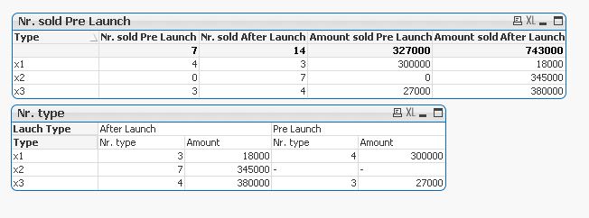
I don't think bubble chart will be suitable here, if it is you can draw the representation you need, we will try to do it
Data:
LOAD type as Type,
saledate,
qty,
amount
FROM
[phones test.xlsx]
(ooxml, embedded labels, table is Sheet1);
Left Join(Data)
LOAD
Type,
releasedate
FROM
[phones test.xlsx]
(ooxml, embedded labels, table is Sheet1);
New:
NoConcatenate
LOAD *,
if(saledate<releasedate,'Pre Launch','After Launch') as Launch_Flag
Resident Data;
DROP Table Data;
- Mark as New
- Bookmark
- Subscribe
- Mute
- Subscribe to RSS Feed
- Permalink
- Report Inappropriate Content
Well you can show it 3 different bar.
Or
You can use gauge chart also. crate 2 different gauge for each expression.
see qlik demos for more ideas.
Regards,
Please appreciate our Qlik community members by giving Kudos for sharing their time for your query. If your query is answered, please mark the topic as resolved 🙂
- Mark as New
- Bookmark
- Subscribe
- Mute
- Subscribe to RSS Feed
- Permalink
- Report Inappropriate Content
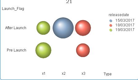
or will this work for you?
- Mark as New
- Bookmark
- Subscribe
- Mute
- Subscribe to RSS Feed
- Permalink
- Report Inappropriate Content
Thanks Kushal, I will play further with the bubble and the gauge chart.
- Mark as New
- Bookmark
- Subscribe
- Mute
- Subscribe to RSS Feed
- Permalink
- Report Inappropriate Content
Hi Didier,
Maybe:
Release:
Mapping
LOAD
Type,
releasedate
FROM
[phones test.xlsx]
(ooxml, embedded labels, table is Sheet1) Where Len(Trim(releasedate)) > 0;
Sales:
LOAD
type,
saledate,
ApplyMap('Release',type) as releasedate,
saledate - ApplyMap('Release',type) as DaysSinceRelease,
qty,
amount
FROM
[phones test.xlsx]
(ooxml, embedded labels, table is Sheet1);
Then:
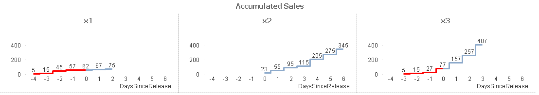
Trellis Line chart with dimensions type and DaysSinceRelease.
Expression:
Rangesum(Above(sum(qty),0,RowNo()))
with Background colour =if(DaysSinceRelease <0,LightRed())
Plateau line style.
Cheers
Andrew