Unlock a world of possibilities! Login now and discover the exclusive benefits awaiting you.
- Qlik Community
- :
- All Forums
- :
- QlikView App Dev
- :
- Best way to produce Chart
- Subscribe to RSS Feed
- Mark Topic as New
- Mark Topic as Read
- Float this Topic for Current User
- Bookmark
- Subscribe
- Mute
- Printer Friendly Page
- Mark as New
- Bookmark
- Subscribe
- Mute
- Subscribe to RSS Feed
- Permalink
- Report Inappropriate Content
Best way to produce Chart
Hello Guys,
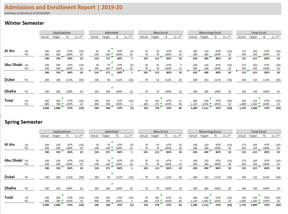
I have a requirement from my director to produce a chart like the below, and send it in a daily email. What is the best way to do so?
We have QLikView and not QlikSense. I know I can make expressions for each text value, but there are going to be too many expressions. If I use a chart or table though, I wouldn't always be able to get the same layout 100%.
What do you think guys? I am intrigued as to what is the best approach for doing the below in an efficient way.
Many thanks in advance. (Note I tried to post this under NP comments but the site won't allow me to do so)
Accepted Solutions
- Mark as New
- Bookmark
- Subscribe
- Mute
- Subscribe to RSS Feed
- Permalink
- Report Inappropriate Content
Not exactly the same, We can achieve using other text objects over lay and the layout of the table since from each column you need same metric by season.
Lines may not possible as expected
between dimension values may not possible like spaces of each
