Unlock a world of possibilities! Login now and discover the exclusive benefits awaiting you.
- Qlik Community
- :
- All Forums
- :
- QlikView App Dev
- :
- Change Axis Representation
- Subscribe to RSS Feed
- Mark Topic as New
- Mark Topic as Read
- Float this Topic for Current User
- Bookmark
- Subscribe
- Mute
- Printer Friendly Page
- Mark as New
- Bookmark
- Subscribe
- Mute
- Subscribe to RSS Feed
- Permalink
- Report Inappropriate Content
Change Axis Representation
Hello All,
I have one tricky requirement to complete in scatter chart where I have X & Y Axis as an expression value which ranges from 0 to 1
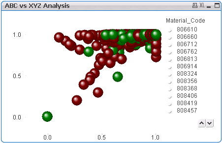
But I need to display the axis representation to ABC on X axis and XYZ on Y Axis respectively.
(Below is output that I need to show.. that I edited in the Paint)

Can it be really possible to do that?
Any suggestions are most welcome 
Regards
Kiran
- Mark as New
- Bookmark
- Subscribe
- Mute
- Subscribe to RSS Feed
- Permalink
- Report Inappropriate Content
Not that easy as the axes are continuous and the axis labels are computed in the chart. Text value don't play well with continuous axis scales. I suggest that you post a sample document for detailed assistance.
Jonathan
- Mark as New
- Bookmark
- Subscribe
- Mute
- Subscribe to RSS Feed
- Permalink
- Report Inappropriate Content
Please find attached QlikView Document.
- Mark as New
- Bookmark
- Subscribe
- Mute
- Subscribe to RSS Feed
- Permalink
- Report Inappropriate Content
Hi
I used reference lines to get this -
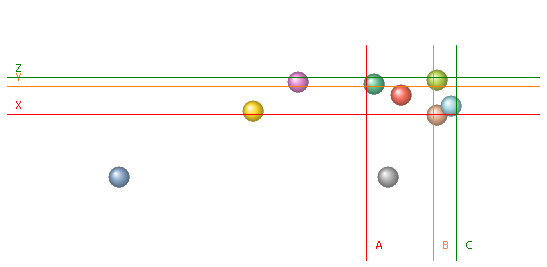
Not exactly what you were after, but hopefully useful.
Jonathan
Sorry - i can't upload the model file due to new data retention policies at my client.
- Mark as New
- Bookmark
- Subscribe
- Mute
- Subscribe to RSS Feed
- Permalink
- Report Inappropriate Content
Hello Jonathan,
It is quite meaningful to represent the chart in this manner.
Thanks for your suggestion.
Although, I am still looking for exact solution whether it is possible to implement the chart as per requirement.
Regards
Kiran