Unlock a world of possibilities! Login now and discover the exclusive benefits awaiting you.
- Qlik Community
- :
- All Forums
- :
- QlikView App Dev
- :
- Chart Axes Labels - Conditional Show
- Subscribe to RSS Feed
- Mark Topic as New
- Mark Topic as Read
- Float this Topic for Current User
- Bookmark
- Subscribe
- Mute
- Printer Friendly Page
- Mark as New
- Bookmark
- Subscribe
- Mute
- Subscribe to RSS Feed
- Permalink
- Report Inappropriate Content
Chart Axes Labels - Conditional Show
Hi All,
I am working on the below chart. The chart dimension is Port, and when I select a single Port all others are greyed out and the % label disappears - the idea being that this will form part of a benchmarking scorecard.
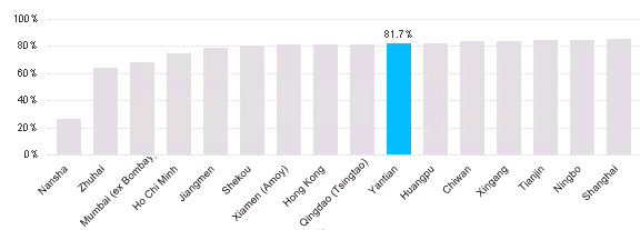
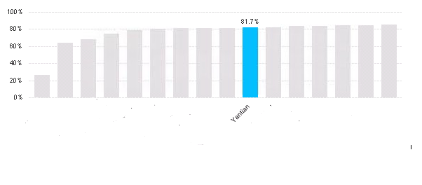
However, I really need to be able to blank out all the other Port names on the axis when a single Port is selected (the idea being to allow benchmarking but maintain confidentiality) - as per the below. Is there a way of doing this? I have tried adding an expression to the axis font, but I have so far not managed to get anything to work.
Any help or advice greatly appreciated!
Accepted Solutions
- Mark as New
- Bookmark
- Subscribe
- Mute
- Subscribe to RSS Feed
- Permalink
- Report Inappropriate Content
The first expression is being used to generate the axis label, and it is achieved by enabling 'Text on Axis' property(expression tab). Text on axis property actaully gets the expression value; hence you need dual() to get the dimension label rather than the value.
The value shown on data point is actually coming from the second expression(without any display option). Check the background/text color logic to hide the other values in the first expression.
- Mark as New
- Bookmark
- Subscribe
- Mute
- Subscribe to RSS Feed
- Permalink
- Report Inappropriate Content
Hi,
managed to get something that might help you. PFA
- Mark as New
- Bookmark
- Subscribe
- Mute
- Subscribe to RSS Feed
- Permalink
- Report Inappropriate Content
Hi ,
Please find the attached QVW
1. Include Your dimension in Set Analysis Expression.
2. Give Conditions in Background Color and Text Color in Expression Tab.
Regards,
Joshmi
- Mark as New
- Bookmark
- Subscribe
- Mute
- Subscribe to RSS Feed
- Permalink
- Report Inappropriate Content
Hi Danielle,
One easy way to do is use set reference, Right click on chart and select set reference
- Mark as New
- Bookmark
- Subscribe
- Mute
- Subscribe to RSS Feed
- Permalink
- Report Inappropriate Content
Hi Tresesco,
Your QWV seems to be doing what I want to achieve, however I can't work out whereabouts the axis labels are being set in your chart? Does my expression need to use the DUAL function?
Any help much appreciated!
- Mark as New
- Bookmark
- Subscribe
- Mute
- Subscribe to RSS Feed
- Permalink
- Report Inappropriate Content
Hi Joshmi,
Thanks for your response, however I don't think this does what I need it to - I have already managed to get the value labels to show conditionally dependant on the selections made, it's the actual axis labels (i.e. the Port names) that I need to be able to restrict.
- Mark as New
- Bookmark
- Subscribe
- Mute
- Subscribe to RSS Feed
- Permalink
- Report Inappropriate Content
Hi Avinash,
I've had a look at set reference and I don't think this will help me on this occasion, as it's the labels I need to restrict, not the bars.
- Mark as New
- Bookmark
- Subscribe
- Mute
- Subscribe to RSS Feed
- Permalink
- Report Inappropriate Content
The first expression is being used to generate the axis label, and it is achieved by enabling 'Text on Axis' property(expression tab). Text on axis property actaully gets the expression value; hence you need dual() to get the dimension label rather than the value.
The value shown on data point is actually coming from the second expression(without any display option). Check the background/text color logic to hide the other values in the first expression.
- Mark as New
- Bookmark
- Subscribe
- Mute
- Subscribe to RSS Feed
- Permalink
- Report Inappropriate Content
Ahah, I understand now!
Thanks so much for your help, works perfectly now!