Unlock a world of possibilities! Login now and discover the exclusive benefits awaiting you.
- Qlik Community
- :
- All Forums
- :
- QlikView App Dev
- :
- Chart: Data labels are over lapping slightly
- Subscribe to RSS Feed
- Mark Topic as New
- Mark Topic as Read
- Float this Topic for Current User
- Bookmark
- Subscribe
- Mute
- Printer Friendly Page
- Mark as New
- Bookmark
- Subscribe
- Mute
- Subscribe to RSS Feed
- Permalink
- Report Inappropriate Content
Chart: Data labels are over lapping slightly
Dear Gurus,
I have below chart in one of the dashboard where numbers for Feb 2014 is over lapping, is there any chance we can move data point, similar to what we can do in Excel?

- Tags:
- charts
Accepted Solutions
- Mark as New
- Bookmark
- Subscribe
- Mute
- Subscribe to RSS Feed
- Permalink
- Report Inappropriate Content
Hi.
The only way you can use add some invisible symbols to move it horizontally.
Set the number format Expression Default.
Modify your expression:
=dual(repeat(chr(255), 10) & value ,value)
- Mark as New
- Bookmark
- Subscribe
- Mute
- Subscribe to RSS Feed
- Permalink
- Report Inappropriate Content
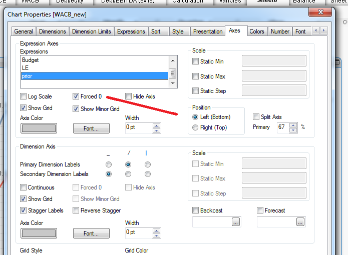
uncheck the Forced Zero checkbox it will show effects as u needed the
above image will help u
- Mark as New
- Bookmark
- Subscribe
- Mute
- Subscribe to RSS Feed
- Permalink
- Report Inappropriate Content
Thanks a lot Whiteline for quiding me in right direction ... in my expression i had ... num(value,'#,##0') .. i just changed to num(value,' #,##0').. it looks better now ...
- Mark as New
- Bookmark
- Subscribe
- Mute
- Subscribe to RSS Feed
- Permalink
- Report Inappropriate Content
Hi.
You can also make the offset various depending on dimension value.
For the top line move them to the left and for the bottom - to the right.
Of course the result depends on the complexity of your data.
I suggest to use sort ranking and odd function.
- Mark as New
- Bookmark
- Subscribe
- Mute
- Subscribe to RSS Feed
- Permalink
- Report Inappropriate Content
Hi,
Thanks for your reply, How can i offset top line move them to the left? ... can you please provide me some example ...