Unlock a world of possibilities! Login now and discover the exclusive benefits awaiting you.
- Qlik Community
- :
- All Forums
- :
- QlikView App Dev
- :
- Chart with accumulative data
- Subscribe to RSS Feed
- Mark Topic as New
- Mark Topic as Read
- Float this Topic for Current User
- Bookmark
- Subscribe
- Mute
- Printer Friendly Page
- Mark as New
- Bookmark
- Subscribe
- Mute
- Subscribe to RSS Feed
- Permalink
- Report Inappropriate Content
Chart with accumulative data
Hello,
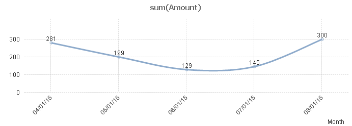
I have a set of data where some amount is represented per month:
04/01/15, 281
05/01/15, 199
06/01/15, 129
07/01/15, 145
08/01/15, 300
I need to create a chart where data point for each month equals sum of all amounts for the last 12 months.
So if the regular line chart looks like this:
I need to create a chart where line looks like this:
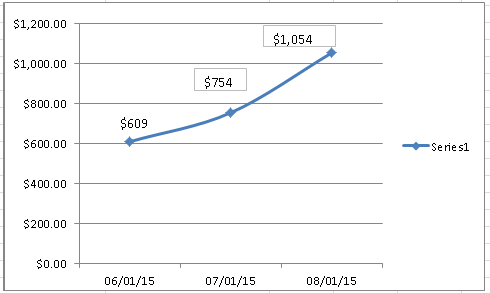
There is a flag that represents 12 months period for each data point (Aug/2015, July/2015, etc) - see attached sample.
But I was not able to produce this chart using existing data structure.
Any suggestions how to do that?
Regards,
Vladimir
Accepted Solutions
- Mark as New
- Bookmark
- Subscribe
- Mute
- Subscribe to RSS Feed
- Permalink
- Report Inappropriate Content
- Mark as New
- Bookmark
- Subscribe
- Mute
- Subscribe to RSS Feed
- Permalink
- Report Inappropriate Content
See attached qvw
talk is cheap, supply exceeds demand
- Mark as New
- Bookmark
- Subscribe
- Mute
- Subscribe to RSS Feed
- Permalink
- Report Inappropriate Content
Gysbert,
Thanks! I've modified it a little bit, but I like the idea.
Appreciate a quick solution.
Have a nice weekend!
Vladimir
- Mark as New
- Bookmark
- Subscribe
- Mute
- Subscribe to RSS Feed
- Permalink
- Report Inappropriate Content
Glad you liked it. Have a nice weekend too!
talk is cheap, supply exceeds demand