Unlock a world of possibilities! Login now and discover the exclusive benefits awaiting you.
- Qlik Community
- :
- All Forums
- :
- QlikView App Dev
- :
- Color gradient bar for heat map (pivot table)
- Subscribe to RSS Feed
- Mark Topic as New
- Mark Topic as Read
- Float this Topic for Current User
- Bookmark
- Subscribe
- Mute
- Printer Friendly Page
- Mark as New
- Bookmark
- Subscribe
- Mute
- Subscribe to RSS Feed
- Permalink
- Report Inappropriate Content
Color gradient bar for heat map (pivot table)
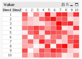
I have a pivot table made as a heat map with colours changing from light to dark with increasing values of the expression. I would like to show a color gradient bar at the bottom of the chart so that the user has an idea of what colour represents what range of values.
How can I go about it?
Thanks.
- Mark as New
- Bookmark
- Subscribe
- Mute
- Subscribe to RSS Feed
- Permalink
- Report Inappropriate Content
How about using a similar Pivot table with no Dimensions, and the definitions of the colors displayed over the same color backgrounds? Or a collection of Text Objects doing the same?
Cheers,
Oleg Troyansky
Upgrade your Qlik skills at the Masters Summit for Qlik - coming soon to Milan, Italy!
- Mark as New
- Bookmark
- Subscribe
- Mute
- Subscribe to RSS Feed
- Permalink
- Report Inappropriate Content
Hi,
one solution could be:

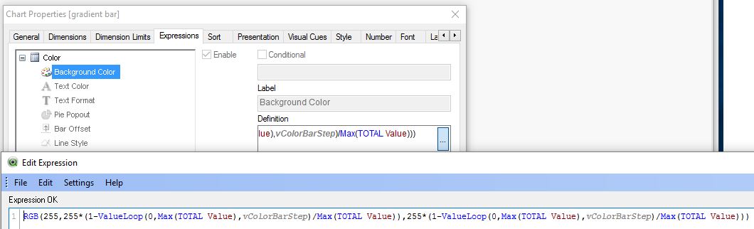
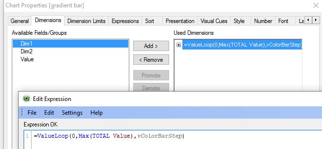
In your real application you could replace Max(Value) with something like Max(Aggr(yourexpression, yourdimension1, yourdimension2))
hope this helps
regards
Marco
- Mark as New
- Bookmark
- Subscribe
- Mute
- Subscribe to RSS Feed
- Permalink
- Report Inappropriate Content
I am trying to do the same thing in Qlik Sense and your example file wouldn't open in it. Could you please share your values in the variable vColorBarStep?