Unlock a world of possibilities! Login now and discover the exclusive benefits awaiting you.
- Qlik Community
- :
- All Forums
- :
- QlikView App Dev
- :
- Combine two fields om X-axe
- Subscribe to RSS Feed
- Mark Topic as New
- Mark Topic as Read
- Float this Topic for Current User
- Bookmark
- Subscribe
- Mute
- Printer Friendly Page
- Mark as New
- Bookmark
- Subscribe
- Mute
- Subscribe to RSS Feed
- Permalink
- Report Inappropriate Content
Combine two fields om X-axe
Dear all,
I have the following question:
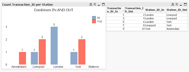
I have a table like this:
| Transaction_ID_In | Transaction_ID_Out | Station_ID_In | Station_ID_Out |
|---|---|---|---|
| 1 | 2 | London | Liverpool |
| 3 | 4 | London | Liverpool |
| 5 | 6 | London | York |
| 7 | 8 | Liverpool | York |
| 9 | 10 | York | Amsterdam |
If I want to show in a graph how many people check IN per station, I use Station_ID_In as Dimension and I Count(Transaction_ID_In) to count per station
If I want to show in a graph how many people check OUT per station, I use Station_ID_Out as Dimension and I Count(Transaction_ID_Out) to count per station.
But I want to show the Check ins AND check outs combined in ONE graph.
This means: Station names as dimension, and two expressions, one that counts the check ins and one that counts the check outs. Is this possible?
See attached file:
- Mark as New
- Bookmark
- Subscribe
- Mute
- Subscribe to RSS Feed
- Permalink
- Report Inappropriate Content
Hopefully solution attached.
Slight addition to the script and a change to the expressions.
I'm sure there are alternate methods to achieve this - I'll let you know if I come across any.
Hope that helps,
Matt - Visual Analytics Ltd
- Mark as New
- Bookmark
- Subscribe
- Mute
- Subscribe to RSS Feed
- Permalink
- Report Inappropriate Content
Excellent Matt.
I am about to write the same. Recommending to amend the script and you gave a good example. Please share more techniques if any...
Thanks - DV
- Mark as New
- Bookmark
- Subscribe
- Mute
- Subscribe to RSS Feed
- Permalink
- Report Inappropriate Content
Hi Frank and Matt,
I found some count mismatch in Matt's solution. I have a different approach to this to make the count correct. I have created a new table using the resident table as below and created a new chart which shows the correct counts.
NewData:
load Station_ID_In as Station, Transaction_ID_In as Transaction_ID, 'IN' as Transaction resident Data_1;
load Station_ID_Out as Station, Transaction_ID_Out as Transaction_ID, 'OUT' as Transaction resident Data_1;
PFA the modified QV file for the chart.
Best Regards,
Sajeevan
- Mark as New
- Bookmark
- Subscribe
- Mute
- Subscribe to RSS Feed
- Permalink
- Report Inappropriate Content
That's very strange; in my version (v9 SR7) I get correct counts:
But when I open your posted example the same chart does indeed show the incorrect counts:
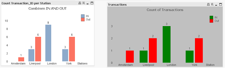
Strange indeed.
All the best,
Matt - Visual Analytics Ltd
- Mark as New
- Bookmark
- Subscribe
- Mute
- Subscribe to RSS Feed
- Permalink
- Report Inappropriate Content
Hi Matt, this looks nice, If I add 'distinct' while creating the stations, it gives the correct values.
So this is usefull, but is there a way of doing this, without creating an extra table. Is it possible to use some kind of Set analysis?
Frank
- Mark as New
- Bookmark
- Subscribe
- Mute
- Subscribe to RSS Feed
- Permalink
- Report Inappropriate Content
Hi Matt,
Thanks for your feedback. I am having V9 SR2 and getting the wrong results - which means it is time for me to upgrade.
Best Regards,
Sajeevan
- Mark as New
- Bookmark
- Subscribe
- Mute
- Subscribe to RSS Feed
- Permalink
- Report Inappropriate Content
Hi Sajeevan,
Thanks for your answer. The only problem is that your solution doubles the number of rows. If I tell you that in my real table every row has 30 fields and the the table contains over 90.000.000 rows, this is not very useful.
Do you have an idea creating the same graph without doubling the rows. Maybe with some kind of Set Analysis?
Hope you can help me!
Best regards,
Frank
- Mark as New
- Bookmark
- Subscribe
- Mute
- Subscribe to RSS Feed
- Permalink
- Report Inappropriate Content
Hi Frank,
Thanks for the feedback. If this is the case then what Matt suggested is the best approach but just load only the distinct station names in a different table like below then the counts will become correct if you are using lower version of the QlikView.
Station:
load distinct Station_ID_In as Station resident Data_1;
load distinct Station_ID_Out as Station resident Data_1;
Set analysis requires a searching value which in your case is the station name or the IN/OUT activity and are in two different fields which will be quite complex. I will let you know the solution if I am successful.
Thanks,
Sajeevan