Unlock a world of possibilities! Login now and discover the exclusive benefits awaiting you.
- Qlik Community
- :
- All Forums
- :
- QlikView App Dev
- :
- Re: Combo Chart: Staggered bar chart with an expre...
- Subscribe to RSS Feed
- Mark Topic as New
- Mark Topic as Read
- Float this Topic for Current User
- Bookmark
- Subscribe
- Mute
- Printer Friendly Page
- Mark as New
- Bookmark
- Subscribe
- Mute
- Subscribe to RSS Feed
- Permalink
- Report Inappropriate Content
Combo Chart: Staggered bar chart with an expression that ignore a dimension
Hi all,
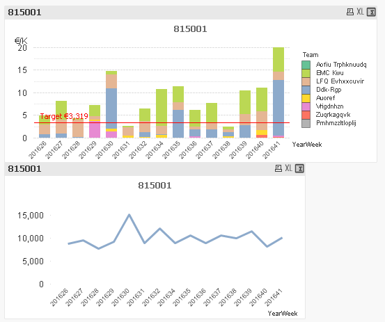
I have the following to charts (first 2 charts below) which I am trying to combine into one.
The challenge is that the second graph is not related to the Team dimension used in the first graph. I managed to combine the charts but using the following expression:
=0.005497 * SUM({$< $(vPrevPOs_YearWeek(16,0)) >} TOTAL<YearWeek> Sales)
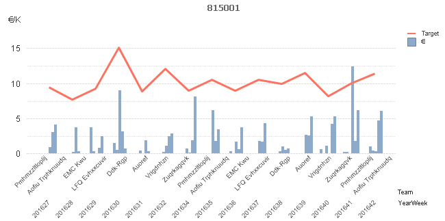
This way the line charts will not consider the Team dimension. However, the bar char is no longer staggered (third chart below) and thus the relation between the line and the bars doesn't make sense. Is there a way how to combine both charts below and still have staggered bars?
I also attached the QVW.
Thanks 
Accepted Solutions
- Mark as New
- Bookmark
- Subscribe
- Mute
- Subscribe to RSS Feed
- Permalink
- Report Inappropriate Content
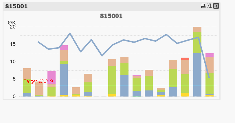
You'll need to use only one dimension and a separate expression for each team. See attached qvw.
talk is cheap, supply exceeds demand
- Mark as New
- Bookmark
- Subscribe
- Mute
- Subscribe to RSS Feed
- Permalink
- Report Inappropriate Content
You'll need to use only one dimension and a separate expression for each team. See attached qvw.
talk is cheap, supply exceeds demand
- Mark as New
- Bookmark
- Subscribe
- Mute
- Subscribe to RSS Feed
- Permalink
- Report Inappropriate Content
You could place one chart on front the other, playing with the layer attribute and a transparent background.
Align both x axis and visually you will get the felling that it's one chart.
It's my first idea hearing your need.
Regards
- Mark as New
- Bookmark
- Subscribe
- Mute
- Subscribe to RSS Feed
- Permalink
- Report Inappropriate Content
I agree with Julian, and how his suggestion may look like.
- Mark as New
- Bookmark
- Subscribe
- Mute
- Subscribe to RSS Feed
- Permalink
- Report Inappropriate Content
This is prefect Gysbert! Thanks