Unlock a world of possibilities! Login now and discover the exclusive benefits awaiting you.
- Qlik Community
- :
- All Forums
- :
- QlikView App Dev
- :
- Creating Bar Chart with multiple fields side-by-si...
- Subscribe to RSS Feed
- Mark Topic as New
- Mark Topic as Read
- Float this Topic for Current User
- Bookmark
- Subscribe
- Mute
- Printer Friendly Page
- Mark as New
- Bookmark
- Subscribe
- Mute
- Subscribe to RSS Feed
- Permalink
- Report Inappropriate Content
Creating Bar Chart with multiple fields side-by-side with the same options.
Hi there,
I am attempting to create a bar chart that contains data from 5 fields within my main table that all have the same 4 options. I want to count each option listed within the field, performed easily with the count() expression, have this listed as the Legend, and then list the 5 fields and their spread of the options side by side.
I can do this in excel by creating a separate table containing the pivoted fields figures, but I can't for the life of me think of a way to do it in Qlikview. I thought of trying an inline table, or using the Aggr function. As you can probably tell I'm just starting out with Qlikview.
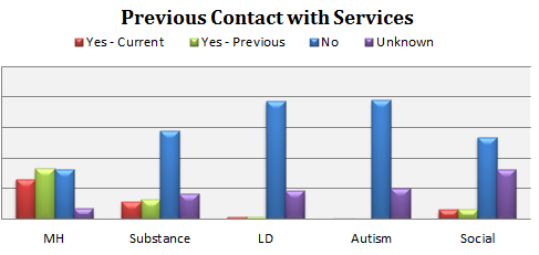
Here is an example of what the chart looks like in Excel. I'd include the counts above the bars.
Many thanks in advance.
Accepted Solutions
- Mark as New
- Bookmark
- Subscribe
- Mute
- Subscribe to RSS Feed
- Permalink
- Report Inappropriate Content
I actually managed to solve this myself.
I used a resident load to copy the column entries into a new table with an extra field that referred to the department. I then just loaded each column into that same table with the same filed names, and then used the department name and option as dimensions and the count of the unique client ID as the expression.
It works very nicely as a count, but I can't now work out how to have each option display as a percentage of the total of the department. I shall get there though.
- Mark as New
- Bookmark
- Subscribe
- Mute
- Subscribe to RSS Feed
- Permalink
- Report Inappropriate Content
You can create Qlikview as well with the extra metrics for that. If you want to do you need to send that excel file
- Mark as New
- Bookmark
- Subscribe
- Mute
- Subscribe to RSS Feed
- Permalink
- Report Inappropriate Content
Okay,
I've attached an example excel file. I'd like to produce a chart that counts the occurence of each option within each field, the bars will represent the % rate at which they occur, and then have the fields listed at the bottom like the picture above shows.
I'm probably not explaining it very well.
Thanks.
- Mark as New
- Bookmark
- Subscribe
- Mute
- Subscribe to RSS Feed
- Permalink
- Report Inappropriate Content
I actually managed to solve this myself.
I used a resident load to copy the column entries into a new table with an extra field that referred to the department. I then just loaded each column into that same table with the same filed names, and then used the department name and option as dimensions and the count of the unique client ID as the expression.
It works very nicely as a count, but I can't now work out how to have each option display as a percentage of the total of the department. I shall get there though.