Unlock a world of possibilities! Login now and discover the exclusive benefits awaiting you.
- Qlik Community
- :
- All Forums
- :
- QlikView App Dev
- :
- Creating Gauge chart
- Subscribe to RSS Feed
- Mark Topic as New
- Mark Topic as Read
- Float this Topic for Current User
- Bookmark
- Subscribe
- Mute
- Printer Friendly Page
- Mark as New
- Bookmark
- Subscribe
- Mute
- Subscribe to RSS Feed
- Permalink
- Report Inappropriate Content
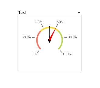
Creating Gauge chart
Good day
I would like to know if it is possible to use the Gauge chart for comparative purposes (Current vs Previous), i.e. have both values on one chart or will I have to create a chart for each value?
Your response will be greatly appreciated, thanks.
Regards
Phelisa
- Tags:
- chart_objetcs
- gauge
- Mark as New
- Bookmark
- Subscribe
- Mute
- Subscribe to RSS Feed
- Permalink
- Report Inappropriate Content
Phelsia
A single Gauge Chart can only display a single Expression, so you will need a Chart for each discrete espression you require.
Best Regards, Bill
- Mark as New
- Bookmark
- Subscribe
- Mute
- Subscribe to RSS Feed
- Permalink
- Report Inappropriate Content
Phelsia,
To my knowledge, a gauge can only display a single dimension and expresssion per chart. Although you can't show both values simultaneously, you could "toggle" between the 2 values using a variable and the expression.
- Mark as New
- Bookmark
- Subscribe
- Mute
- Subscribe to RSS Feed
- Permalink
- Report Inappropriate Content
1 expression for gauge
you can simulate two indicators overlapping two charts
regards
- Mark as New
- Bookmark
- Subscribe
- Mute
- Subscribe to RSS Feed
- Permalink
- Report Inappropriate Content
I think it is quite reasonable usage of the gauge chart, if you want to see the change rather than the separate values. It is one expression, e.g.:
<expression for current>/<expression for previous>
Shown in %.
If you wish, you can add "text in chart" to show the absolute values too, but it is a little overloaded to my taste...
Regards,
Michael
- Mark as New
- Bookmark
- Subscribe
- Mute
- Subscribe to RSS Feed
- Permalink
- Report Inappropriate Content
Most businesses need comparative analysis to identify the state of the business. Qlikvew Alternate States was introduced in version 11 to facilitate comparative analysis such as year-over-year sales comparison where users want to see how current year sales compares to the previous year or current quarter compares to the same quarter a year ago.
Most of case using Line chart or bar chart only using QV.
- Mark as New
- Bookmark
- Subscribe
- Mute
- Subscribe to RSS Feed
- Permalink
- Report Inappropriate Content
Hi Michael
Thank you for the response.
I am trying to get the figure to appear on gauge but it only shows the calculation I am making. Am I doing something wrong or is it only for text strictly?
Regards
Phelisa
- Mark as New
- Bookmark
- Subscribe
- Mute
- Subscribe to RSS Feed
- Permalink
- Report Inappropriate Content
Calculations work. If it shows the expression text, that means your forgot the"=" sign. That is
sum(Amount) - text
=sum(Amount) - result of calculation
Regards,
Michael