Unlock a world of possibilities! Login now and discover the exclusive benefits awaiting you.
- Qlik Community
- :
- All Forums
- :
- QlikView App Dev
- :
- Cummulative Sales vs Plan chart - advise please
- Subscribe to RSS Feed
- Mark Topic as New
- Mark Topic as Read
- Float this Topic for Current User
- Bookmark
- Subscribe
- Mute
- Printer Friendly Page
- Mark as New
- Bookmark
- Subscribe
- Mute
- Subscribe to RSS Feed
- Permalink
- Report Inappropriate Content
Cummulative Sales vs Plan chart - advise please
 Hi,
Hi,
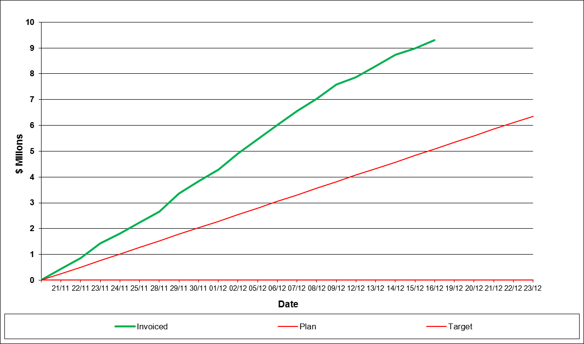
I am trying to define a line chart to show cummulative sales by day vs cummulative planned values by day within a selected period.
I want the graph to show the Plan cummulative values for all days within the selected period that exist on the Plan table and the Sales cummulative values for the days that exist on the Sales table for that same period. Ideally the sales line should stop when there are no more sales for the rest of that period.....
so it should look something like the image shown - green line = sales and red line = plan
Any ideas how I would acheive this?
Accepted Solutions
- Mark as New
- Bookmark
- Subscribe
- Mute
- Subscribe to RSS Feed
- Permalink
- Report Inappropriate Content
- Mark as New
- Bookmark
- Subscribe
- Mute
- Subscribe to RSS Feed
- Permalink
- Report Inappropriate Content
If you select "Full Accumulation" in the Expressions tab for both expressions, that should accomplish what you want.
Regards,
Vlad
- Mark as New
- Bookmark
- Subscribe
- Mute
- Subscribe to RSS Feed
- Permalink
- Report Inappropriate Content
Thanks for the response. I've tried that, but only get a plan line extending for the dates that match the sales transaction dates. Perhaps it is the way in which I have defined/loaded my tables.
- Mark as New
- Bookmark
- Subscribe
- Mute
- Subscribe to RSS Feed
- Permalink
- Report Inappropriate Content
It might be...can you post a reduced sample?
- Mark as New
- Bookmark
- Subscribe
- Mute
- Subscribe to RSS Feed
- Permalink
- Report Inappropriate Content
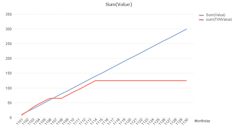
Hi Vlad,
I created simple spreadsheets for plan data and transaction data and pulled those into a new QV. This now shows the full date axis for the plan data which is what I want  . The transaction line 'FLAT LINES' for the balance of the period where there are no transctions, which would be correct for any closed preiod. Is there a way that I can make the transaction line stop when it reaches the current date in the graph if I were showing the current period? It would look a bit neater.
- Mark as New
- Bookmark
- Subscribe
- Mute
- Subscribe to RSS Feed
- Permalink
- Report Inappropriate Content
Hi,
Check this attached application.
Hope this helps you.
-Sridhar
- Mark as New
- Bookmark
- Subscribe
- Mute
- Subscribe to RSS Feed
- Permalink
- Report Inappropriate Content
Thanks Sridhar, this is what I am after.
- Mark as New
- Bookmark
- Subscribe
- Mute
- Subscribe to RSS Feed
- Permalink
- Report Inappropriate Content
if you have huge data then it is good to implement it in script level