Unlock a world of possibilities! Login now and discover the exclusive benefits awaiting you.
- Qlik Community
- :
- All Forums
- :
- QlikView App Dev
- :
- Re: Display values on line chart
- Subscribe to RSS Feed
- Mark Topic as New
- Mark Topic as Read
- Float this Topic for Current User
- Bookmark
- Subscribe
- Mute
- Printer Friendly Page
- Mark as New
- Bookmark
- Subscribe
- Mute
- Subscribe to RSS Feed
- Permalink
- Report Inappropriate Content
Display values on line chart
Hi everybody,
I have a line chart with an x-axis time series (which is updated every month with the latest information) and an y-axis with sales values.
The user can select the shop for viewing line chart of its sales value during the month.
Furthermore, each store is associated with events such as openings of competitors whose date is expressed in months like sales values.
I want to show these events with a symbol placed in the month in which it happened at the sales level (plus a million not to overlap the line) of the store of that month.
With this function:
=if(inmonth([DATA IMPATTO],Data,0)=-1,sum(Vendite_AM)+1000000)
where:
DATA IMPATTO is the date of the event (month)
Data is the date of the sales values (month)
Vendite_AM is the sales values
I can display the symbol only if there is a singol event.
If I have more than one event associated to one shop I cannot display anything on the graph, just the line.
How can I do it?
- « Previous Replies
-
- 1
- 2
- Next Replies »
- Mark as New
- Bookmark
- Subscribe
- Mute
- Subscribe to RSS Feed
- Permalink
- Report Inappropriate Content
Not sure, I understand this?
=if(inmonth([DATA IMPATTO],Data,0)=-1,sum(Vendite_AM)+1000000)
where:
DATA IMPATTO is the date of the event (month)
Data is the date of the sales values (month)
Vendite_AM is the sales values
- Mark as New
- Bookmark
- Subscribe
- Mute
- Subscribe to RSS Feed
- Permalink
- Report Inappropriate Content
If I have more than one event associated to one shop I cannot display anything on the graph, just the line.
So, if you have more than one event, you would not want to show it on the chart? I think it should be possible, would you be able to share a sample of what you have so far?
- Mark as New
- Bookmark
- Subscribe
- Mute
- Subscribe to RSS Feed
- Permalink
- Report Inappropriate Content
Perhaps I am mistaken, but I suspect that DATA IMPATTO is not properly associated with Data in the fact table, so if more than one value exists, it is ambiguous and nothing will be displayed. I would perform the InMonth() in the load script and append the event to the main fact table with an event flag field (such as EvFlag = 0 or 1). Then the expression can simplify to
=(Sum(Vendite_AM) +1E6) *EvFlag
- Mark as New
- Bookmark
- Subscribe
- Mute
- Subscribe to RSS Feed
- Permalink
- Report Inappropriate Content
No no, I want to display all the events associated to one shop.
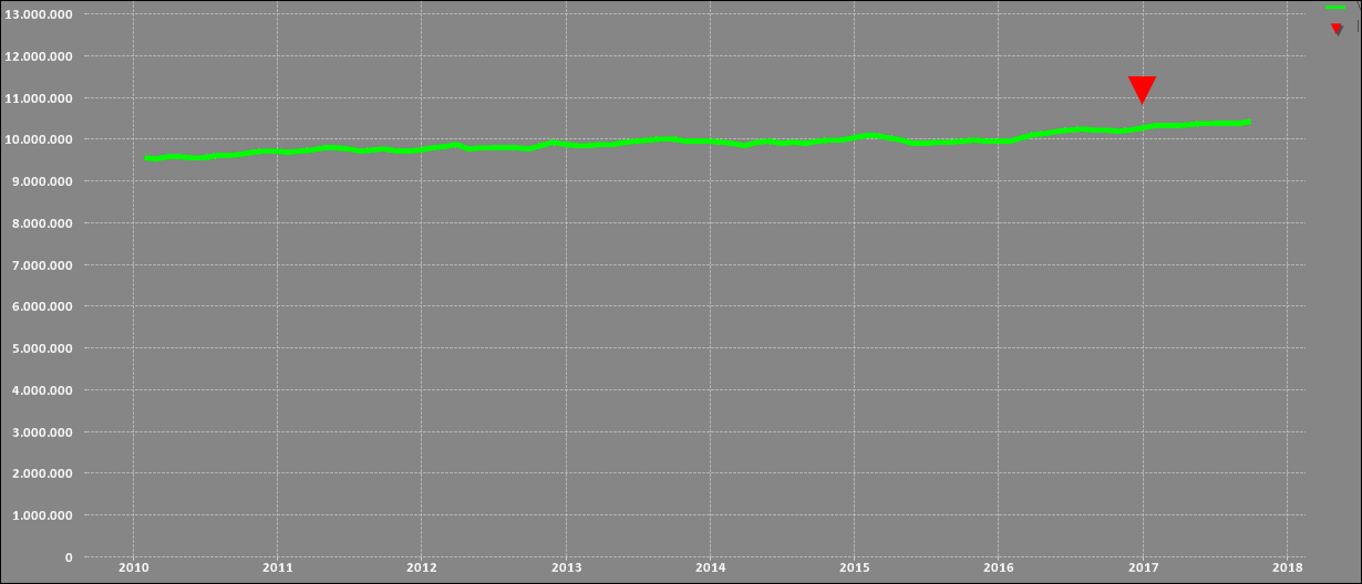
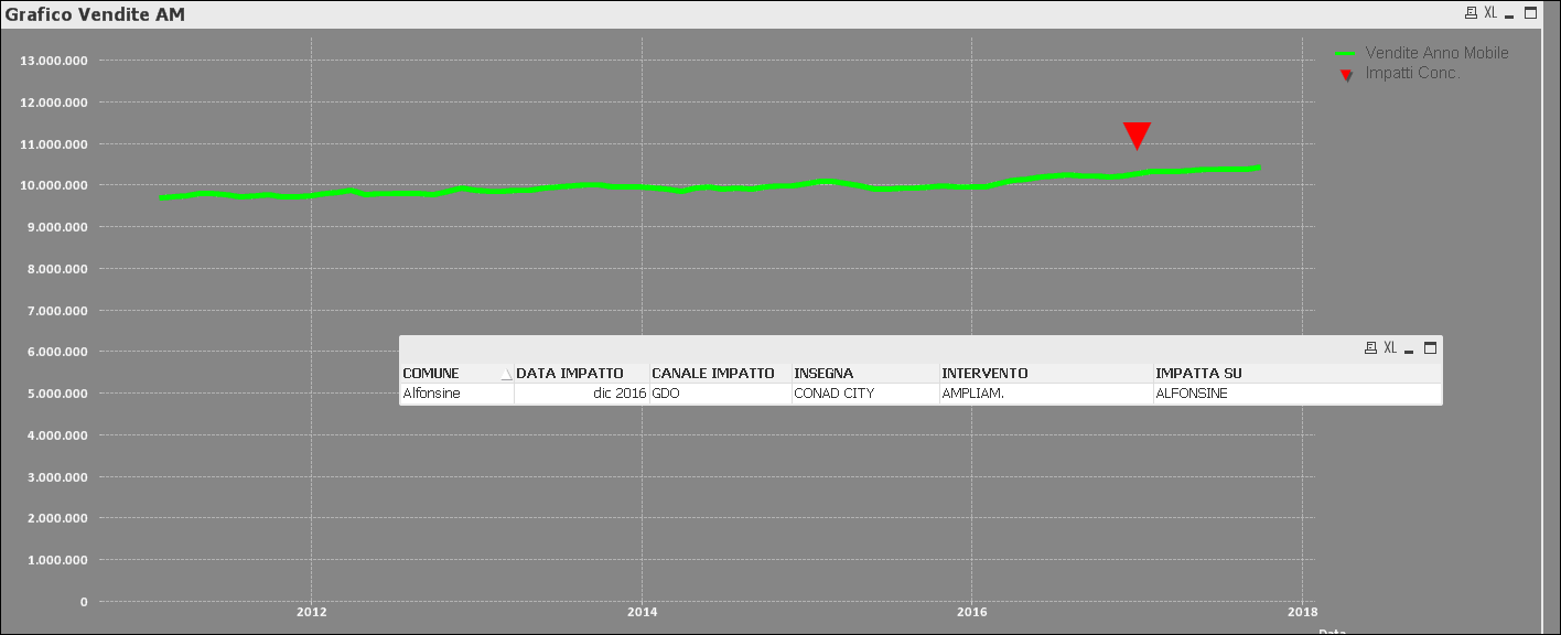
The graph I posted at the beginning of the discussion (watch 1st image below) is the case where one shop has only one event associated.
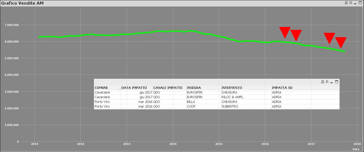
If I select I shop that has more than one event, I cannot display anything:

In the second case I would display 4 triangles.
- Mark as New
- Bookmark
- Subscribe
- Mute
- Subscribe to RSS Feed
- Permalink
- Report Inappropriate Content
I think the dates are actually associated correctly ('MMM - YY') because the formula works when the value is unique.
With your function, how can I display the symbol at the right level of my x-axis (time series in month)?
- Mark as New
- Bookmark
- Subscribe
- Mute
- Subscribe to RSS Feed
- Permalink
- Report Inappropriate Content
yeah, correct:
in the first line I copy my function/formula
In 3rd, 4th and 5th line I explain the variables contained in the formula for give you more clearness
- Mark as New
- Bookmark
- Subscribe
- Mute
- Subscribe to RSS Feed
- Permalink
- Report Inappropriate Content
Would you be able to attach a sample to check out what might be going on?
- Mark as New
- Bookmark
- Subscribe
- Mute
- Subscribe to RSS Feed
- Permalink
- Report Inappropriate Content
I want to see 4 triangles for 4 events.
Now I can see 1 triangle only if I have 1 event.
If I have 2 or more events I cannot see anything,
- Mark as New
- Bookmark
- Subscribe
- Mute
- Subscribe to RSS Feed
- Permalink
- Report Inappropriate Content
Dual(If(DATA IMPATTO=Max(DATA IMPATTO),Data, ''),Sum(Vendite_AM))
or
Dual(If(Data=Max(Data), DATA IMPATTO, ''),Sum(Vendite_AM))
- « Previous Replies
-
- 1
- 2
- Next Replies »