Unlock a world of possibilities! Login now and discover the exclusive benefits awaiting you.
- Qlik Community
- :
- All Forums
- :
- QlikView App Dev
- :
- Re: Displaying sales TY vs LY in a chart
- Subscribe to RSS Feed
- Mark Topic as New
- Mark Topic as Read
- Float this Topic for Current User
- Bookmark
- Subscribe
- Mute
- Printer Friendly Page
- Mark as New
- Bookmark
- Subscribe
- Mute
- Subscribe to RSS Feed
- Permalink
- Report Inappropriate Content
Displaying sales TY vs LY in a chart
Hi,
I need to display TY sales by day vs LY sales for the corresponding day LY as defined in a calendar.
I need the chart to be displayed as follow
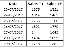
But I can only get QV to display as follows
sample data & QVW attached.
Thanks in advance
- Mark as New
- Bookmark
- Subscribe
- Mute
- Subscribe to RSS Feed
- Permalink
- Report Inappropriate Content
Hi Warren,
Try:
Calendar:
LOAD seq_id,
Date,
Week_Start,
Week_End,
Year,
Week,
Date_LY
FROM
[ty vs ly example.xlsx]
(ooxml, embedded labels, table is calendar);
MappingLYDate:
Mapping
LOAD
Date,
Date_LY
Resident Calendar;
Sales:
LOAD
Date,
Sales
FROM
[ty vs ly example.xlsx]
(ooxml, embedded labels, table is sales);
Left Join(Sales)
LOAD
ApplyMap('MappingLYDate',Date) as Date,
Sales as LY_Sales
Resident Sales;
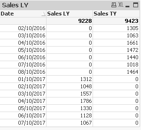
Gives:
| Date | sum(Sales) | sum(LY_Sales) |
|---|---|---|
| 9599 | 9140 | |
| 02/10/2016 | 1461 | 1353 |
| 03/10/2016 | 1949 | 1732 |
| 04/10/2016 | 1274 | 1403 |
| 05/10/2016 | 1628 | 1412 |
| 06/10/2016 | 1812 | 1856 |
| 07/10/2016 | 1475 | 1384 |
Cheers
Andrew
BTW generating random data in the excel sheet is fine but suggest you copy and paste over with values before uploading. 
- Mark as New
- Bookmark
- Subscribe
- Mute
- Subscribe to RSS Feed
- Permalink
- Report Inappropriate Content
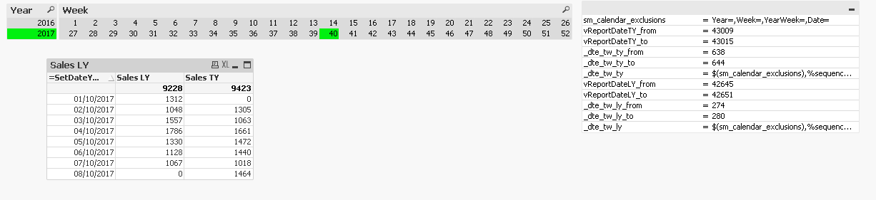
Another option would be to change your dimension to this
=SetDateYear(Date, Max(TOTAL Year))
- Mark as New
- Bookmark
- Subscribe
- Mute
- Subscribe to RSS Feed
- Permalink
- Report Inappropriate Content
Hi Andrew,
I like this solution, but how would you deal with real world challenges like e.g. order no. which unique for each order ?
If I am not mistaken, this approach would actually show Sales and LY Sales for each order no. as well, right ?
Would you recommend just aggregating data to a certain level and then joining the LY values ?
Thanks
Kristina