Unlock a world of possibilities! Login now and discover the exclusive benefits awaiting you.
- Qlik Community
- :
- All Forums
- :
- QlikView App Dev
- :
- Doing Data Science-ey stuff (linear regression lin...
- Subscribe to RSS Feed
- Mark Topic as New
- Mark Topic as Read
- Float this Topic for Current User
- Bookmark
- Subscribe
- Mute
- Printer Friendly Page
- Mark as New
- Bookmark
- Subscribe
- Mute
- Subscribe to RSS Feed
- Permalink
- Report Inappropriate Content
Doing Data Science-ey stuff (linear regression lines in QlikView)
Hello Qlik-ers,
In the mad-rush to get ever more “scientific” about data, exploring Qlik features that fall under this thorough statistical genre have yielded some useful examples. However, some chart settings & combinations still behave in puzzling ways.
Specifically I sought a foundation for plotting linear regressions when the data consists of a variety of X,Y series concatenated to a single table. In this manner, the underlying data model can “bundle” together disparate topics, pulled into visualization focus by applying selection.
This example combines 3 data topics, each with possible multiple subsets:
- The Anscombe quartet (a useful series for calibrating linear regression calculations) (https://en.wikipedia.org/wiki/Anscombe%27s_quartet)
- Masses for American women as function of height age 30–39(https://en.wikipedia.org/wiki/Simple_linear_regression) – html table @2
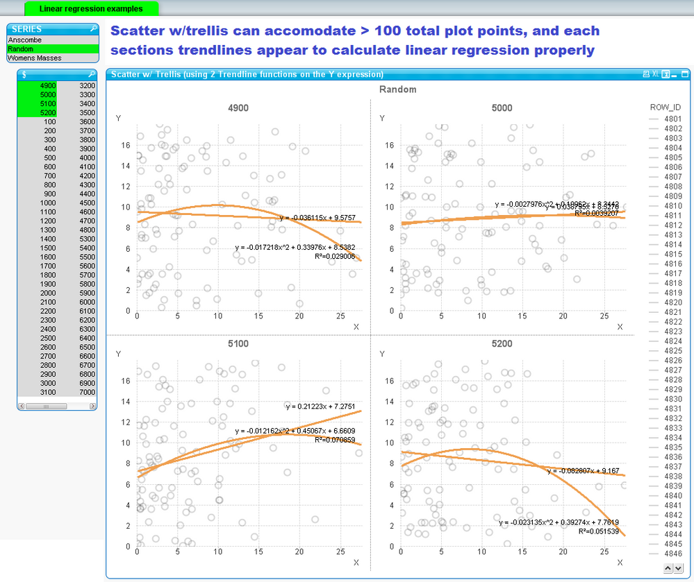
- Randomized X, Y coordinates in sets of 100 points
Each X,Y data point is tagged with a 2-hierarchy dimension: {Topic} | {Subset Name}
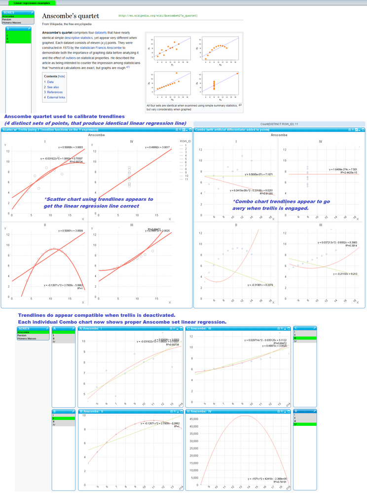
The Anscombe data set was used specifically because it verifies plot lines were correct. The premise is each of the four sets in the quartet produce identical linear regression.
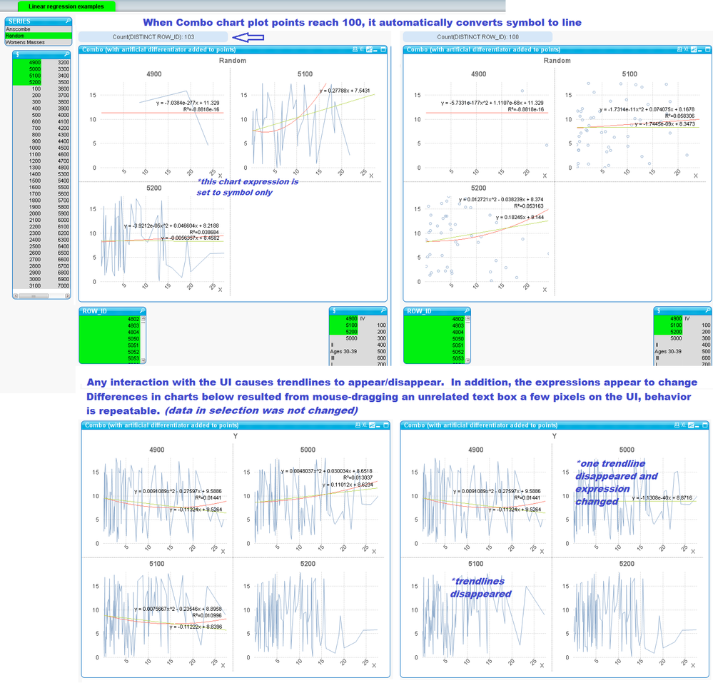
The Combo chart did some interesting things. If two points shared the same value of either identical X,Y value, the chart would collapse these points so by "cheating" the points were given distinction by adding a near insignificant small sub-decimal amount to force them to plot as separate points.
The trendlines on the combo chart also seem to create the linear regression trendlines, but when trellis was engaged, started to perform erractically. Also when the combo chart in trellis form was fed more than 100 data points, it automatically switched over to a line chart (even when line was not activated and the expression was instructed to only use symbol)
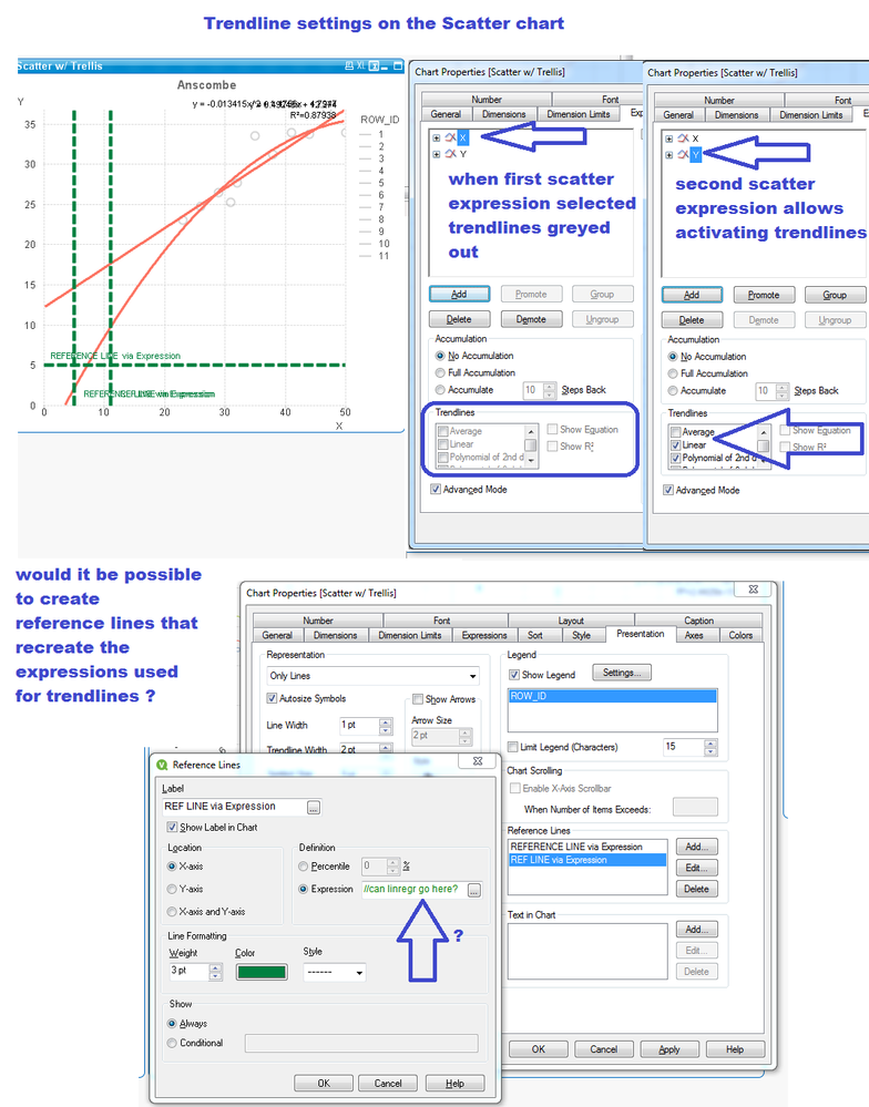
Naturally the X,Y scatter seems best choice for generating linear regression, however it wasn’t necessarily intuitive this could only be activated by having the Y expression in focus, whereas trendlines checkboxes are greyed out when the X expression is in focus.
Ideally I’d like to take the linear regression expression syntaxes being shown via trendlines and recreate these as reference lines. Is it possible to extract the linear regression calculations pre-packaged to checkboxes, and use these elsewhere? (i.e. take ‘y=.026998x + 8.632’ and use it as a reference line).
Thanks for any consideration you can give the topic! Appreciate your thoughts & feedback.


