Unlock a world of possibilities! Login now and discover the exclusive benefits awaiting you.
- Qlik Community
- :
- All Forums
- :
- QlikView App Dev
- :
- Re: Fixing colors to values in a Bar Chart
- Subscribe to RSS Feed
- Mark Topic as New
- Mark Topic as Read
- Float this Topic for Current User
- Bookmark
- Subscribe
- Mute
- Printer Friendly Page
- Mark as New
- Bookmark
- Subscribe
- Mute
- Subscribe to RSS Feed
- Permalink
- Report Inappropriate Content
Fixing colors to values in a Bar Chart
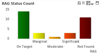
Is it possible to fix colors to the values in a Bar Chart?
My chart shows the RAG Status count across a selection of projects. The RAG status dimension is sorted as so:
if (RAG='On Target',1,if (RAG='Marginal',2,if (RAG='Moderate',3,if (RAG='Significant',4,if (RAG='Critical',5,if (RAG='Not Found',6,if (RAG='Not Reported',7,8)))))))
And the Colors palette is arranged in matching order.
All works fine if I have one or more values for each RAG count. However, if a count is zero the color is assigned to the next value in line, when what I want is the color skipped too.
This is visible in the example below where there are no 'Critical' projects, so Red() is used for the bar that shows the count of projects where the RAG is 'Not Found', when I want it to be skipped.
- « Previous Replies
-
- 1
- 2
- Next Replies »
- Mark as New
- Bookmark
- Subscribe
- Mute
- Subscribe to RSS Feed
- Permalink
- Report Inappropriate Content
Note that for a bar chart, you must add the background color expression to the Expression, not the Dimension.
-Rob
- « Previous Replies
-
- 1
- 2
- Next Replies »