Unlock a world of possibilities! Login now and discover the exclusive benefits awaiting you.
- Qlik Community
- :
- All Forums
- :
- QlikView App Dev
- :
- Forecast line overlay
- Subscribe to RSS Feed
- Mark Topic as New
- Mark Topic as Read
- Float this Topic for Current User
- Bookmark
- Subscribe
- Mute
- Printer Friendly Page
- Mark as New
- Bookmark
- Subscribe
- Mute
- Subscribe to RSS Feed
- Permalink
- Report Inappropriate Content
Forecast line overlay
Hi everyone,
My dashboard has a sand chart with sum(Amounts). Years go from 2010-2020. I would like to add a line to the chart that shows a forecast for 2015-2020, based on the trend in 2010-2014. The user could then compare that forecast line against the real data of sum(Amounts).
I first thought of overlaying a separate line chart on top of the existing sand chart, but I'm not quite sure what expression I would use. Any ideas?

- Mark as New
- Bookmark
- Subscribe
- Mute
- Subscribe to RSS Feed
- Permalink
- Report Inappropriate Content
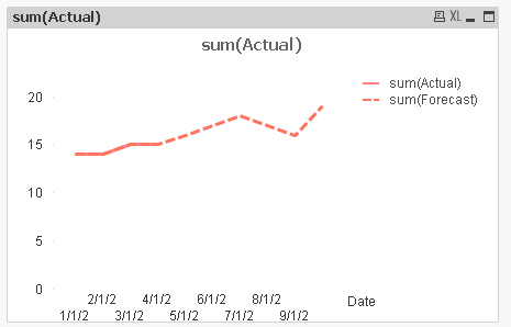
I don't think that you can do exactly what you require, but I would be tempted to create a separate chart that would show the top part of the chart. I have included a sample.
The key items are to use ='<S2>' in your line style for the chart to turn it dashed and to use the same values when your lines are the same.
Hope this helps
- Mark as New
- Bookmark
- Subscribe
- Mute
- Subscribe to RSS Feed
- Permalink
- Report Inappropriate Content
Hi Rupert,
Thanks for the response. In many ways this is an elegant solution, and I was thinking of overlaying a chart on top as well.
The problem is that this data isn't dynamic - I want the chart to calculate a forecast regardless of my selection - something to the effect of "take the average of 2010-2015 and multiply 3% a year". I imagine this would be a complicated expression and need help writing it. Ultimately, I want to reach a point where the user could select the % growth per year.
- Mark as New
- Bookmark
- Subscribe
- Mute
- Subscribe to RSS Feed
- Permalink
- Report Inappropriate Content
Anyone else have any ideas?