Unlock a world of possibilities! Login now and discover the exclusive benefits awaiting you.
- Qlik Community
- :
- All Forums
- :
- QlikView App Dev
- :
- Get more than 18 colors in color pallate
- Subscribe to RSS Feed
- Mark Topic as New
- Mark Topic as Read
- Float this Topic for Current User
- Bookmark
- Subscribe
- Mute
- Printer Friendly Page
- Mark as New
- Bookmark
- Subscribe
- Mute
- Subscribe to RSS Feed
- Permalink
- Report Inappropriate Content
Get more than 18 colors in color pallate
Hello,
I am having a requirement where, I have more than 18 distinct values for whcih i am showing color legend. But now as more than 18 values so color for the dimension is repeating. I don't want repeated colors for different dimension value.
So to give example:
In this graph the orange color marked is showing two different manufacturer.
So I want to every manufacturer different color. How can I do that?
Thank you in advance for the help.
- Mark as New
- Bookmark
- Subscribe
- Mute
- Subscribe to RSS Feed
- Permalink
- Report Inappropriate Content
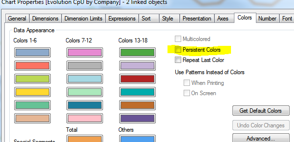
Choose Persistant Colors
- Mark as New
- Bookmark
- Subscribe
- Mute
- Subscribe to RSS Feed
- Permalink
- Report Inappropriate Content
- Mark as New
- Bookmark
- Subscribe
- Mute
- Subscribe to RSS Feed
- Permalink
- Report Inappropriate Content
Add this field to the table of "Manufacturer" dimension.
Rgb(round(Rand()*(255 ),1),round(Rand()*(255 ),1),round(Rand()*(255 ),1)) AS myRandomRGB
and then use it to specify the Backgorund color inside the expression
![2017-06-01 17_26_26-QlikView x64 Personal Edition - [C__Users_Michele.Denardi_Desktop_gescli.qvw_].png](/legacyfs/online/165535_2017-06-01 17_26_26-QlikView x64 Personal Edition - [C__Users_Michele.Denardi_Desktop_gescli.qvw_].png)
If a post helps to resolve your issue, please accept it as a Solution.
- Mark as New
- Bookmark
- Subscribe
- Mute
- Subscribe to RSS Feed
- Permalink
- Report Inappropriate Content
You can also symply use
Rgb(round(Rand()*(255 ),1),round(Rand()*(255 ),1),round(Rand()*(255 ),1))
on you chart expression background.
If a post helps to resolve your issue, please accept it as a Solution.
- Mark as New
- Bookmark
- Subscribe
- Mute
- Subscribe to RSS Feed
- Permalink
- Report Inappropriate Content
Thank you Michele for a solution. I have applied it. But now what I am getting is, in legend I am seeing different color for a specific manufacturer and in actual graph the there are some other set of colors for particular manufacturer.
I am getting what going on here.
Do you know the fix?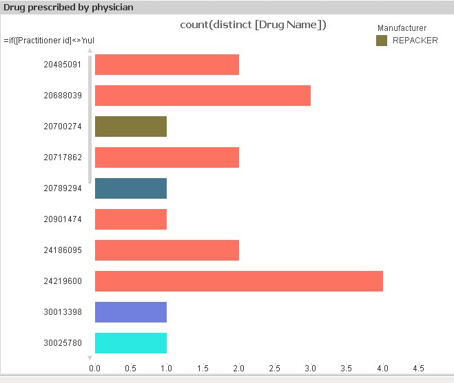
- Mark as New
- Bookmark
- Subscribe
- Mute
- Subscribe to RSS Feed
- Permalink
- Report Inappropriate Content
I think a color-expression like the following will be more suitable to create multiple colors:
= colormix1(mod(rowno(), 3) / 4, color(rowno()), if(rowno() < 12, red(), blue()))
Whereby I'm not sure if it's really a good idea to use such many different colors because many people couldn't really differ these various colors and a repeating of them (with a visible description that the colors after 18 items are repeating) could give a better user experience.
Beside them the use of such many dimension-values within a chart with visible items, a legend and scrollbars isn't very user-friendly - often there are better possibilities to visualize the information to the users.
- Marcus