Unlock a world of possibilities! Login now and discover the exclusive benefits awaiting you.
- Qlik Community
- :
- All Forums
- :
- QlikView App Dev
- :
- Re: Has anyone ever done an accumulation of bar gr...
- Subscribe to RSS Feed
- Mark Topic as New
- Mark Topic as Read
- Float this Topic for Current User
- Bookmark
- Subscribe
- Mute
- Printer Friendly Page
- Mark as New
- Bookmark
- Subscribe
- Mute
- Subscribe to RSS Feed
- Permalink
- Report Inappropriate Content
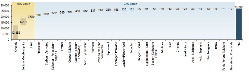
Has anyone ever done an accumulation of bar graph that looks like the example?
The values shown are the actual values and the accumulated total is shown at the end.
- Mark as New
- Bookmark
- Subscribe
- Mute
- Subscribe to RSS Feed
- Permalink
- Report Inappropriate Content
Search the forum for waterfall chart, e.g. like
Waterfall Chart for Bridging data
Basically, use the bar offset expression attribute to shift your bars vertically.
- Mark as New
- Bookmark
- Subscribe
- Mute
- Subscribe to RSS Feed
- Permalink
- Report Inappropriate Content
Whatt version of Qlikview are you using?
You can go to Dimension Limits and Tick Show Totals, this will show a bar for the total values
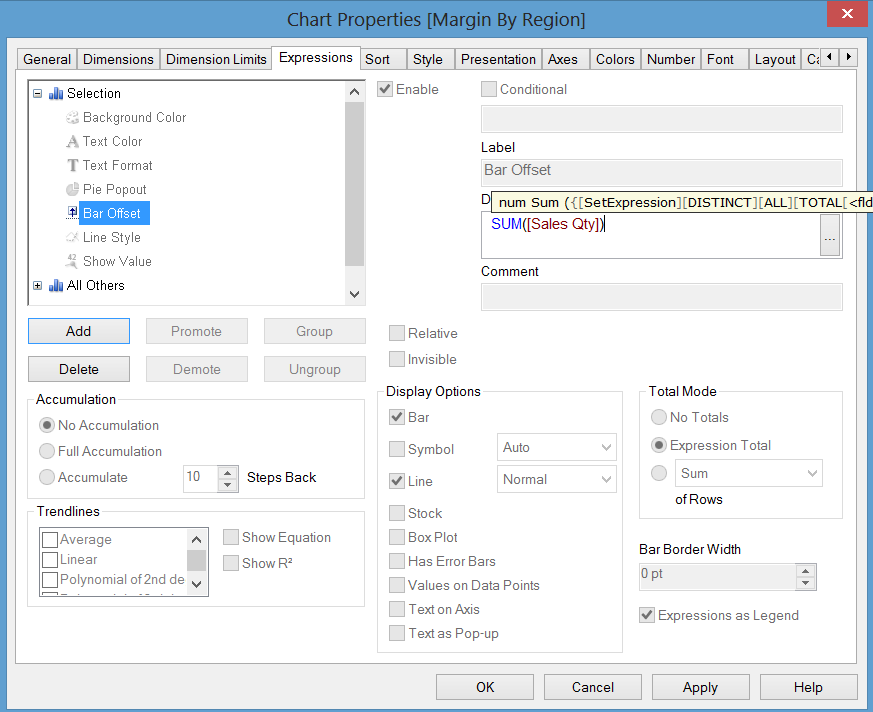
You can then use the bar offset function in the Expression Definition
like here
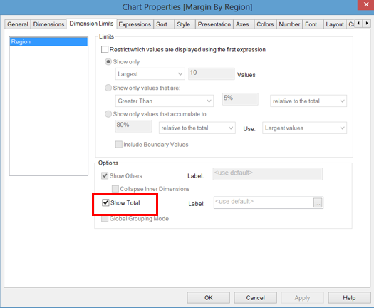
Something like this for the bar offset
- Mark as New
- Bookmark
- Subscribe
- Mute
- Subscribe to RSS Feed
- Permalink
- Report Inappropriate Content
Hi,
I've made a video tutorial long back. Please check the below link...
Cheers,
DV
- Mark as New
- Bookmark
- Subscribe
- Mute
- Subscribe to RSS Feed
- Permalink
- Report Inappropriate Content
I think that the bar offset expression should be like this, to make sure ther is no offset for total bar:
if(count (distinct <dimension field>)=1, rangesum(above(sum([Sales Qty]),1, Rowno())), 0)
Af for the numbers - check "show values on data points"
- Mark as New
- Bookmark
- Subscribe
- Mute
- Subscribe to RSS Feed
- Permalink
- Report Inappropriate Content
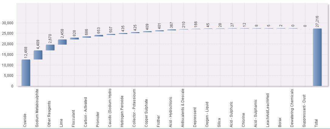
Thanks for the assistance everyone. I got it figured out.
I ticked "Show Total" and then I added the following to the bar offset property:
If(rowno()=1 or Dimensionality()=0,0,rangesum (above(sum(amount),1,rowno()-1)))
And this is the result (I still got to make it a bit prettier, but the basic design is what I need)
- Mark as New
- Bookmark
- Subscribe
- Mute
- Subscribe to RSS Feed
- Permalink
- Report Inappropriate Content
So the customer has now decided that they do want the percentages that show in the background. The 78% \ 22% shown in the different colors.
Is it possible to do, or to even add a line that shows what makes up 80% of the total and what makes up 20% of the total?