Unlock a world of possibilities! Login now and discover the exclusive benefits awaiting you.
- Qlik Community
- :
- All Forums
- :
- QlikView App Dev
- :
- Re: Histogram with multiple dimensions and express...
- Subscribe to RSS Feed
- Mark Topic as New
- Mark Topic as Read
- Float this Topic for Current User
- Bookmark
- Subscribe
- Mute
- Printer Friendly Page
- Mark as New
- Bookmark
- Subscribe
- Mute
- Subscribe to RSS Feed
- Permalink
- Report Inappropriate Content
Histogram with multiple dimensions and expressions
Hello,
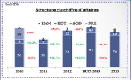
i need to display a histogram with 3 expressions( Sales, Budget,sales N-1) and 2 dimensions (Year , Product) like this:
the dimension Year in the axis X but the product (EMN,EDT,SOD,PRF) on the bar. and the expressions are on different bar, how can i do this ??
 Be
Be
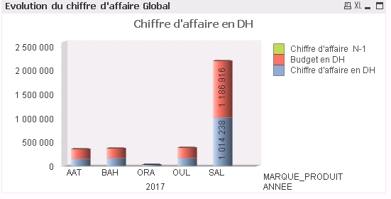
because when i ve tried to do it in qlikview the result i get is this : both of the dimension are on the axis X, and the expressions are on the same bar
- Mark as New
- Bookmark
- Subscribe
- Mute
- Subscribe to RSS Feed
- Permalink
- Report Inappropriate Content
any help please?
- Mark as New
- Bookmark
- Subscribe
- Mute
- Subscribe to RSS Feed
- Permalink
- Report Inappropriate Content
Hi.
On the "Style" tab in the chart properties, you must select SubType -> Stacked.
- Mark as New
- Bookmark
- Subscribe
- Mute
- Subscribe to RSS Feed
- Permalink
- Report Inappropriate Content
thank you for your answer, I have already test that option but there is no change i have the same result as the second image posted.
Any other suggestions please?
- Mark as New
- Bookmark
- Subscribe
- Mute
- Subscribe to RSS Feed
- Permalink
- Report Inappropriate Content
Attach please qvw with the chart.
- Mark as New
- Bookmark
- Subscribe
- Mute
- Subscribe to RSS Feed
- Permalink
- Report Inappropriate Content
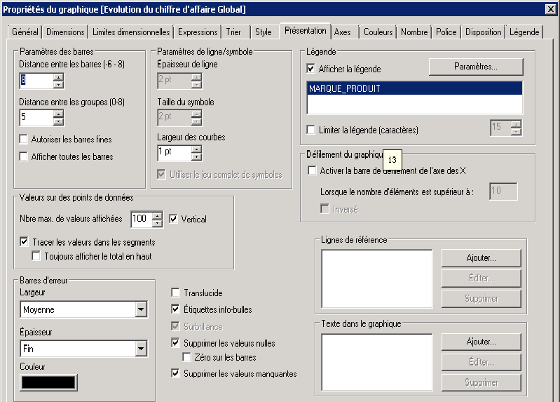
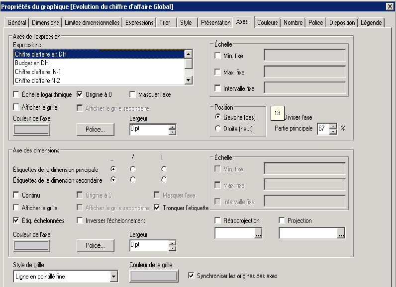
thank you for your answer , but i really can't share the qvw , the data is so confidential.
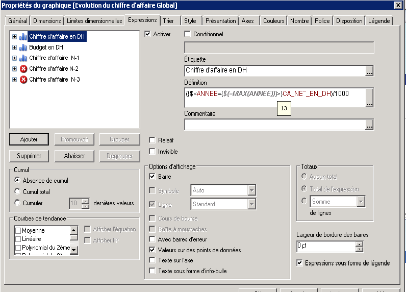
i have capture all the parameters hope its clear
thank you
t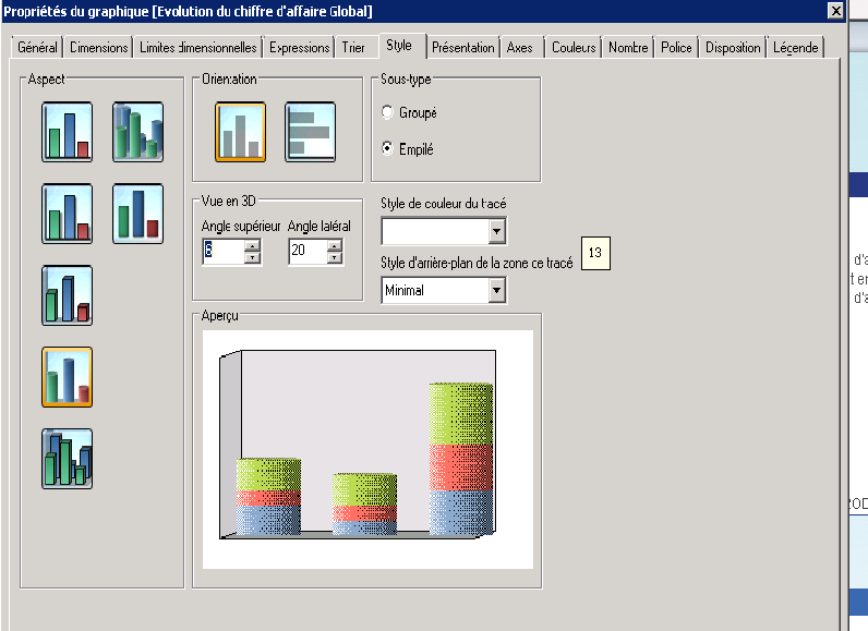
- Mark as New
- Bookmark
- Subscribe
- Mute
- Subscribe to RSS Feed
- Permalink
- Report Inappropriate Content
Sorry, I confused, on the "Style" tab in the chart properties, you must select Sous-Type-> Groupe.
- Mark as New
- Bookmark
- Subscribe
- Mute
- Subscribe to RSS Feed
- Permalink
- Report Inappropriate Content
Thank you but when i select "groupe" as "sous type", it gives this: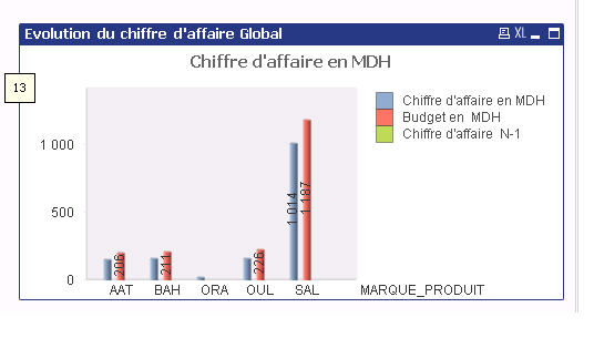
its not the structure that i want, here is the result i want : the different KPI on X axis , and the dimension on the bar with different colors