Unlock a world of possibilities! Login now and discover the exclusive benefits awaiting you.
- Qlik Community
- :
- All Forums
- :
- QlikView App Dev
- :
- Re: How Can I Change the Color?
- Subscribe to RSS Feed
- Mark Topic as New
- Mark Topic as Read
- Float this Topic for Current User
- Bookmark
- Subscribe
- Mute
- Printer Friendly Page
- Mark as New
- Bookmark
- Subscribe
- Mute
- Subscribe to RSS Feed
- Permalink
- Report Inappropriate Content
How Can I Change the Color?
Hello:
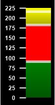
I have thermometer chart using the following expression and I would like to make the "Finance*", Implementation, Confidence = {High} segment to be a light green and the third Sum to be Yellow. Is there a way to do that?
As always, thanks in advance for any and all help.
- « Previous Replies
- Next Replies »
- Mark as New
- Bookmark
- Subscribe
- Mute
- Subscribe to RSS Feed
- Permalink
- Report Inappropriate Content
I assume you mean for the horizontal chart, correct? If yes, I tried changing the orientation to vertical and it does not work. It remains horizontal. That would have been too easy.  lol
lol
- Mark as New
- Bookmark
- Subscribe
- Mute
- Subscribe to RSS Feed
- Permalink
- Report Inappropriate Content
Great, So you are looking same way what we show in view which is horizontal. So, You want same thing in Vertical way?? Or different question is that?s
- Mark as New
- Bookmark
- Subscribe
- Mute
- Subscribe to RSS Feed
- Permalink
- Report Inappropriate Content
What we showed is correct? If so, You want to show same in vertical way. Is that ur query?
- Mark as New
- Bookmark
- Subscribe
- Mute
- Subscribe to RSS Feed
- Permalink
- Report Inappropriate Content
Hello Anil:
Yes, what I want to show is in a vertical way. Not sure it’s doable with a Qlikview Test Tube / Thermometer.
- Mark as New
- Bookmark
- Subscribe
- Mute
- Subscribe to RSS Feed
- Permalink
- Report Inappropriate Content
Got it.. It won't doable with QT Tube/Thermometer. Instead, I used 3rd Look and make some width reduce to get exact. But, Work around i got finally like below
Note - If applicable please mark it as helpful and flag correct answer which you satisfy the answer.
- Mark as New
- Bookmark
- Subscribe
- Mute
- Subscribe to RSS Feed
- Permalink
- Report Inappropriate Content
Hello Anil:
Ok. I think I know what you mean. You used the chart type that's listed before the test tube type, right? Then for the width, you simply grabbed the right edge of the chart and dragged it to the left, correct? This will work as I can then add a text box to overlay the chart or next to it with the text I currently.
You've made me think of something though, when you said you changed the width. I'm going to try changing the reference line widths in the test tube chart to see what I get. I'll let you know.
A big thank you for all your help with this. I appreciate it.
- Mark as New
- Bookmark
- Subscribe
- Mute
- Subscribe to RSS Feed
- Permalink
- Report Inappropriate Content
Hello Again Anil:
Ok.
- Mark as New
- Bookmark
- Subscribe
- Mute
- Subscribe to RSS Feed
- Permalink
- Report Inappropriate Content
Well, Glad it got worked. Even I should thank to cleveranjos
- « Previous Replies
- Next Replies »