Unlock a world of possibilities! Login now and discover the exclusive benefits awaiting you.
- Qlik Community
- :
- All Forums
- :
- QlikView App Dev
- :
- How to color code an increase or a decrease of a m...
- Subscribe to RSS Feed
- Mark Topic as New
- Mark Topic as Read
- Float this Topic for Current User
- Bookmark
- Subscribe
- Mute
- Printer Friendly Page
- Mark as New
- Bookmark
- Subscribe
- Mute
- Subscribe to RSS Feed
- Permalink
- Report Inappropriate Content
How to color code an increase or a decrease of a metric over the previous period?(pivottable)
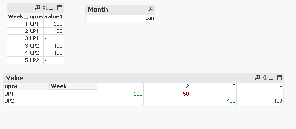
I am building a pivot table that has the total sales revenue per week. I would like to create a color flag so that the numbers of the current week will be colored green if there was an increase in sales from last week's, colored red if there was a decrease or black if the number remained the same. My expression is the sum of sales and dimension is date mm/dd/yyyy.
- Mark as New
- Bookmark
- Subscribe
- Mute
- Subscribe to RSS Feed
- Permalink
- Report Inappropriate Content
There you go:
First, create a master calendar and create month and week column in it.
Then, sum up your value group by week and link this table to master calendar using week column as key.
Next, create a new column for Last Week value and join back to the original fact table.
Refer to qvw attached for reference.
Thanks and regards,
Arthur Fong
- Mark as New
- Bookmark
- Subscribe
- Mute
- Subscribe to RSS Feed
- Permalink
- Report Inappropriate Content
Felipe, did Arthur's post and sample app get you what you needed? If so, please remember to come back to the thread and use the Accept as Solution button on Arthur's post to give him credit for the help and to let others know it worked for this use case. If you still need further help, leave an update.
Regards,
Brett
I now work a compressed schedule, Tuesday, Wednesday and Thursday, so those will be the days I will reply to any follow-up posts.
- Mark as New
- Bookmark
- Subscribe
- Mute
- Subscribe to RSS Feed
- Permalink
- Report Inappropriate Content
You put the below expresssion in the color tab of the exresssion
if( Column(1) > Above(Column(1)) , Green() ,
if( Column(1) = Above(Column(1)) , Black() , red()))
