Unlock a world of possibilities! Login now and discover the exclusive benefits awaiting you.
- Qlik Community
- :
- All Forums
- :
- QlikView App Dev
- :
- Re: How to set different colors in a pie chart tha...
- Subscribe to RSS Feed
- Mark Topic as New
- Mark Topic as Read
- Float this Topic for Current User
- Bookmark
- Subscribe
- Mute
- Printer Friendly Page
- Mark as New
- Bookmark
- Subscribe
- Mute
- Subscribe to RSS Feed
- Permalink
- Report Inappropriate Content
How to set different colors in a pie chart that has 2 dimensions?
Hi all,
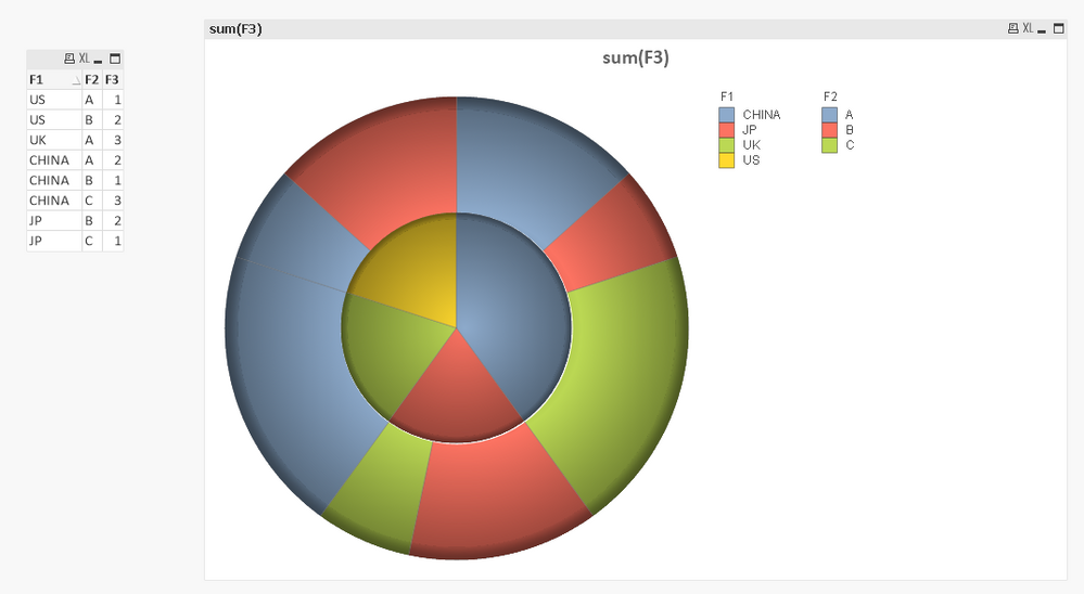
I have data and created a pie chart like below:
I saw that the color sort is the same for the first dimension and second dimension.
The sort is from color1 to the last.
But I want to make all color different(F1 and F2).
I try to use if condition in expression background color, but I can't make the F1 and F2 different.
Do you have any ideas about that?
Thanks in advance and you can use my demo.
- Mark as New
- Bookmark
- Subscribe
- Mute
- Subscribe to RSS Feed
- Permalink
- Report Inappropriate Content
- Mark as New
- Bookmark
- Subscribe
- Mute
- Subscribe to RSS Feed
- Permalink
- Report Inappropriate Content
I saw that thread, but I have 2 dimensions in my pie chart, I try to use set RGB in load script, but it doesn't work.
I don't know how to solve this.
Have you try it in my sample?
- Mark as New
- Bookmark
- Subscribe
- Mute
- Subscribe to RSS Feed
- Permalink
- Report Inappropriate Content
HI,
I am not an expect, but back to my experience it is not possible to completely separate the dimensions' colours. However, you can assign it according to your needs:
Go to Expressions tab, Click on the "+" mark near your expressions and write what you need in the "background color". e.g.
=if(Only(F2) = 'A',
if(Only(F1) = 'US', rgb(50, 120, 120),
if(Only(F1) = 'JP', rgb(70, 140, 140),
if(Only(F1) = 'CHINA', rgb(150, 160, 160),
rgb(200,100,100))))

,

if(Only(F2) = 'B',
if(Only(F1) = 'US', rgb(200, 255, 120),
if(Only(F1) = 'JP', rgb(150, 255, 140),
if(Only(F1) = 'CHINA', rgb(100, 255, 160),
rgb(200,255,100))))

,

if(Only(F2) = 'C',
if(Only(F1) = 'US', rgb(200, 120, 255),
if(Only(F1) = 'JP', rgb(150, 140, 255),
if(Only(F1) = 'CHINA', rgb(100, 160, 255),
rgb(100,100, 255))))

, null())))
I have made a sample for you, have fun 🙂
- Mark as New
- Bookmark
- Subscribe
- Mute
- Subscribe to RSS Feed
- Permalink
- Report Inappropriate Content
Hi Hassan,
Really thanks for your sample, I got some ideas from your sample and scripts. Then I tried below expression:
=if(Only(F1) = 'US',
	if(Only(F2) = 'A',RGB(231,58,132),
	if(Only(F2) = 'B',RGB(154,132,188),
	if(Only(F2) = 'C',RGB(221,225,0),
	RGB(247,173,36)))),
 if(Only(F1) = 'UK',
	if(Only(F2) = 'A',RGB(231,58,132),
	if(Only(F2) = 'B',RGB(154,132,188),
	if(Only(F2) = 'C',RGB(221,225,0),
	RGB(141,202,151)))),
 if(Only(F1) = 'CHINA',
	if(Only(F2) = 'A',RGB(231,58,132),
	if(Only(F2) = 'B',RGB(154,132,188),
	if(Only(F2) = 'C',RGB(221,225,0),
	RGB(0,157,136)))),
 if(Only(F1) = 'JP',
	if(Only(F2) = 'A',RGB(231,58,132),
	if(Only(F2) = 'B',RGB(154,132,188),
	if(Only(F2) = 'C',RGB(221,225,0),
	RGB(122,54,144)))),Null()))))
But it doesn't work.
You set every combination of F1 and F2 a color, that's really cool, but there are also some same color in the chart, like
F1 = JP is the same with F1=JP and F2=B
Actually what I want is 4 different colors in inner circle for 4 different countries,
3 different colors in outer circle for 3 different (A,B,C), that's fine.
I'm not sure whether the pie chart can't set color if there are more than 1 dimension in qlikview.
Thanks.
Aiolos
- Mark as New
- Bookmark
- Subscribe
- Mute
- Subscribe to RSS Feed
- Permalink
- Report Inappropriate Content
it is what i meant with "it is not possible to completely separate the dimensions' colors". There are limitations and a lot of work around. I know what you need, but you have to look at this pie chart from another perspective. The dimensions are connected and they are used to express "sum(F3)" , therefore, qlikview tries to make a combination of colors to show that "connection". However, There is 1 trick, you can delete this connection by creating two pie charts on top of each other (don't forget to consider caption, transparency etc.), so you can edit it the way you want.
I am really sorry, but my experience is limited when it comes to charts 🙂
I wish you the best,
Ahmed
- Mark as New
- Bookmark
- Subscribe
- Mute
- Subscribe to RSS Feed
- Permalink
- Report Inappropriate Content
Really thanks for your reply, I got it.
Maybe that's just the limitation for qlikview.
Thanks.
Aiolos
