Unlock a world of possibilities! Login now and discover the exclusive benefits awaiting you.
- Qlik Community
- :
- All Forums
- :
- QlikView App Dev
- :
- Line Graph - Actuals vs Previous Years in % (growt...
- Subscribe to RSS Feed
- Mark Topic as New
- Mark Topic as Read
- Float this Topic for Current User
- Bookmark
- Subscribe
- Mute
- Printer Friendly Page
- Mark as New
- Bookmark
- Subscribe
- Mute
- Subscribe to RSS Feed
- Permalink
- Report Inappropriate Content
Line Graph - Actuals vs Previous Years in % (growth)
I have explored almost all the threads here which belong to my problem and also tried the possible solutions. I can't believe that this graph is that hard to create in QV but it seems it is.
What I want to create is a line graph which shows the Actuals in % of the previous Quarter+Year, for each product group (three).
So my dimensions are Quarter_and_Year and Product_Group, the result should be three lines (product_group) from Q1/2008 til Q2/2011 showing the growth for each quarter.
I have tried it by complex formulas, by seperate tables, changes in structure, but I didn't get it.
Hope you can help me as it's important for my File,
many thanks in advance
Christoph
- Mark as New
- Bookmark
- Subscribe
- Mute
- Subscribe to RSS Feed
- Permalink
- Report Inappropriate Content
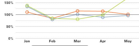
above you see the screenshot of what i want, but instead of the months i want Year+Quarter (from Q1/2008 over the years)
The graph above i achieved with the formulas below:
=sum(if(inYearToDate(invoicedate,MaxOrderDate,0) and customer='Dritte' and type='Sales',amount)) /
sum({$ < CalendarYear = {$(=year(addyears(MaxOrderDate,-1)))}, costumer={Dritte}, type={Sales}, productgroup_Text={[group1], [group2], [group3]} > } amount)
- Mark as New
- Bookmark
- Subscribe
- Mute
- Subscribe to RSS Feed
- Permalink
- Report Inappropriate Content
im doing a similar chart and have had problems as well, did you end up figuring it out
- Mark as New
- Bookmark
- Subscribe
- Mute
- Subscribe to RSS Feed
- Permalink
- Report Inappropriate Content
I skipped the whole thing, sorry mate 😕
Maybe I will have a look at it again during the summer
- Mark as New
- Bookmark
- Subscribe
- Mute
- Subscribe to RSS Feed
- Permalink
- Report Inappropriate Content
I stumbled across this post while searching for a better solution for this. I solved it pretty simple, by creating the previous year value for my data model.
So you load the fact onto itself.
Concatenate (Facts) Load
Y + 1 as Y,
Fact as Fact_PY,
0 as Fact
Resident Facts;
You can use in all formulas then simply Fact_PY instead of Fact.
Disadvantage: Your data and memory consumption increases which can be a problem in big applications.