Unlock a world of possibilities! Login now and discover the exclusive benefits awaiting you.
- Qlik Community
- :
- All Forums
- :
- QlikView App Dev
- :
- Linear gauge settings - dynamic control by row
- Subscribe to RSS Feed
- Mark Topic as New
- Mark Topic as Read
- Float this Topic for Current User
- Bookmark
- Subscribe
- Mute
- Printer Friendly Page
- Mark as New
- Bookmark
- Subscribe
- Mute
- Subscribe to RSS Feed
- Permalink
- Report Inappropriate Content
Linear gauge settings - dynamic control by row
Hi all,
I'm creating a KPI dashboard which contains a linear gauge as a column within a larger straight table. Each row of the table is a different KPI, with different parameters for its max, min, various thresholds and target.
In the script I have calculated all the different parameters relating to the gauge, for each KPI measure. So the gauge min, gauge max, segment widths and segment colours are all calculated in the script.
When I come to apply this to the gauge settings (which do accept field names as values), then my gauges don't work. The individual segment widths and colours I have defined in the script do not come through at all.
I have already read that the gauge min and max values are global for the table, so I got round this by calculating the gauge values and segment widths as a percentage on a zero to one scale. However it also seems that the segments and colours are also global for the table which I hadn't read anywhere.
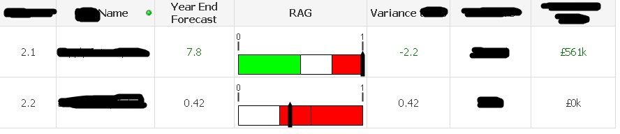
This is how I want it to look (2 images combined here):
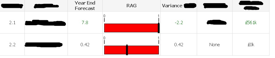
This is how it actually looks:
So this is as much a moan towards Qlikview than a question - but I'm really dissappointed. What is the point of having dynamically controllable gauge settings if they do not display in a tabular format?
Is there a way to solve this problem?
Regards
Dan
- Mark as New
- Bookmark
- Subscribe
- Mute
- Subscribe to RSS Feed
- Permalink
- Report Inappropriate Content
Hi.
You can't assign different boarders using the standard gauges in the straight table.
It makes sense as each row in the table usually represents a different object of the same kind.
There are some common ways to handle such requirements:
- use normalized values
- use alternative visual representation (bar in the cell or set of tiny cells)
- use separate gauge objects
- use extensions
- Mark as New
- Bookmark
- Subscribe
- Mute
- Subscribe to RSS Feed
- Permalink
- Report Inappropriate Content
whiteline wrote:
It makes sense as each row in the table usually represents a different object of the same kind.
I think there are alot of examples where gauge parameters may vary even within a dataset containing the same data. For example in regional sales, each country may have different targets and different good and bad thresholds. In my case I have several different company KPI's that I want to represent in a summary table - another valid application.
I can't use normalised values in this case as I need the colour boundries to be different on each row.
Could you expand on your 2nd idea of bar in the cell or set of tiny cells?
Could you also expand on extensions?
Thanks
- Mark as New
- Bookmark
- Subscribe
- Mute
- Subscribe to RSS Feed
- Permalink
- Report Inappropriate Content
Dan,
Check this attachment.
Thanks,
AS
- Mark as New
- Bookmark
- Subscribe
- Mute
- Subscribe to RSS Feed
- Permalink
- Report Inappropriate Content
I see. You have created what looks like a table, but is in fact loads of separate objects.
There are three issues I can see with this method.
1. You cannot export the data to excel, or to an image for pasting elsewhere because all the objects are individual.
2. Every cell and object needs to be individually configured with if statements or set analysis for it to pick up the right value. This means alot of set up time.
3. No sorting of the table or making dynamic selections in the table are possible.