Unlock a world of possibilities! Login now and discover the exclusive benefits awaiting you.
- Qlik Community
- :
- All Forums
- :
- QlikView App Dev
- :
- Max Accumulated Value as refrence
- Subscribe to RSS Feed
- Mark Topic as New
- Mark Topic as Read
- Float this Topic for Current User
- Bookmark
- Subscribe
- Mute
- Printer Friendly Page
- Mark as New
- Bookmark
- Subscribe
- Mute
- Subscribe to RSS Feed
- Permalink
- Report Inappropriate Content
Max Accumulated Value as refrence
Hi,
I'm not sure how to get my chart to show what I want. So hopefully someone can help me 
This is I want to do
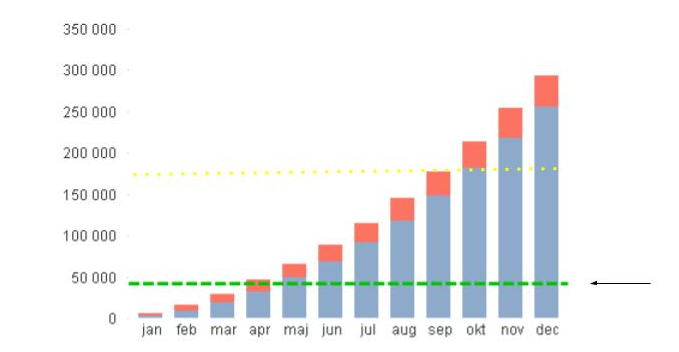
1) The green line I want as a reference it should be max of a accumulate value. In my picture that is the dotted yellow line. Need to show if the accumulated value is under the total budget of the year.
2) The red part in the stacked chart is now added on a accumulated value. I want to show for example that in June if cost are £ 100 and the accumulated cost are 750. I do not want it as percent.
Chart explanation:
Blue - Accumulated costs
Red - Monthly cost
Green - Budget
- Mark as New
- Bookmark
- Subscribe
- Mute
- Subscribe to RSS Feed
- Permalink
- Report Inappropriate Content
Not sure I completely understand your requirement. Would you be able to share a sample to look at this? and also share the expected output?
Best,
Sunny
- Mark as New
- Bookmark
- Subscribe
- Mute
- Subscribe to RSS Feed
- Permalink
- Report Inappropriate Content
Thank's Sunny for taking up your time
I did the correct way in my first solution. I hade some errors in my data model that changed the result. All that was needed was to look it again after some pause :-).