Unlock a world of possibilities! Login now and discover the exclusive benefits awaiting you.
- Qlik Community
- :
- All Forums
- :
- QlikView App Dev
- :
- Re: Panel barchart?
- Subscribe to RSS Feed
- Mark Topic as New
- Mark Topic as Read
- Float this Topic for Current User
- Bookmark
- Subscribe
- Mute
- Printer Friendly Page
- Mark as New
- Bookmark
- Subscribe
- Mute
- Subscribe to RSS Feed
- Permalink
- Report Inappropriate Content
Panel barchart?
Hello.
Is there any change of doing a chart like this:
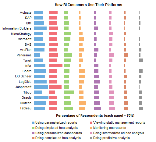
I really do not like stacked bar chart myself and I am looking more better way to present the data in my customer's dashboard.
If this is not possible, is there any other options that you could propose to me instead of stacked bar chart? Really important to be able to compare the dimensions together. There is time axis and a page dimension and a metric of course.
I know that this can be done with many separate charts, but it would be really nice to only have one .. This could be done in other software, so why not in QV?
Cheers,
Niko
Accepted Solutions
- Mark as New
- Bookmark
- Subscribe
- Mute
- Subscribe to RSS Feed
- Permalink
- Report Inappropriate Content
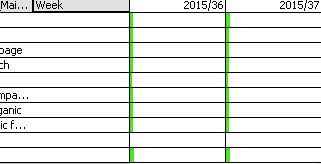
Hi,
Already got it working.. I was using wrong time dimension to solve this.
Found the solution when I chop this to two different dimension as text and really saw what were happening with the numbers. The totals were wrong, but when I did put the right time dimension there it did work! (I think..)
The working expression were:
=sum(Metric_ABC)/sum(total <WeekYear> Metric_ABC)
Where the WeekYear is just a right WeekYear 
Cheerio,
Niko
- Mark as New
- Bookmark
- Subscribe
- Mute
- Subscribe to RSS Feed
- Permalink
- Report Inappropriate Content
You could use sveral bar-charts and overlap them with some adjustments to the layout and positions from the axis.
- Marcus
- Mark as New
- Bookmark
- Subscribe
- Mute
- Subscribe to RSS Feed
- Permalink
- Report Inappropriate Content
Yes, you can do that with a straight table and expressions that are represented as Linear Gauge instead of Text. You can find an example of that kind of chart here: Re: Linear Gauge Color in Straight table
talk is cheap, supply exceeds demand
- Mark as New
- Bookmark
- Subscribe
- Mute
- Subscribe to RSS Feed
- Permalink
- Report Inappropriate Content
Good call Gysbertgwassenaar. Fill to Value linear gauges should do the job.
- Mark as New
- Bookmark
- Subscribe
- Mute
- Subscribe to RSS Feed
- Permalink
- Report Inappropriate Content
You could also use a pivot table to get a display like that. This should save you from typing similar expressions compared to a straight table.
Have a look at the survey sample at
- Mark as New
- Bookmark
- Subscribe
- Mute
- Subscribe to RSS Feed
- Permalink
- Report Inappropriate Content
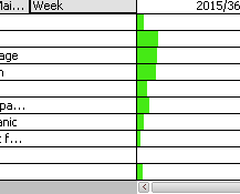
Hello,
I am trying to use pivot table, but the calculations are not going right I assume what I am trying to do.
Would love to see how the proposition of Dimension A (for example page) divides on every Year/Week.
So 2015/36 would be 100% and how that would be divided between pages.
I have tried:
=sum(Metric_ABC)/sum(total Metric_ABC)
=sum(Metric_ABC)/sum(total <Dimension A> Metric_ABC)
=sum(Metric_ABC)/sum(total <WeekYear> Metric_ABC)
=sum(Metric_ABC)/sum(total <WeekYear, Dimension A> Metric_ABC)
But nothing seems to be working.. On the picture is
=sum(Metric_ABC)/sum(total <Dimension A> Metric_ABC)
Cheers,
Niko
- Mark as New
- Bookmark
- Subscribe
- Mute
- Subscribe to RSS Feed
- Permalink
- Report Inappropriate Content
Hi,
Already got it working.. I was using wrong time dimension to solve this.
Found the solution when I chop this to two different dimension as text and really saw what were happening with the numbers. The totals were wrong, but when I did put the right time dimension there it did work! (I think..)
The working expression were:
=sum(Metric_ABC)/sum(total <WeekYear> Metric_ABC)
Where the WeekYear is just a right WeekYear
Cheerio,
Niko
- Mark as New
- Bookmark
- Subscribe
- Mute
- Subscribe to RSS Feed
- Permalink
- Report Inappropriate Content
Few questions:
- Is there a way to show number next to the green bar? Other than creating other expression next to it.
- And can the bars be colored with each dimension?
Cheers,
Niko
- Mark as New
- Bookmark
- Subscribe
- Mute
- Subscribe to RSS Feed
- Permalink
- Report Inappropriate Content
No, another expression is the way to do that. That's also the best way to do it even if it were possible.
Each column of bars can have its own color. You can adjust the color of the segments as you want. All bars will have the same color for all the dimension values. That too is generally the best way to display them. But you don't have a choice in this case, so you'll just have to live with it anyway.
talk is cheap, supply exceeds demand
- Mark as New
- Bookmark
- Subscribe
- Mute
- Subscribe to RSS Feed
- Permalink
- Report Inappropriate Content
Thank you for your answer! I will take a look on to this matter.
And thank you for others as well, it is really nice to see that the community helps  !
!
Cheers,
Niko