Unlock a world of possibilities! Login now and discover the exclusive benefits awaiting you.
- Qlik Community
- :
- All Forums
- :
- QlikView App Dev
- :
- Problem with Line Chart "Show All Values"
- Subscribe to RSS Feed
- Mark Topic as New
- Mark Topic as Read
- Float this Topic for Current User
- Bookmark
- Subscribe
- Mute
- Printer Friendly Page
- Mark as New
- Bookmark
- Subscribe
- Mute
- Subscribe to RSS Feed
- Permalink
- Report Inappropriate Content
Problem with Line Chart "Show All Values"
Hey,
I have a Line Chart where the performance of an athlete is measured. The dimension is MonthYear, and the expression is a simple sum(Points), and then under Expressions I have the Accumulate 12 steps back option enabled. This way the Line Chart gives me the evolution of points over a years time for each MonthYear.
So far so good, but the problem is that under the Dimensions tab, I need to have "Show All Values" enabled, else it will not account for months in which the athlete did not participate and that causes the accumulate 12 steps back to cover a period longer than one year.
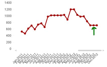
The problem that occurs because of this, is that the Chart will also show MonthYear values from the future and from the far past. So f.e. now it shows the Line Chart from lets say 1900 until December 2012. But ofcourse I'd rather not include any MonthYear values that occur before the athlete started participating, and also I would like the chart not to show values from the future, i.e. at this moment it should not show November and December 2012.
I've tried some things with the "Enable Conditional" option in the Dimensions tab, but that doesn't seem to have any effect so far.
Is there any way of hiding these 'unwanted' MonthYear values without changing the Data structure, in other words: are there any useful Qlikview options I do not know about?
Accepted Solutions
- Mark as New
- Bookmark
- Subscribe
- Mute
- Subscribe to RSS Feed
- Permalink
- Report Inappropriate Content
So you want a rolling 12 month period, and to see only the months the athlete participated?
Consider making an "AsOf" table to tie each AsOfMonth to the previous twelve Months, then using AsOfMonth as the chart dimension instead of Month, and doing NO accumulation. The data connections themselves would then do the 12 month rolling sum with a simple sum(Points), would only pull in months that had data, and you'd only need to look at the months you wanted to look at. You could even select just a single AsOfMonth in the chart, and you'd still see the 12 month rolling average as of that month.
If it's not clear, I mean generating a data structure like this:
AsOfMonth, Month
Oct 2012, Oct 2012
Oct 2012, Sep 2012
...
Oct 2012, Nov 2011
Sep 2012, Sep 2012
Sep 2012, Aug 2012
...
Sep 2012, Oct 2011
...
A down side of this approach is user confusion about what month they're actually selecting, since now you have an AsOfMonth and a Month, and both are selectable, and both behave differently. If they select Apr 2011 as a Month, for instance, your chart will show the Apr 2011 points in all the months between Apr 2011 and Mar 2012. This will confuse them and be useless even if it's technically correct for what they selected.
- Mark as New
- Bookmark
- Subscribe
- Mute
- Subscribe to RSS Feed
- Permalink
- Report Inappropriate Content
Hi,
Maybe in the chart properties -> Axes tab, Dimension axis box, you can enable continuous axis and disable your 'show all option'.
This way, your chart will have a proper axis in scale but those values will not be included.
Hope this helps,
Erich
- Mark as New
- Bookmark
- Subscribe
- Mute
- Subscribe to RSS Feed
- Permalink
- Report Inappropriate Content
So you want a rolling 12 month period, and to see only the months the athlete participated?
Consider making an "AsOf" table to tie each AsOfMonth to the previous twelve Months, then using AsOfMonth as the chart dimension instead of Month, and doing NO accumulation. The data connections themselves would then do the 12 month rolling sum with a simple sum(Points), would only pull in months that had data, and you'd only need to look at the months you wanted to look at. You could even select just a single AsOfMonth in the chart, and you'd still see the 12 month rolling average as of that month.
If it's not clear, I mean generating a data structure like this:
AsOfMonth, Month
Oct 2012, Oct 2012
Oct 2012, Sep 2012
...
Oct 2012, Nov 2011
Sep 2012, Sep 2012
Sep 2012, Aug 2012
...
Sep 2012, Oct 2011
...
A down side of this approach is user confusion about what month they're actually selecting, since now you have an AsOfMonth and a Month, and both are selectable, and both behave differently. If they select Apr 2011 as a Month, for instance, your chart will show the Apr 2011 points in all the months between Apr 2011 and Mar 2012. This will confuse them and be useless even if it's technically correct for what they selected.
- Mark as New
- Bookmark
- Subscribe
- Mute
- Subscribe to RSS Feed
- Permalink
- Report Inappropriate Content
Thanks a lot, it works great!
Is there a way to work around the Month selection problem you mentioned? In case there is not I could add a calculation condition or conditional show, so that it will only show/calculate the graph if you haven't selected a Month (or a Year).
The only remaining downside then perhaps is that I have to add all the AsOfMonths manually, but luckily Excel can help a bit there.
- Mark as New
- Bookmark
- Subscribe
- Mute
- Subscribe to RSS Feed
- Permalink
- Report Inappropriate Content
I can think of one way around the month selection problem, but it could be difficult to implement and still not quite perfect. Basically, don't ever let them select anything BUT the AsOfMonth. To support regular charts, add a "Type" field or some such to the AsOf table, with values of 'Current' and 'Rolling 12'. You could also use flags. For regular charts, use set analysis to restrict the real Month field by saying "Type"={'Current'}. At that point, rename "AsOfMonth" to "Month" and "Month" to "InternalMonth" or something like that. Now when they select "Month", they're really selecting a 12 month rolling period, but your charts can restrict this to just the month as required.
You don't need to build the AsOf table manually. Do something like this (untested):
AsOf:
LOAD date(fieldvalue('Month',recno()),'MMM YYYY') as Month
AUTOGENERATE fieldvaluecount('Month')
;
LEFT JOIN (AsOf)
LOAD Month as AsOfMonth
RESIDENT AsOf
;
LEFT JOIN (AsOf)
LOAD * INLINE [
Type
Current
Rolling 12
];
INNER JOIN (AsOf)
LOAD *
WHERE Month = AsOfMonth
OR ( Type = 'Rolling 12'
AND Month <= AsOfMonth
AND Month > addmonths(AsOfMonth,-12))
;
Edit: I should note that I haven't used the AsOf technique much in live applications, so there could be issues I haven't run across. I think I only wrote one big application that uses this technique. I dealt with the problem roughly the way I mentioned - by only allowing them to select the "As of Month" field. Technically they can still get at the month field through some of the charts, though. I didn't go so far as to make them read only. And it has caused some confusion, though not quite the confusion I mentioned. Instead, a user was confused that when they selected a month, they were still looking a rolling 12 months, for instance. They expected to see ONLY that month, since that's how QlikView normally behaves. On a different note, in that application, it looks like I used Y/null flags instead of a "Type" field. I believe that long ago testing showed that Y/null or maybe it was 1/null flags were the fastest in set analysis.