Unlock a world of possibilities! Login now and discover the exclusive benefits awaiting you.
- Qlik Community
- :
- All Forums
- :
- QlikView App Dev
- :
- Re: Scaling a grid chart or getting the scatter ch...
- Subscribe to RSS Feed
- Mark Topic as New
- Mark Topic as Read
- Float this Topic for Current User
- Bookmark
- Subscribe
- Mute
- Printer Friendly Page
- Mark as New
- Bookmark
- Subscribe
- Mute
- Subscribe to RSS Feed
- Permalink
- Report Inappropriate Content
Scaling a grid chart or getting the scatter chart to work - Qlikview
Hi All. I'm calling on your guidance, as I am stuck, and despite much time googling and trawling through similar questions, I can't seem to find an answer
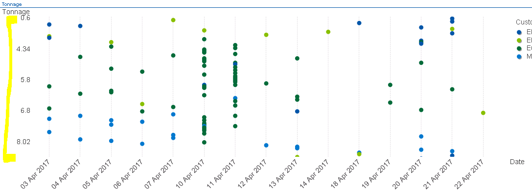
I am currently trying to create a form of scatter chart that gives me a chart of weights (Y axis) by Date (x axis) demonstrated by customer.
A grid chart gives this to me, but I can not get this to scale. The image below provides an example of this. We should have 'Tonnage' up to 32 tonnes, yet I only see this scaled to 8. Re-sizing the chart allows more to be included, however this isn't necessarily practical and does not necessarily resolve the problem.
If I try and create this via a Line chart, the scaling works fine, but it averages my weights where I need to effectively show the raw data - a weight for each ticket number (although I don't want to or need to show the ticket). If I try and set it up as a Scatter, it wants 2 numerical expressions.
I may be the way I'm approaching this or my calculations, but any advice is greatly appreciated.
Cheers!
Rebekah
- Mark as New
- Bookmark
- Subscribe
- Mute
- Subscribe to RSS Feed
- Permalink
- Report Inappropriate Content
I have a workaround that may work for you. It's for a grid chart.
My problem is based on survey data. Each location has an average survey score and number of participants. I wanted to show the score Y-axis and have the number of participants as the dot size.
I autogenerated a percentage table (tonnage in your case). This is what I used as a Y-axis. My expression then changes from just Sum(Participants)
to
If(Round(Avg(Score),0.1)=Round(Avg(ScoreAxis),0.1),Sum(Participants),0)
This it to keep the grid chart from populating every spot on the grid. At this point the chart looked like my original problem. To scale, add an expression with a constant value. I just added 1. This shows every Y-axis every value you autogenerated. If you want to reduce the Y-axis to limit to range of the values, change the constant expression to:
If(Avg(ScoreAxis)>=Min(TOTAL Aggr(Avg(Score),Location)) and Avg(ScoreAxis)<=Max(TOTAL Aggr(Avg(Score),Location)),1)
I have attached an example.
Unfortunately, this workaround will require you to round the expressions to be able to link with the scaled axis.
I hope this helps.
- Mark as New
- Bookmark
- Subscribe
- Mute
- Subscribe to RSS Feed
- Permalink
- Report Inappropriate Content
Thanks Leroux. I got round the issue using scaling, but if I'm honest I'd prefer a better way, so I'll give this a go on our next development and let you know how I get on