Unlock a world of possibilities! Login now and discover the exclusive benefits awaiting you.
- Qlik Community
- :
- All Forums
- :
- QlikView App Dev
- :
- Stacked Chart bar - Exibe 100% na coluna, mas prec...
- Subscribe to RSS Feed
- Mark Topic as New
- Mark Topic as Read
- Float this Topic for Current User
- Bookmark
- Subscribe
- Mute
- Printer Friendly Page
- Mark as New
- Bookmark
- Subscribe
- Mute
- Subscribe to RSS Feed
- Permalink
- Report Inappropriate Content
Stacked Chart bar - Exibe 100% na coluna, mas preciso que o tamanho seja do valor total
Hello
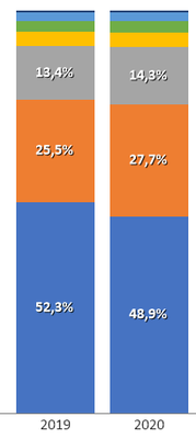
I create the graphic below:
This chart shows sales by year, separated by type of sale.
As a visualization, it is correct. This is how I want to see it, as it shows whether there has been growth between the years.
However, I want to view the total% by type of sale, each year. If I change to% annual, the graph will look like this:
It shows the correct%, but equaled the size of the columns.
Is it possible to show the correct%, according to the year, but without changing the size of the columns?
André
- Mark as New
- Bookmark
- Subscribe
- Mute
- Subscribe to RSS Feed
- Permalink
- Report Inappropriate Content
Best I can offer on this one is to check the Help link below to see if that might shed some light upon things:
If you find this is not what you need, and you want to see different functionality, the only other place I could point you would be the Ideas area of Community to see if someone has already posted something on this and if not, you could add it yourself.
https://community.qlik.com/t5/Ideas/idb-p/qlik-ideas
Sorry I do not have something better, if you can attach an example QVW with some data etc., that might help with further responses from others that may have better info than do I too.
Regards,
Brett
I now work a compressed schedule, Tuesday, Wednesday and Thursday, so those will be the days I will reply to any follow-up posts.

