Unlock a world of possibilities! Login now and discover the exclusive benefits awaiting you.
- Qlik Community
- :
- All Forums
- :
- QlikView App Dev
- :
- Trellis chart to show multiple expression values
- Subscribe to RSS Feed
- Mark Topic as New
- Mark Topic as Read
- Float this Topic for Current User
- Bookmark
- Subscribe
- Mute
- Printer Friendly Page
- Mark as New
- Bookmark
- Subscribe
- Mute
- Subscribe to RSS Feed
- Permalink
- Report Inappropriate Content
Trellis chart to show multiple expression values
We can find that there is a example file on C:\Program Files (x86)\QlikView\Examples\Documents\Data Visualization.qvw -->> Trellis tab
It will show the chart on grid format. But, current it can show one expression value only.
e.g.
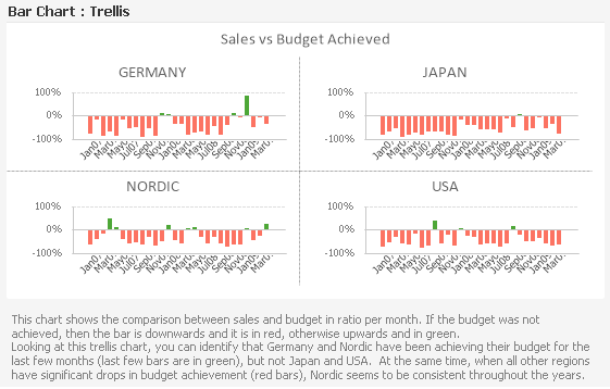
Can we add one more expression to show total count of clients as line style on the same chart?
- Mark as New
- Bookmark
- Subscribe
- Mute
- Subscribe to RSS Feed
- Permalink
- Report Inappropriate Content
Hello, Alex!
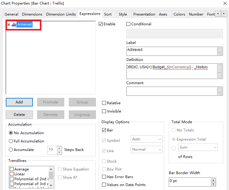
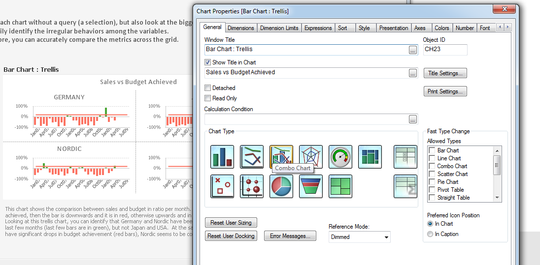
Change the graph style to Combo Chart and you will be able to make lines and dots.
I just added one line with constant 0.2 (red line).
- Mark as New
- Bookmark
- Subscribe
- Mute
- Subscribe to RSS Feed
- Permalink
- Report Inappropriate Content
Thanks Sergey. How can we add expression like
Count({<Region = {GERMANY, JAPAN, NORDIC, USA}>} [Account Number]) ?
- Mark as New
- Bookmark
- Subscribe
- Mute
- Subscribe to RSS Feed
- Permalink
- Report Inappropriate Content
If we are lookin' at specifically this example so there is a field called "Customer Number".
So the second expression (line) would be:
=Count({<Region = {GERMANY, JAPAN, NORDIC, USA}>} [Customer Number])
yes, it is the same as you wrote, but count is the absolute value enstead of "Achieved".
Next we need to do some axis manipulating, go to the Axes tab :
1. Select our second expression and set it to the second axis: Position -> Right(Top);
2. Turn off "Forced to 0" - line would be more comfortable to read;
3. Turn on "Hide axis" - it will hide absolute values, because we don't need them much (I suppose).
That all. After all this steps you'll get the line which interprets a customer count per mounth.
- Mark as New
- Bookmark
- Subscribe
- Mute
- Subscribe to RSS Feed
- Permalink
- Report Inappropriate Content
Great, it works fine. Thanks a million!
- Mark as New
- Bookmark
- Subscribe
- Mute
- Subscribe to RSS Feed
- Permalink
- Report Inappropriate Content
Hello, Alex!
Glad to hear it! If your issue is solved you can close a topic by marking the right answer 😃 Thank you.